PICK YOUR AI THEME TO GET STARTED

DAY 05 | EPISODE 02 | QUICK CLIP 6
CROSS DEVICES

Paul Davenport | 02:43
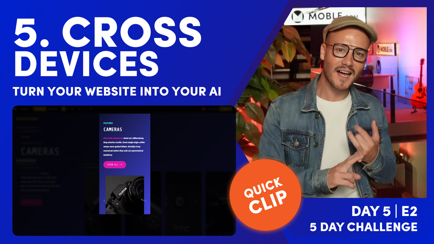
Your MOBLE website is responsive, meaning that it should render perfectly on all devices. Here we look at some simple ways to test in the MOBLE platform, but also look deeper in to how for specific devices via your Browser.
"Number five, you want to check your website on different devices. Well, as you know, in the MOBLE platform, you can come and check your website on mobile, tablet, and on desktop. Now the preview settings here, what we are doing is taking the smallest size, the smallest break point for each of those devices so you can be sure you're looking at the smallest one. Now if you've, which I hope you have, watched day three, episode one, where I took you through the essentials class, then you'll know how to structure a website page so you don't run into any issues on MOBLE from the get-go. And that's because our AI Website Bots are going to come in and make sure all your padding and alignment is working just fine. But still make sure you have looked at your pages on mobile, tablet, and desktop.
And do remember that if your page are particularly long and there is some information that you don't really want to display on mobile, then you can come into any layout, any frame, and then go to the advanced tab and say, "You know what? I just want to show this particular layout on desktop only." And you can do that right down to this frame here. So I could say, "You know what? Don't show this card on mobile, show it on desktop only." Now that's my advice to most users. Just make sure you use our preview tools in here because we are look previewing there on the smallest size for that particular device. But you can also go a step further. I'll just flip into another tab.
Now looking at this on the front-end, and I could go to inspect element here in Chrome or on Safari as well, but I could click the mobile tab and you can see I can change my screen size here to different dimensions and across different devices as well. So I'm here on a Mac, but I could go and look at this on a surface and a Samsung Galaxy and so on and so forth. So there's top tip there if you do want to have a look at other devices, another browsers, without having to go and buy a million phones."