PICK YOUR AI THEME TO GET STARTED

DAY 1 | EPISODE 5
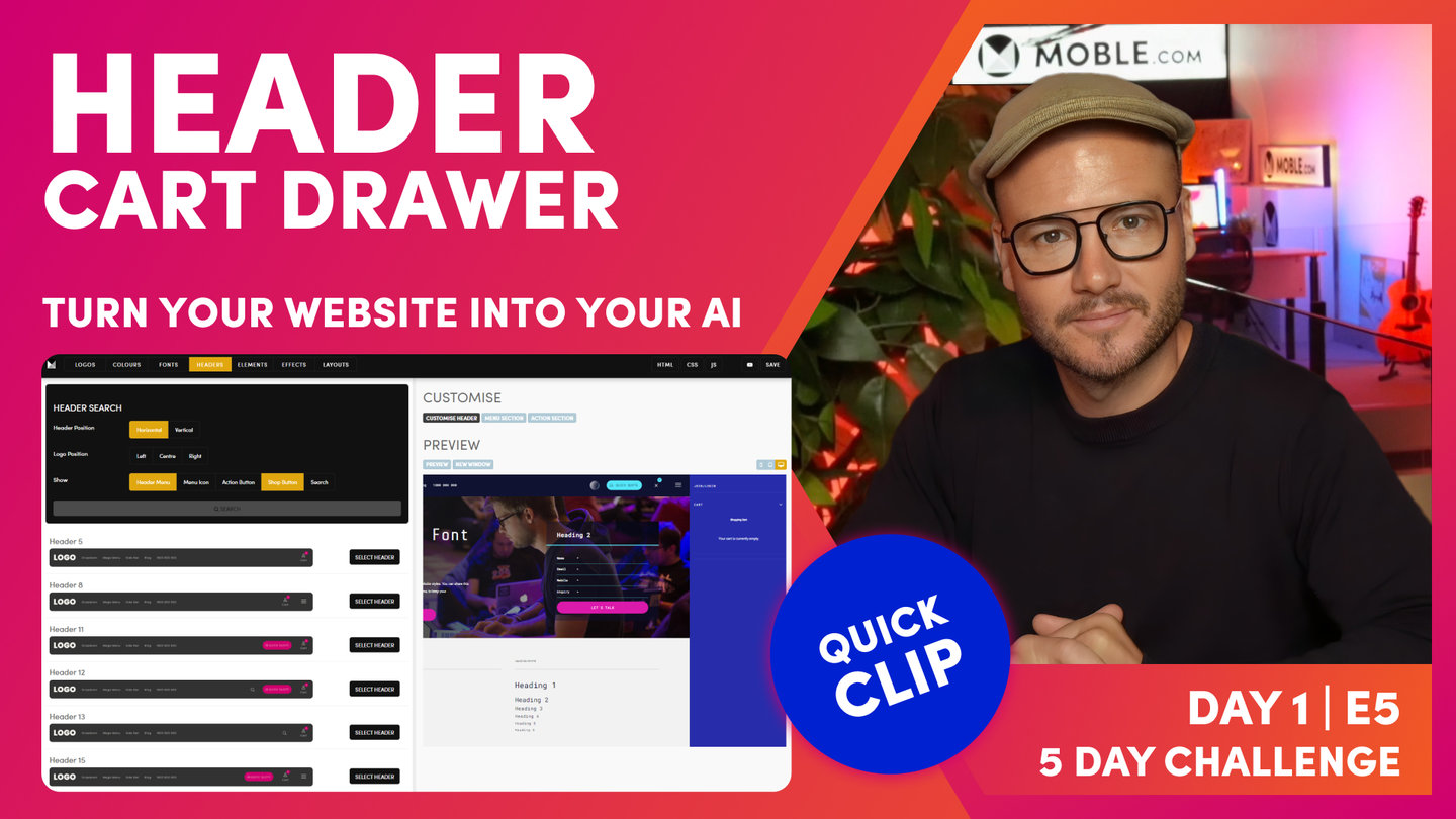
HEADER

Paul | 17:08 | 5 mins
Don't spend too long on this Episode. Think of it a precursor to Day 2, Episode 1, when we will revisit your Header to add all your pages, and build your complete website menus and navigation.
LESSON PLAN

Header Intro
Paul Davenport | 03:52
Simply select a Header, customise preferences and move on. The task should only take 5-10mins.
"In this episode, we're going to choose your header. Now, it really is one of the most simple episodes, but there's three things I just want you to keep in mind. Okay. Number one is don't spend more than five minutes on this episode. You're just going to choose a header of which there's hundreds to choose from, and then I'm going to show you how to customize it. And I'll be racing through that customized header bit because it really is quite simple stuff and the UI is fairly intuitive enough for you to work it out yourself. So use the timestamps if you want to skip ahead or maybe even play this episode on double time. The second thing I want you to understand here is that I do need, you have to chosen the header before we move on to day two, episode one, where we build out your menus in navigation.
So think of this episode as a precursor, as a quick setup before we get to day two. So definitely just jump ahead, choose a header, and maybe choose some of the customised header preferences. You'll be flipping between the menus, the navigation area, and the header area tomorrow in episode one. Okay. And the third thing to realise is, although we've got a 100 pre-formatted headers here, and we'll always add in more, you can actually go and customise your own headers with HTML, CSS and JavaScript if you know code but that's not part of the five-day challenge, so stay tuned for later masterclass episodes, where we'll focus on that. And if you don't know code, you might be able to learn code quite quickly when you watch these masterclass sessions because the coding here is not so complicated. So without further ado, let's get on with it. Let's pick your header and then race through it and we'll move on to the next episode.
Okay. So here we are in the headers area, which you can access by the main menu, go to styles as you know, and then in the top bar we can click the headers tab, which will bring you through to the headers area where you can see we've got hundreds of headers and we're always adding more. But right now I've got header 17 as my default, which has got a logo on the left, it's got the menu and it's got search, it's got the Action Section, a shop, and the menu icon as you can see here in the preview. Well, with there being so many headers, I can actually filter those. So I've got, you can see here, a horizontal header. I could also have a vertical header with a vertical on the left that could also filter via logo position. So left center and right, you can see here I'm on left, which is the default, and you can also choose what you want in the header. You can have basically a header menu, which also is a multi menu.
Okay. And you could have a menu icon, which is the menu icon which rolls out a Drawer or a Menu Section, which we're going to be explaining that in this episode. You can have an Action Section, which is your main call to action that rolls down a form as you can see here. And you can have a shop. Of course when you add items to a cart that will display and it opens up what we call a cart Drawer, and you can have a search which opens up a quick search by default, or you can use to link it to a full search page. Okay. So we'll be covering more of that as we go."
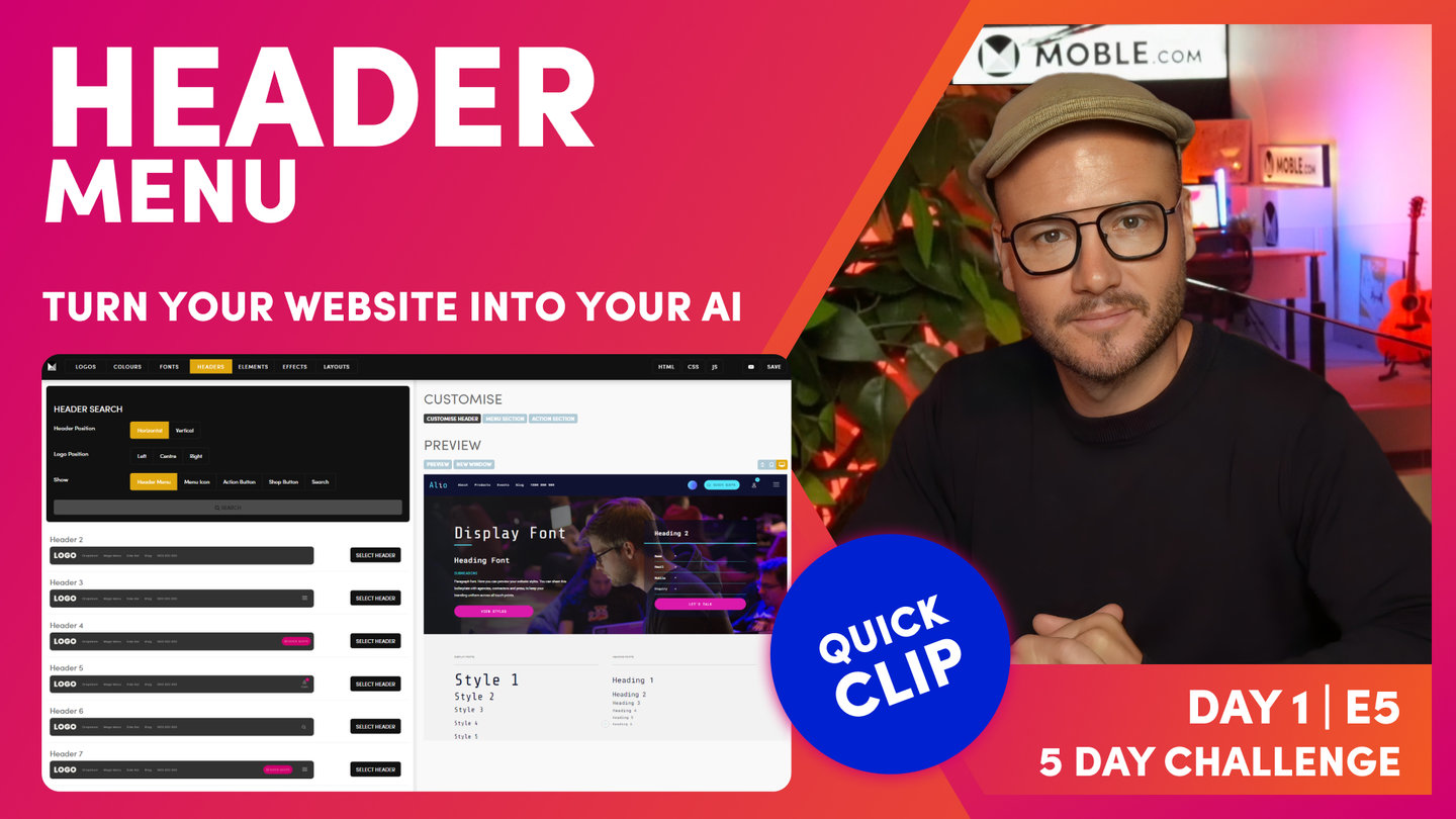
Header Menu
Paul Davenport | 01:20
Decide if you'd like a Header Menu in you navigation. The Header menu is highly recommended and is a requirement if using drop downs and mega menus.
"Okay, so header menu. Header menu quite simply is the main heading navigation that sits in your header and you can filter the headers with the header menu. Just click header menu and then click search. Okay. So if you want a header navigation, this will now show all the headers with that navigation. Now I can select here header two, and you can see I've got a very simple header with just a logo and the header navigation. Okay. Well, if I hit customize, I can go and tailor that. I could decide even to hide or show that. So I'll click hide and you can see now I've got header two, which is hiding the header navigation. Okay. I can click back, click show, and now I've even put it into the center and now that will show my header navigation and in the center. Okay. I click back, I could also put it on the right, click save, and now it's going to show my header navigation over to the right. Pretty simple stuff."
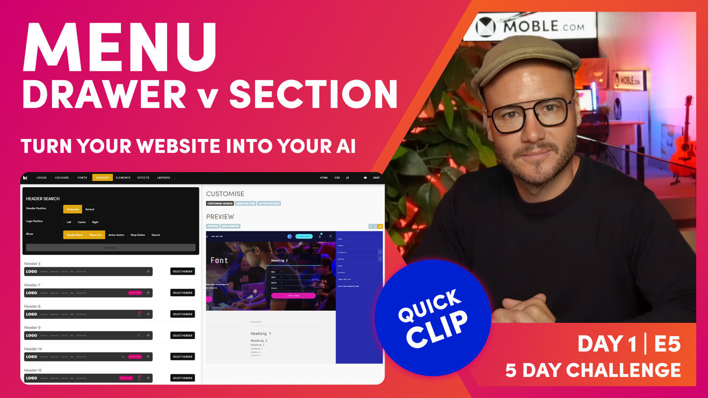
Drawer Menu or Menu Section
Paul Davenport | 04:55
A menu Drawer is a great choice for beginners, there is no design and styling work required, it just works. A Menu Section is requires customising your Menu in the Page Editor. More on this in Day 2.
"Okay. Now I'm going to choose a header with a menu icon. Well, in the filter here, if I choose menu icon and header menu, it's going to show me all the headers that have got both the header menu and a menu icon. Hit search, and those are all the headers. Okay. So if I jump over to my preview and I can now see it rolls down what we call a Menu Section. This is a custom page that we can design however we like with a menu in it. That's what we call a Menu Section, which you're going to learn more about that in forthcoming episodes. Okay. Now if I hit the mobile, I can also see... Click my menu icon, I can also see my Menu Section there. Okay. So Menu Section is one thing that we can choose. I'll just pop back into desktop. Now we're going to have a look at a Drawer menu.
So to look at that, I'm going to go back to the customised header button, and here I'm going to select Drawer menu. You see there's two types, I've got a Menu Section and a Drawer menu. So I'll select Drawer and click save. Now if I jump back to my preview, you can see it rolls out a Drawer. Now this is a multi menu, it builds it automatically. We don't have to customise or build anything, that just works. So if you're a newbie, you might select Drawer menu. You don't have to do any work, it just works. Okay. So there you can see that in mobile and desktop.
So now I'm going to show you a Menu Section. So back to the customised header. I'm going to click section. And you can see the direction. I might want this to roll from the top. In this place, I'll show you what it looks like from the right. So I'm going to click here and it slides in from the right. Okay, you're getting what's happening, I choose top. Obviously what's going to happen is the Menu Section is going to roll down from the top as you can see here. Okay, so that's what we call our menu icon.
Now if I go here, I could actually add some text. We used to always have the word menu because people didn't know what an icon was, so I could write any text there such as the word menu, and it's going to include that. If I delete it and leave it blank, then it's going to remove it and resize it so it's just a menu icon. Okay. If I want to edit this custom menu, I can click here to the Menu Section, go into the Editor, and that's going to take me to the page Editor where I can update everything. You can see it's got the merge tags there that I talked about in the first episode, which you can control in the my account area. So I'd leave those merge tags there. When you save on the front end, they're going to appear.
Now in the Layouts' Drawer here, there's a quick introduction, there's lots of Menu Sections pre-made in the type. I'll just scroll through the list of Themes. Let's see what we should have, let's choose this one from Enki. Okay. There's all of the Layouts, but if I want to filter that down and only see the Menu Section, if I could type here, then you can see there's two Menu Sections on this Theme. I'll hold shift and click that, and then it's going to drop it in.
Now, I could go and customise that menu just like any other page, so we'll explore that a little bit further, but I could go right in here and tailor anything I want to. In this case, I'm going to change the background Colour. I've got my space cadet here with this more blue, and I like it on a gradient angle of which you'll see. I like it, this particular design, around 130, I could change this here to say home, and I could actually put a link back home in here manually, which I could just link in the link list here to the homepage, and that will populate that to, what we call our index page. I could put in some SEO title in there as well. Okay. So this is how we build custom Menu Sections just by dropping them onto the page.
And on day three, we'll also show you how we build these out from absolute scratch as well. So you can use the Layouts or build them from scratch. When you hit preview now you can see that our Menu Section is updated, so it can be that quick. There's hundreds of these Menu Sections to choose from, so you're either going to choose a menu Drawer or a Menu Section, and then you can see here that Menu Section also updates on mobile with our accordion."
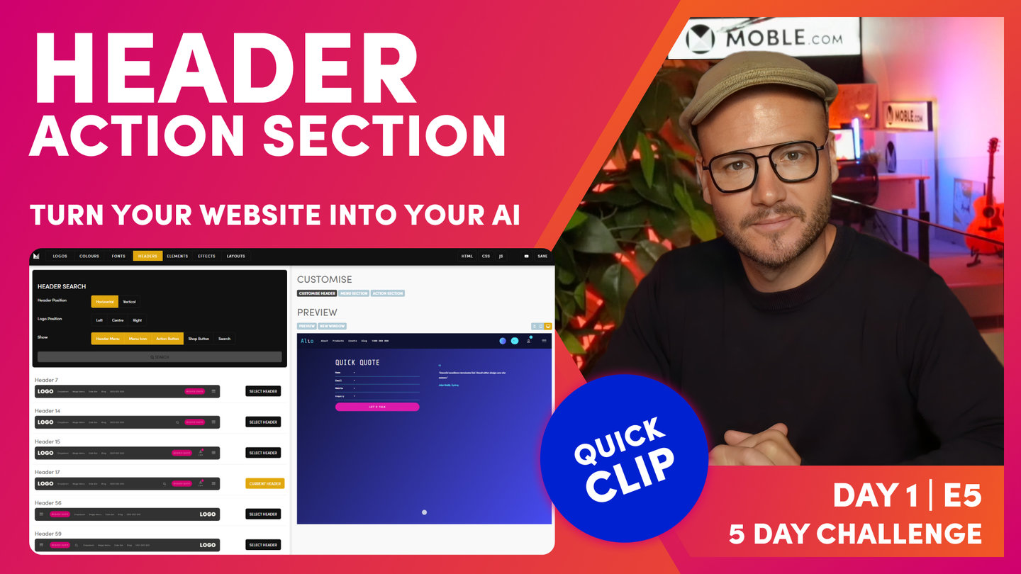
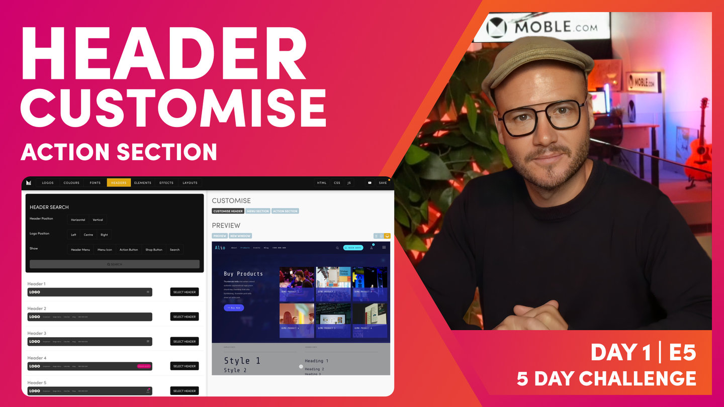
Action Section
Paul Davenport | 03:33
An Action Section makes a significant improvement to your website conversion rate and is highly recommended for websites looking to grow new business.
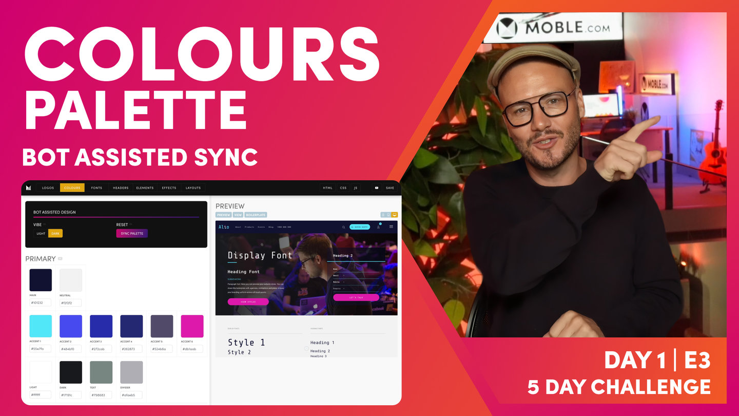
"Okay, so that's a quick introduction to Layouts there, starting to see a bit of the power about what's coming. Okay. So now we'll move on to our Action Section. So an Action Section is perhaps one of the most important elements of your entire website. This is the area of your website that gets the most form completions because it sits in a header, which is also sticky, so as people scroll, the header is always there and the action button is always there on mobile and on desktop. So wherever they go on any page, they're always looking at this button. It's why mobile websites always work and always convert well, because there's this big call to action button that's always there. And as you saw in previous episodes, in the Colours' episode, even when you scroll, we can make that change Colour to really Drawer attention to people as they go deeper down the page.
So this is what we call your Action Section. Now, just like the Menu Section, you can actually customize this build from scratch, which we'll learn on day three or just tweak this to customize your own. So in here I'll go with that same Colour. I'll keep it 126 just for now. And then I could go back to the Layouts' Drawer and I could search all of the different Action Sections as well. So in here I could look for Action Sections by Theme. So I'll choose Alphonso in here. Okay. And then that showed me all the Layouts but if I want the Action Section, I'll just choose Action Section, and there's that one. Hold shift to drop it onto the page, save me having to drag and then delete the one that I don't want or go and customize whatever.
In this case, I'm happy with the one that I've already got there, but I could go to type as well and search. Again, let's go and have a look through all of these different types of Layouts. I'll just filter here, Action Section, and you can see all of the Action Sections that we've got to choose from. There's loads here. We're always adding more, and so let's say I'll choose this one. Hold shift to drop it on the page again, to save me having to drag, and I can then go and customise whatever I want to with this particular one. I could change back to the blue. This one's got a background image. Okay. So in this case, I'll just have a gradient going over the top of it. We're going to learn all about that in forthcoming episodes.
Cool. Okay. So if I can just delete the one that I don't want, I prefer this one, and then I can save and exit and we've now got a brilliant call to action that's on brand very quickly without really too many design skills. Now I could change the words that are in the call to action here. It says quick quote, so clicking that customised button here. Got the close that's uppercase as well. I could change the icon that we use, maybe I'll choose the paper airplane, whatever icon I want there.
And sometimes I just want to click to a different page. Sometimes it's... Use this button to click to a page on another website, maybe some ticketing system that you're using. So I can type in as long as I put in https:// and the whole URL, it will link away and open that in a new window so your website stays open, so top tip there for if you're not using a roll down Action Section. You can see here it's updated with the plane saying quick quote, and as I click it, it rolls down our Action Section in this case, one with a testimonial."
Shop & Cart Drawer
Paul Davenport | 02:49
A Cart Drawer is an absolute requirement if you have an online shop. If you don't have a shop you can add a Shop at any time in the future, simply selecting a Header with a Shop.
"So if you've got an online shop, it's absolutely essential that you have a header with a shop button. That's going to show people the number of items that are in the cart, but it's also going to roll out the cart Drawer so that they can see all of the items explicitly what's in their cart. Okay. So the key thing about this is that in the filters, obviously you can filter to show only headers that have the shop button as you can see here. But also at the moment, just be aware that I've highlighted everything so I could remove things from the filters and it's going to show me more with the shop button. Okay.
Here we've got what we call the cart Drawer. Very simple stuff. So I can go and customise this and I can change the label. Now if my cart has got nothing in it, I can choose to show the word cart. Okay. Now, I can also change the icon that appears there. I'm using the user icon because I like to show people that this is my cart because they can see the dollar value there, but also they can know that people have got a user account. So I find that works really nicely because people... The user now knows they can click that, go to their profile and see everything in their profile, so past orders. They might want to change their billing information, update the card, the shipping information, how they want to receive notifications.
So I recommend that you have a my account, but more traditionally, even if you have got my account, people like to have a shopping cart icon as well. So you can choose a shopping cart icon or a user icon in there, and when you're happy with that, just press save. I'm actually going to put mine back to user icon. It makes more sense for the site I'm actually building, which I like. So there you can see my information. Now, I've already added things to my cart before, so it's got $0. I'm going to show you how to change the preferences of that later. But out the box, it's going to say $0 and it's going to fall back to cart, the word cart, if it needs it. Okay. Don't have to worry about that right now. It just works. Okay. So that's an introduction to the shop button, but of course, we're going to cover a lot more than that if you actually have got a shop in Day Four."

Search
Paul Davenport | 01:33
If you would like to ad search you can choose between a Search Drawer to rolls down a keyword search, or a link to a Search Page which can have a pre-made layout or be customised.
"So if you've got an online shop, it's absolutely essential that you have a header with a shop button. That's going to show people the number of items that are in the cart, but it's also going to roll out the cart Drawer so that they can see all of the items explicitly what's in their cart. Okay. So the key thing about this is that in the filters, obviously you can filter to show only headers that have the shop button as you can see here. But also at the moment, just be aware that I've highlighted everything so I could remove things from the filters and it's going to show me more with the shop button. Okay.
Here we've got what we call the cart Drawer. Very simple stuff. So I can go and customise this and I can change the label. Now if my cart has got nothing in it, I can choose to show the word cart. Okay. Now, I can also change the icon that appears there. I'm using the user icon because I like to show people that this is my cart because they can see the dollar value there, but also they can know that people have got a user account. So I find that works really nicely because people... The user now knows they can click that, go to their profile and see everything in their profile, so past orders. They might want to change their billing information, update the card, the shipping information, how they want to receive notifications.
So I recommend that you have a my account, but more traditionally, even if you have got my account, people like to have a shopping cart icon as well. So you can choose a shopping cart icon or a user icon in there, and when you're happy with that, just press save. I'm actually going to put mine back to user icon. It makes more sense for the site I'm actually building, which I like. So there you can see my information. Now, I've already added things to my cart before, so it's got $0. I'm going to show you how to change the preferences of that later. But out the box, it's going to say $0 and it's going to fall back to cart, the word cart, if it needs it. Okay. Don't have to worry about that right now. It just works. Okay. So that's an introduction to the shop button, but of course, we're going to cover a lot more than that if you actually have got a shop in Day Four."
TEXTBOOK
A user guide to Website Headers
PICK FROM OVER 100 HEADERS
A website Header is perhaps one of the most important structural components of your website. In this Episode, you'll quickly select your Header in a few clicks, whether you're a beginner who has never created a website before, or if you are an advanced website developer.
You will be able to revisit the Headers area at any time to swap and change your Header on the fly. The most important thing, for now, is to choose a Header that best fits your immediate needs, and know that you can always swap and change as you learn and grow.
ACCESS THE HEADERS AREA
To access the Headers area, click the Main Menu icon at the top left of the page and select 'Styles'.
Here you will see a range of Headers that have been preformatted for you. You can simply choose the Header that you like, click 'Save' and your new Header will be ready to go.

Add a Header is as easy as: 1 Going to Headers, 2 Selecting a Header, 3 Saving a Header.
When considering what to include in your Header, it's a good idea to go back to your workshop data to confirm your most important pages and website objectives. Typically, you'll want to include these items in your Header.
Keep in mind that your Header is responsive and therefore you need to allow design for mobile, tablet and desktop. You can preview your Header for each device using the device buttons to the far right of the Preview. All MOBLE Headers are responsive as standard; they are also 'sticky', meaning they stick to the top of the page as you scroll. Therefore, the links you place in your Header will be accessible to your visitors with a single click, wherever they are on your website. This gives you a great opportunity to encourage clicks to your most important pages, which is especially important in lead generation websites.
If you are building a website that aims to generate as many leads as possible, you might only decide to have your Phone Number and a Quick Quote button in your Header. You could conceal the rest of your pages inside a Drawer Menu that is linked to the Hamburger Icon.
Alternatively, for example, you can see that many of your website leads are generated from your Case Study pages; you might also include a link to your Case Studies page in the Header Menu. In this example, your Header would include Header Menu, Call-to-Action Button, and the Drawer Menu. Often subtle changes like this make a huge difference to your conversion rates; it is very important that you can learn from your results and come back to change your Header as you learn.
Typically, less is more with Headers. It is often best practice to not to have more than 6 items in your Header unless you have a large website with more than 40 pages.
HEADER SEARCH BOX
Your Header typically sits horizontally across the top of the website, though it is possible to have a website Header that sits vertically to the left of the page.
MOBLE is currently adding many more Header options to the Headers area and will be inviting Frontend developers to submit new Headers to the MOBLE framework. So, every time you design a new website, please use the search tools to see if any new options are available to you.
Similarly, you can search the Headers on offer by the position of the Logo, which is quite self-explanatory, with Logos positioned either left, centre or right.
Now, to demo the next items in the Search Box, I am going to Select Header 16. You can see that Header 16 includes all of the available components and makes for the perfect Header to describe the range of features on offer in your Header.

The Header Search Box helps you find the Header that you're looking for. Select the Items, click Search and choose from the filtered list of Headers.
HEADER MENU
Alongside your Logo, the Header Menu is often the most prominent component that sits in your Header. The Header Menu is a collection of links created in the 'Navigation' area. Here I will hold Control on the keyboard and click 'Navigation' from the top left Main Menu. This will open the Navigation area as a new Tab.
Here you can update the pages is your Header and Drawer men.
Jump back to Series 1 Episode 6 for a refresher on Menus and Navigation.

Did you know? You can select your pages for the Header Menu in the 'Navigation' area.
DRAWER MENU
The Drawer Menu is an off-canvas menu that slides into your page. It contains the list of pages that you set up for the Drawer Menu in the Navigation area. Currently, the default menu slides in a drawer from the 'Right', flip between 'Top' and 'Left' slide-in Drawer Menus and also select the width of your Drawer or design your own menu in the Visual Editor with a 'Menu Section'.
Select a Header with a Drawer Menu, then click the Hamburger icon in the Preview pane. You will see that the Drawer Menu slides in.
To select the preferences for the Drawer Menu, click the 'Customise Button'. We will cover this in the next Episode.
Importantly, the Drawer Menu is the default menu that shows on mobile devices. As such, even if you use a Menu Section you should still complete your Drawer Menu in the navigation area. Again, jump ahead to Day 2 Episode 1 for a refresher on Menus and Navigation for a complete breakdown of the types of menus that are available.
Did you know?
We sometimes refer to the Drawer Menu as a 'Site Map' menu since you can easily include your entire website Site Map within it. There is no limit to the number of levels of navigation within this multi-menu drawer.
The Drawer Menu is the default Menu that appears on mobile devices, and therefore, you give your users easy access to every page on your website, in a neat multi-menu that can easily be navigated on any device.
Even if you don't select a Drawer Menu here in your Header, over in the Navigation area you should assign the pages to your Drawer Menu, since it's always used on mobile whether you select it for your Header or not.

The Drawer Menu seen here sliding in from the right.
ACTION BUTTON
The 'Action Button' allows you to add a Call-to-Action in your Header. It is a tremendously popular feature with MOBLE clients, especially for lead generation websites where you are looking to increase the number of website enquiries. You can see here in the Preview that by clicking the Action Button a drawer slides down from the top of the page. This allows you to include a Call-to-Action message and typically includes a form to attract new conversions and subscribers.
If you are wondering where to edit the content within the drawer, you can:
- Go back to the Pages area (I'm just going to hold 'Control' and click 'Pages'); this opens up a new Pages area in a new Tab.
- Then in the Pages area, click 'Section' and 'Search'.
- You will then see a page called Quick-Form. This is where you can edit the content that sits within the Slide down drawer. We will talk about Sections in other Episodes, though essentially Sections are not normal pages, as they don't have a URL (page address). However, by allowing you to edit them just like any other page, you have all the functionality of the MOBLE editor. Therefore, you have full control to create what you like here. Another example of a Section might be your website footer. On MOBLE you can create anything in your Footer; imagine a footer with a background video or transitioning slider. Whatever you like you have the full potential to create it.

LINK BUTTON
The Link Button is a prominent button in your Header that you can link to any page on your website. This is often used to attract a high volume of clicks to a key page like 'Join', 'Pay', 'Login' etc. It is an alternative to the Action Button, rather than sliding down a Drawer, it links to an actual page.
In the Customise Tab, you can change the icon and the word within the button. We will look at this shortly. You can also remove or change the background colour in the colours tab, which we will also cover in forthcoming Episodes.

The Link Button brings prominence to a nominated page. Update the page via the customise tab.
SEARCH
For larger websites with many pages, you might wish to consider having a 'Search' option. By clicking search it pops up a search box as standard. We will be introducing a range of configurable search options shortly, so please stay tuned for this as we continue to bring more functionality to you. If you would like to try out our latest search techniques before they hit the main CMS, we would love to accommodate you. Please contact us at www.moble.com/lets-talk.

Add Website Search to your Header
6 WAYS TO CUSTOMISE YOUR WEBSITE HEADER
Now we'll look specifically at how you can use the 'Customise' Button to configure your Header mix 'n match features and fucntionality.

The 'Customise' button is located at the top of the right of the page.

The 'Customise' button is located at the top of the right of the page.
1. HEADER LOCATION
For Horizontal Headers there are two types of Header location. Your Header can either sit so that is 'Nested' i.e. it overlays the background image behind it. Or it can sit 'Above' the background image.
Nested
If you select 'Nested' you will notice that a Transparency Option will appear. You have two options: either 100% Transparency or 10% Transparency.
- 100% means your header will be completely see-through. When you scroll down the page the background colour will appear.
- 10% means that your header will show your background colour, though it will have an opacity of 90%, allowing you to see the image below and still read the text in your Header.
Above
If you select 'Above', your menu background will display the full colour.
You can choose your Header background colour by clicking on the Colours Tab in the Styles area. Jump ahead to Episode 5 to learn about colours.
2. ACTION BUTTON
There are three options to change your Action Button:
ACTION BUTTON TEXT
This is the text that appears in the button.
CLOSE BUTTON TEXT
When you click the Action Button a Draw slides down. Notice that the text in the button changes. This will typically be something like 'Close' or 'Exit', though you can control what you would like it to say here.
ACTION BUTTON ICON
You can also select an icon that you would like to appear in your Action Button. You can start typing to filter the icons or simply scroll to find an icon that is appropriate.
3. LINK BUTTON
The Link button is very much the same, with the ability to change the text and the icon. You should consider keeping the word as short as possible as there really is not too much space. So typically, this might be something like 'Join', 'Pay', 'Login', 'Win' etc.
Notice that you should also include the URL of the page that you are linking to.
If you are linking to a page on your website you only require the last part of your URL including the forward slash. E.g.
- /your-page-name
If the page is linking to another website you will need the entire website address and the page will automatically open in a new Window. E.g.
- https://www.website-name.com/page-name
4. DRAWER MENU
You can change the Word used underneath the Drawer Menu icon. Typically this will be 'Menu'. Though this could be for anything e.g. if you had a playlist of tracks. You might call this tracks or play.
Though you can be creative, always choose small words to fit the space, perhaps words with no more than 5 letters. If your website was for a collection of art, you might simply say the word 'Art'. If you're uncertain it's best to stick with the word 'Menu'.
5. SEARCH
Search allows you to customise the word to open up your website search box. You can also select an icon to appear here also.
6. HTML, CSS & JS
Finally, while MOBLE will also continue to introduce new Headers and Header options, we do understand that a Header can be uniquely specific as to the requirements of a business or project. Therefore, you have full access to the website HTML, CSS and JS to make quick amendments to the code and develop your own Headers.
Series 9 is a dedicated Series for frontend code. If you're a designer that wants to learn code then this series is your opportunity to get started.
If you would like to customise your own Header with HTML, CSS and JS tweaks, please feel free to contact MOBLE at www.moble.com/lets-talk and we will be happy to assist and point you in the right direction.
WHAT'S NEXT?
Now you've created your Header, it's time to bring it to life by adding your logo. Next you'll learn how designers create logos for the web, and apply a splash of animation to your most important brand asset.
DAY 1: EPISODES
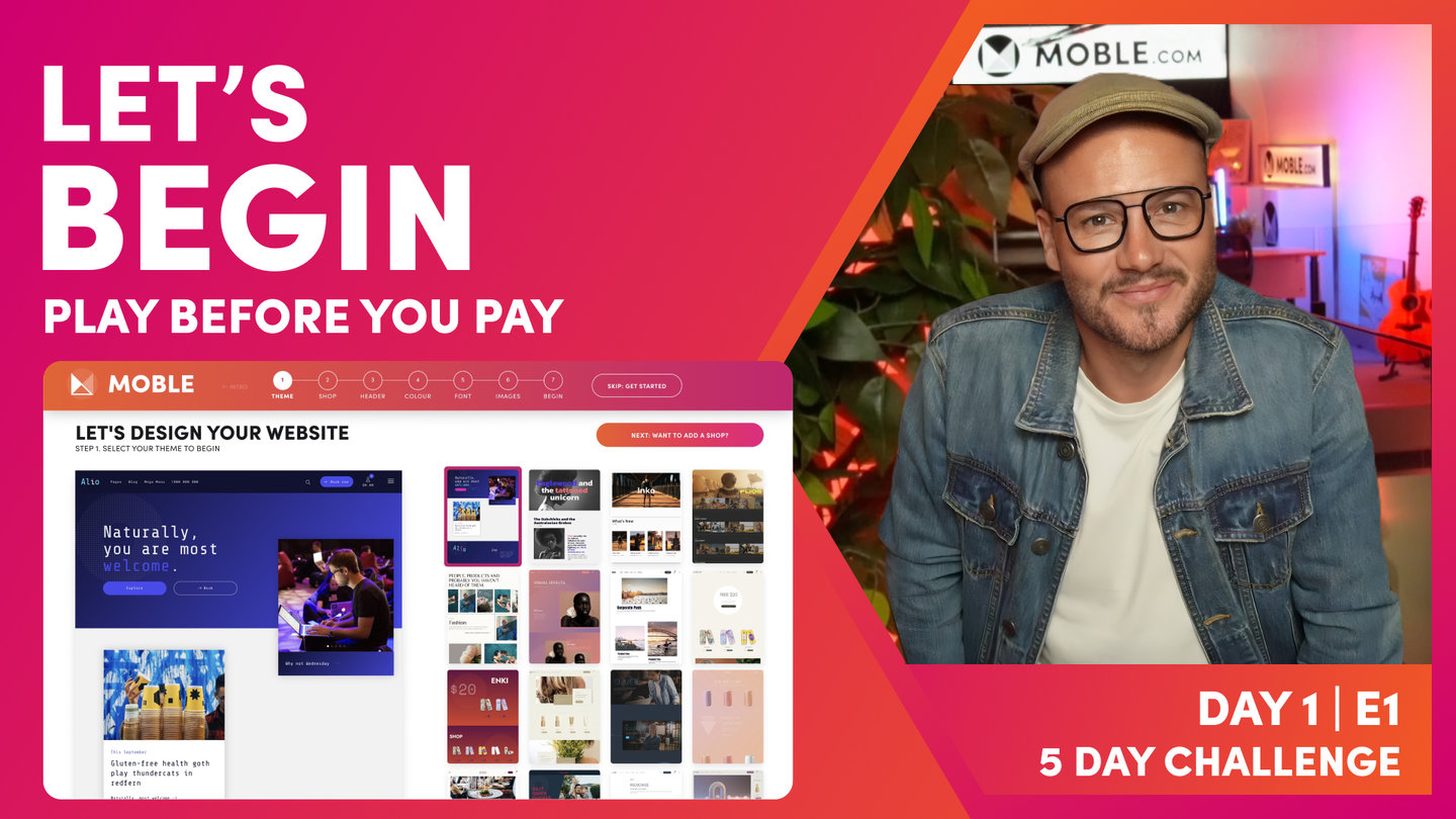

Play before you Pay?
GETTING AROUND
SUPPORT
AI SALES LINE
AI SUPPORT LINE
ENQUIRIES
team@moble.com.au
GET A QUOTE
A Web Builder for Design. A CMS for Business. We serve all businesses from SME's to Enterprise. Talk with us for AI development, custom website design, website development, ecommerce websites, directories, intranets and social networks.
PRIVACY | WEBSITE TERMS | PLATFORM TERMS | © 2026 MOBLE PTY LTD