DAY 1 | EPISODE 9
ELEMENTS

Paul | 5:30 | 10 mins
This Episode is a precursor to Essentials class on Day 3, Episode 1. It's ok to make some quick decisions now knowing that you can come back to change your preferences at any point in the future and your changes will instantly be made across your entire website.
LESSON PLAN

Elements Intro
Paul Davenport | 00:56
Think of Elements as sitewide settings that you can update once and apply globally right around your website.
"In this episode, we're going to introduce you to elements. Now, elements are core design settings that are site-wide, so many of the other design settings that you'll see in the five-day challenge and throughout your time with mobile are per instance, so per that instance on a page. Well, elements are design choices that you make that are site-wide, and there's three elements that we're going to look at in this episode."
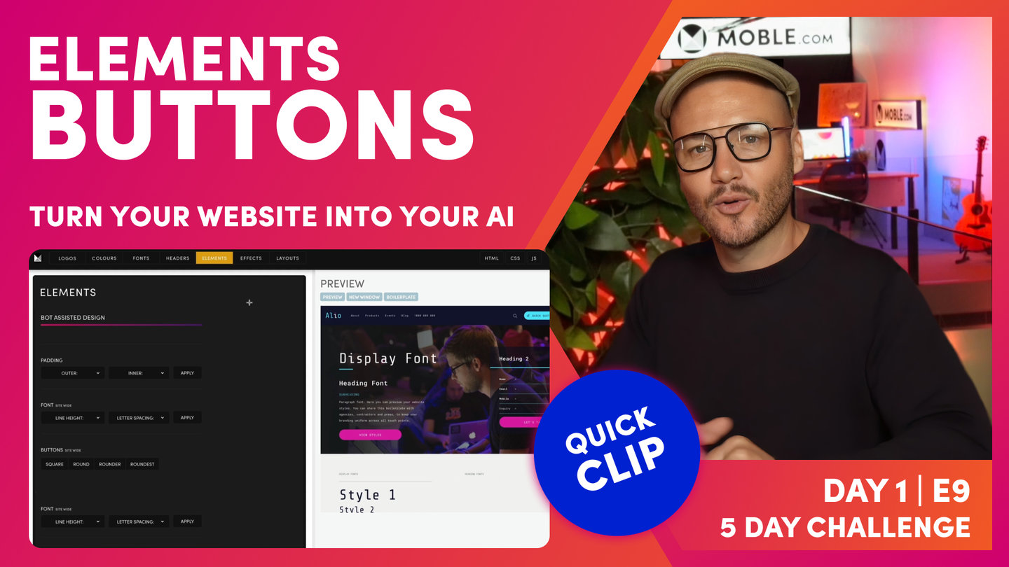
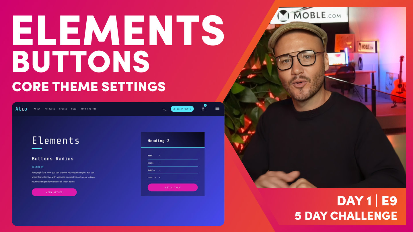
Button Radius
Paul Davenport | 01:27
Decide if you'd light your buttons to be Square, Round, and Rounded or the most Roundest of all.
"Now, to access elements, go to the main menu on the top left, go down to styles, and you'll see elements in the top bar. Now, the first design choice I want you to make is whether you want your buttons square, round, rounder, or roundest. Now, you can see here in the preview that there's a button there to play with, but it also controls the button in the form and also the button in the Action Section. So have a think, which of these buttons is going to be the nicest for your website? Knowing that you can change at any time. So here, we'll have a look at square and we'll have a look at round, and rounder and roundest. Okay, so make that choice now, knowing that you can come back at any time during the five-day challenge or any time in the future and change this with just one click."
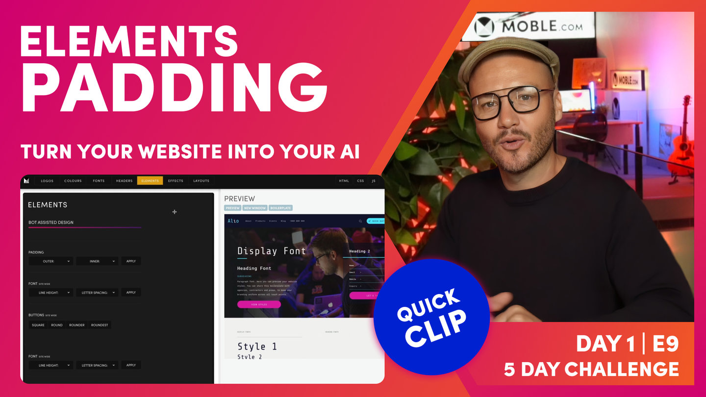
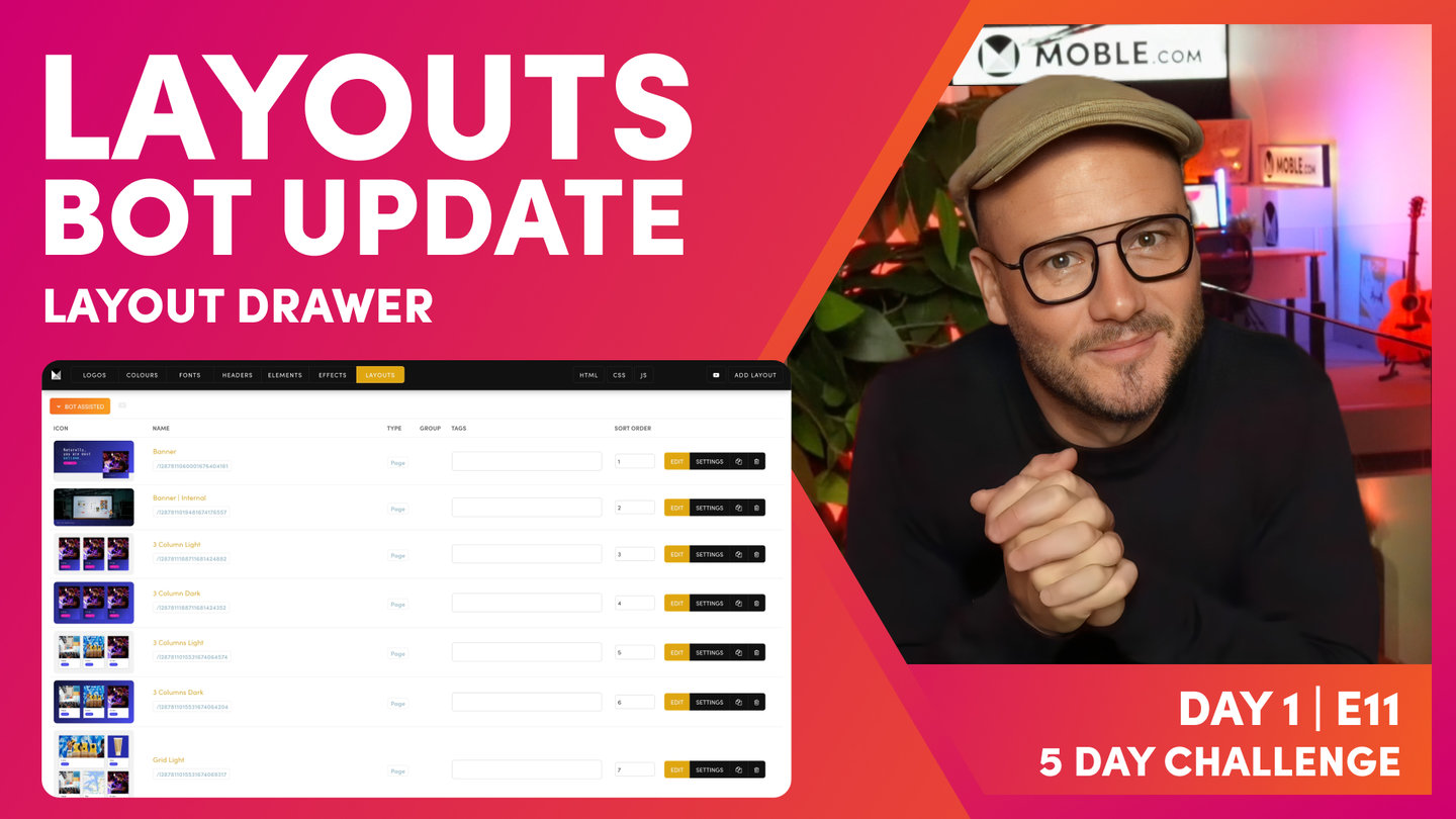
Layout Padding
Paul Davenport | 02:14
There are thousands of Layouts on MOBLE all with different Padding and Alignment. Set your padding preferences here and as soon as you drop new Layouts on your page they will instantly adopt these settings and be perfectly aligned.
"The next element that we're going to look at is your padding. Now, there's a whole episode focusing on building Layouts from scratch on day three, the essentials episode, so if you want to know more, watch that episode now. It'll teach you really how to build any website Layout in the world from scratch. But core to that episode and core to that learning is padding. Now, on mobile, we've got outer padding, which is the padding that sits on the outside of your Layout, and we've got the inner padding, which is the padding that wraps each block or wraps each container as we call them in front-end development.
And so when you pick the settings here on the element, it's going to change those across the entire website in one hit, so that means all of the Layouts will work together. So as you pick a Layout from one Theme or a Layout from another Theme, those Themes might have different padding. They might have different outer padding and they might have different inner padding. Well, we're going to set the outer and inner pad here so when you drag those Layouts onto a page, it will instantly convert that into your settings. And that's one of the tricks on mobile, how we get all of these Layouts to work together, and it's our AI Website Bots that are doing that change for you.
So you can have a play with this now. In the Layout, in the preview here, you can get a feel for that outer and inner padding, and that's going to stand you in good stead for when we move on to day three, because this is one of the first things we learn in that core session where we teach you to build any website in the world from scratch."

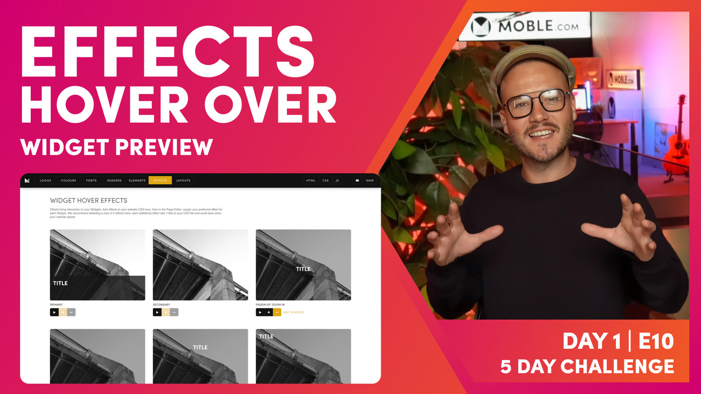
Widget Card Padding
Paul Davenport | 01:41
Choose the site wide Padding for your Dynamic Widgets and opt for Tight, Regular or Loose.
"And the final element I want you to consider is your widget card. Now, if we look over in the preview here, we can see our widget card. Now, the widget card are presets which control the padding and alignment across all of your widgets so that they all look nice and work together. So really, there's three types that you can choose from here. There is literally no padding, and then we have tight, regular, and loose. I just want you to note here that in the actual widget itself, you can actually change the padding within the widget there too, so this is in addition. It's really more focusing on the height between the title or the height between the summary. So this makes sure that no matter how you configure your widgets, some widgets don't have a title, some don't have a summary, some don't have a price, this setting makes sure that all of your widget settings all work together, no matter how you configure that particular widget. So don't need to overcomplicate this. I just want you to select non, tight, regular, or loose.
Okay, and that's the end of the session. That was elements. And now, we're nearly racing to the end of day one. We're going to quickly go and have a look at effects."
WHAT'S NEXT?
Now you've selected your Elements, we move on to another simple but essential choice and where you choose the Hover Over Effects for your dynamic widgets.
DAY 1: EPISODES


Play before you Pay?
GETTING AROUND
SUPPORT
AI SALES LINE
AI SUPPORT LINE
ENQUIRIES
team@moble.com.au
GET A QUOTE
A Web Builder for Design. A CMS for Business. We serve all businesses from SME's to Enterprise. Talk with us for AI development, custom website design, website development, ecommerce websites, directories, intranets and social networks.
PRIVACY | WEBSITE TERMS | PLATFORM TERMS | © 2026 MOBLE PTY LTD