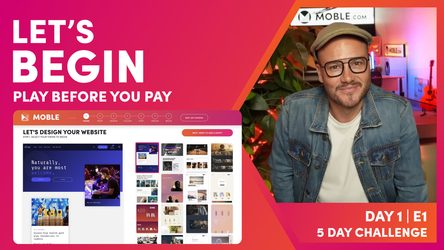
PICK YOUR AI THEME TO GET STARTED

DAY 1 | EPISODE 4
FONTS

Paul | 32:39 | 10 mins
If you're creating a new brand, you'll be selecting Fonts for the first time. To help you, the Episode finishes with a look at how designers choose Font Pairs and gives you a few quick, fool proof hacks, so that you can decide on the most amazing Font Pairing for your new brand.
LESSON PLAN
Fonts Intro
Paul Davenport | 02:24
We split this Episode in two; quick tasks for designers to update Fonts and move one, and a detailed session for Beginners.
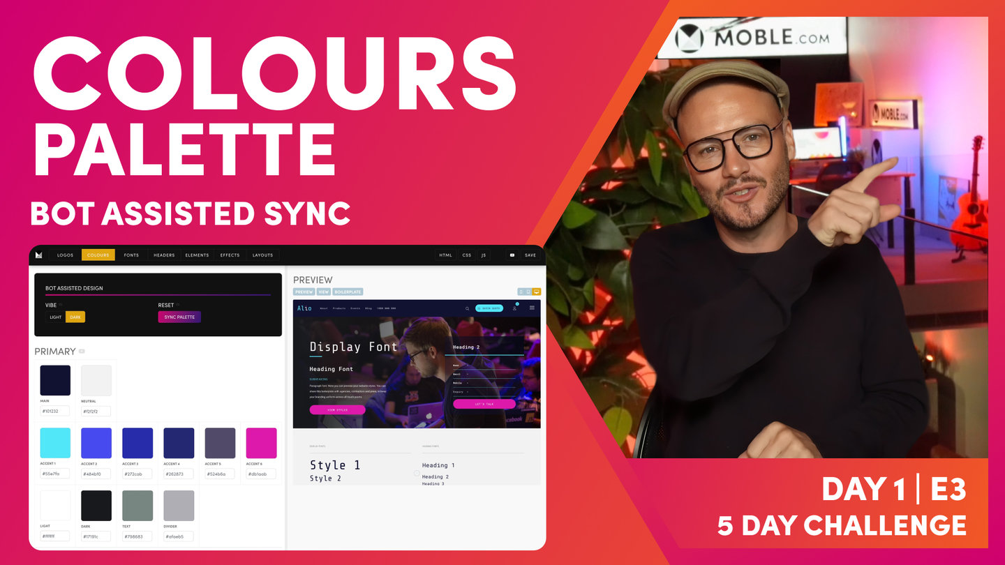
"Now is the time to update your fonts and fonts is actually a similar philosophy to Colours where we lock down a palette of Colours so that in the Editor, our content team could only choose the Colours that we have chosen for them. Well, fonts is exactly the same. We're going to now create a palette of fonts for our content team to use in the Editor. And the reason for this, and this is one of the biggest problems I see in website design, is that platforms allow the content team to go in at any time in the future and they give a whole library of fonts for people to choose from. That's a nightmare because that means our content team can now be tempted to select fonts that are not in our brand guidelines and they will, right? So we need to lock down the fonts and don't allow people to select them in the Editor.
So let me just show you what I mean by that. Let's go over to the Editor and let's put a cursor here on this particular piece of text and let's go over to our fonts. Well here, you can see all of my headings and for each of the headings I can have a different style. Well, this is another key point of why content Editors tend to be a bit tempted to choose fonts because they know, as a content team, the power of SEO. So they know you should only really have one Heading 1 on a page and maybe two Heading 2s or three Heading 3s. It's almost like a pyramid, a hierarchy. So typically, if fonts are created then that Heading 1 is always going to be bigger.
But what if they need to have a Heading 3 lower down in the page or a Heading 5, but still make it large? So this is the idea around creating a nice palette of fonts so that it considers all users and gives them that flexibility so that they don't need to introduce new fonts into the platform and they can always optimise the page for things like SEO."
Fonts for Designers
Paul Davenport | 07:23
Select two Typefaces, apply the Typefaces to the Font Palette, use the Bots to assist with Line Height and Letter Spacing.
"My experience tells me that there's always two very distinct types of users at this point. Now, typically, we've got website designers or people that understand branding and have got quite a reasonable knowledge of fonts. And then, often in business we've got some newbies in terms of design that don't understand it and would like to understand more. So in this session, I'm actually going to take three minutes now for... If you understand fonts, I'm just going to give you a quick three-minute overview, three tasks really, that you can now just go in the Fonts area here, just do these three tasks, and move on. And then, I'll go really slow for the final 20 minutes so that people can understand fonts and by the end of this session, you'll be just as good as those other designers that have moved ahead.
So what are these three tasks? Well, it comes down to using the AI Website Bots to do all the hard work for you. So what I'll do here, we're just in the Fonts area which is from Styles and then Fonts is the third tab along. Now, you can see here, I'll just drawer your attention to Heading 1. Now, in the onboarding, I chose Roboto Condensed because I didn't have my font there. I need Roberto Mono for my... That's in my brand guidelines. So here I will actually just remove this and type in RoAI Website Bots and you can see, I've got Roboto Mono here. Brilliant. I'm going to select that.
Now, I could go through all of these fonts and start replacing them but all I need to do now, I've chose Roboto as my typeface here so I'm just going to apply this typeface to all of them, just click this. Now, the button runs it and it goes and replaces them all for us. So you don't need to wait too long for that. You can see, it loads... The preview actually takes longer to load on the right. Pretty quick. So that's your first task, choose your first typeface.
Now, if you remember from the onboarding earlier, I said, "When you're choosing your heading, choose a conservative one. And then, for your more display ones, choose a more poppy one." Well, you've just seen that in the Editor where we can have Heading 1 and we can make it in this Heading 1 or we can give it another style and make it a bit more poppy. That's pretty cool, right? So what I wanted to do is show you now that all of these are in our conservative Roboto Mono, I just want to go and show you which fonts here to apply that more poppy typeface.
Well, there are three places to do it. I would do it in all the styles and later on in this video, I'm going to explain what all these styles are so you can skip ahead to those if you need to. There are indications here of what they do. So you go and replace all the styles with that more poppy one and then go and replace the widget title and the widget price. So it's the widget price, the widget title. I would do all of the styles. You can come back and change these later. As we move into Day 3, you might want to come back once you've designed and change a couple of these. And then, if you are using block quotes, you might change the block quote as well. So you're really just going to go and change those.
So for me, I know that my poppy one that I'm using for this Theme is Share Tech Mono. So I would simply go through and replace Share Tech Mono. Now, once I've done that, I can now come back up here and get the AI Website Bots to do the hard work for us. Well, in the Theme, let me just go... I'll show you this first of all actually. I've got Roboto Mono selected here but now I could take this typeface and go and make it a font. So for this Heading 1, I can choose the desktop size, the mobile size, the line height which is above and below the line, and the letter spacing between. I can also say which is the bold and regular that I want people to pick and choose from in the Editor.
And if you need to, you can actually lock down upper uppercase. You probably wouldn't ever lock down uppercase but you can do if you want to. Particularly, you might do that for the header font which you can see if I just jump back down here to menu, you can see our header text is there. This one, I might decide to make uppercase. Cool. So I think you get that pretty good.
So in here, I now would know that my Theme has made these pretty good for me to begin with and I can come back and change these if I want to. With the exception of two things. Now, as a designer you know that there are two things with fonts that make a real difference and its line height and letter spacing. So line height being the text above and below in the lines. And then, the letter spacing. Well here in 2023, it can be quite contemporary for, let's say paragraph text, to have quite a loose line height, almost double line height spacing.
So what we've said with the AI Website Bots is we've actually said to the AI Website Bots, "Choose..." Here, we've got three kind of presets with the AI Website Bots that they can go and apply, right? So we've got tight, regular, and loose. So if you do want a loose line height, just select Loose. And then, for your letter spacing, depending on your font, you might want it tighter or more regular or loose and you can play around with these. So just select one line height and one letter spacing and hit Apply and then you'll see that our AI Website Bots update in here. Then you can come over here in the preview and have a look and just play around with it.
Now, this is based on the fact that Moble have built hundreds of websites so we've built our AI Website Bots knowing the more common use cases. So it's most likely that we'll get you... If you're a designer, you want specific things, it's most likely we'll get you very close with the bot. So that's going to save you having to go through each of these font in the palette and make them all out one by one.
So you can just run the typeface. Then, you can go and choose some of these styles and I recommend you probably change the 12 or maybe at least the first 6 and then go and change the widget title, the widget price, and maybe if you like, the block quote as well. So that's it. And then, you'll just come and choose and have a play with the line height and letter spacing, hit Apply. Once you're happy in here, press Save. And that's it, that's the episode done. So that can really take you about 5 minutes but it's worth having a bit of play with it so I'd allow about 10 minutes to get this set up and then have a play and decide what your like best knowing that you can come into any of these fonts after you've used the AI Website Bots and tweaked them as you like."
Fonts for Beginners
Paul Davenport | 03:03
Understand how fonts are used on websites.
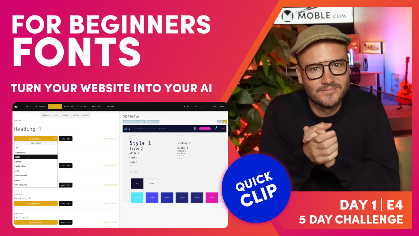
"Well, here we are in the Fonts area which as you know by now, you can access via the Main Menu if you click Styles. And then in the top bar, we select Fonts. Okay. Now, the first thing I want to drawer your attention to is where it's says Heading 1. This is the name of our first font. Now, below that, we have the ability to select a typeface. Now, when selecting a typeface, there are two main choices. Do you want a serif or a sans serif? Well, serif just means there's tails or squiggly bits on the end of the characters as opposed to sans serif which means they don't have the tails or squiggly bits on the end of the characters, sans being the word for without in French. So I want you to think, "Does your font need a serif or a sans serif?"
But also in the list here, you can select what we call Display and Handwriting and also, Monospace. Well, where it says Heading 1 here, I can actually type over this as a preview to have a look and feel for the type of font that I need. Now, if you've got brand guidelines and if you're an existing brand, then you probably already know the font that you require. So this is where I want you to check your brand guidelines or check whoever created your brand what your actual fonts are.
Now, in the list here we've got a list of Google fonts but you can actually also add an Adobe font but you do need a license for that which you'd have to buy over on the Adobe Fonts website. So for the purpose of this episode, we're using the Google fonts that we've got here which are free and also web safe, meaning they work on all browsers and all devices.
Now, if you've had a branding agency and they've chosen a particular font for you that's not a Google font, you can go back to them and ask them for something similar that you can use or you can go into Google and there's a whole bunch of font matching websites where you can just upload an image of your font and it will match that for you. They work to a varying degree of success but there are a lot of them font matcherator, WhatTheFont, Font Squirrel has one, What Font Is, LikeFont. There's a whole bunch there that you can play with to get something very similar and like I say, the best way is to go back to the person who chose that font for you and ask them to match it with a Google font."
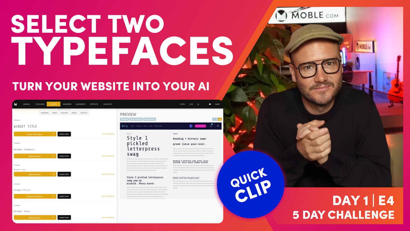
Pick Two Typefaces
Paul Davenport | 06:49
Select two Typefaces and apply them Typefaces to your Font.
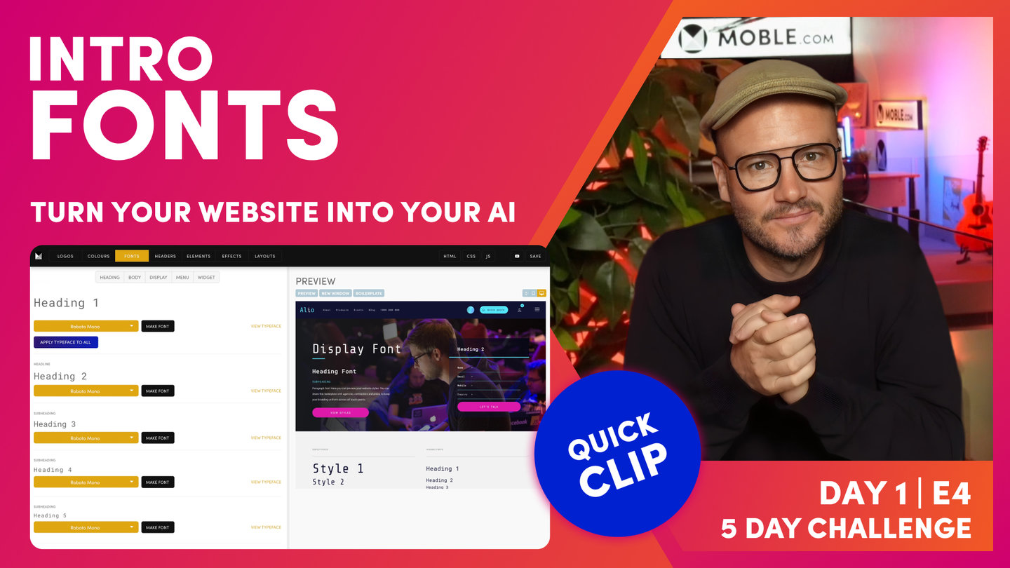
"Well here, you can see I'm back in my brand guidelines and I've got two typefaces. I have Share Tech Mono and Roboto Mono. Well, I'll go back into the Fonts area and I can now add these fonts. So I'll click the first typeface here on Heading 1 and I'll type R-O-B, which gives me a filtered list of Roboto fonts. So I'm going to select Roboto Mono. And now, notice the anchor links at the top. I can use the body to scroll down to the body fonts which consists of paragraphs and forms and I can also click the display font to go to our more poppy display fonts. Now, this is where I would add my Share Tech Mono. So if I type Share, it filters down and now, I can select Share Tech Mono.
Okay. Well, let's scroll back up to the heading font and notice here that if I choose Roboto Mono and apply this typeface to all, it's going to populate all of the fonts that are available in one hit to save me having to populate them all. It's going to save a lot of time. So you can see here, they're all now populated with Roboto Mono.
But if I go back to my first display font, which you can see here, it says Style 1. Now, I can just go through the display fonts that I want to put Share Tech Mono. So if I apply this first, Share Tech Mono, and I'll go through now the rest of the display fonts. Okay. So at this point you might be wondering, what do we mean by display font? What do we mean by this style font that you can see here? Well, to explain this, I'll just jump over to the Editor.
When you first go back into the Editor, you'll notice that your changes haven't updated. So that's where we need to hit the Refresh button if you've made any changes in the font area. So the Editor will now pick up those changes for you. So just be conscious of that. If you're looking at old fonts in the Editor, just hit Refresh. Now, if you've used other platforms, you'll be used to heading fonts, these H tags, and these are important for styling your fonts and keeping them consistent but they're also important for SEO.
So when you set up a page, what Google likes to see is there's one Heading 1, maybe there's two Heading 2s, and it's a hierarchy down through those headings. Well, if you're managing a webpage, what if lower down in the page as a Heading 4 you want a big poppy title, right? Then is that to say that if you follow Google's instructions or followed other web platforms, that you have to have this hierarchy and you can only use smaller fonts lower down the page?
Well, that doesn't make sense for a design but this is why at Moble, we have these display fonts. And you can see here in the Editor, I have my normal heading fonts 1-6 here. But then, I also can choose the style of those fonts. So this is where you can still have your nice SEO hierarchy with only one heading font but you could have a Heading 5 lower down in the page in Style 1 as you can see here. And so, that's why we have the two types at Moble to give you that flexibility.
So back in the Fonts area, you can see this is why I was saying we will choose the heading font as a more conservative font. As a rule of thumb, this is. This is just my advice to get you going. And then, I'm using a more creative display font. In this case, I'm using Share Tech Mono. So I can go through all of these display fonts and turn them into Share Tech Mono.
And that's my immediate advice, make them all the conservative one and then make your display fonts a more poppy style. So the only thing that you might change on that is down in the widgets, you might have the title to be your display font. I often like to make the widget price Share Tech Mono. So the title and the price in the widgets pop a little bit more. So at any point, I can press save and then hit the preview. If I scroll down here in the preview, now you can see my fonts have been updated, and if I look at my widget card, you can see both the price and the title are in Share Tech Mono.
Okay. So that should make sense. Now, if we look back in the Fonts area here, you'll see that we've also got these styles 7 through to 12. Well, back in the Editor, you can see it only goes up to Style 1-6. So what are Style 7-12? Well, Style 7-12 are secret fonts that only the designer can see. Sometimes, you don't want the content team to be messing around with certain fonts that only you want to use for yourself. So an example of that here, I'll jump over to the Allio site, and you can see I've got this really large font here. Now, this particular font is there because as I scroll, it moves to the right. So this is a very much of a design feature. Well, let's go and have a look how that's managed.
Okay. So here in the Editor, I can see the font. If I just highlight this, you can see here that it's not a particular style. But if I look at the source code, I can see here that it's a heading tag. It's a H4 but it's in Style 12. So I could change this Style 12 here to Style 7 or to Style 8 and so forth and it's now going to change to that particular style. So because designers know a bit of HTML and we want some secret fonts, this is how we manage it in the source code. We just literally market a... I could market as Style 6 as normal and just change the 6 to 12. So 7 and 8 and 9 are those secret fonts. 12 is what we reserve for a more poppy, the large font by default. And then, Style 10 and Style 11 are used for the shop and the member profile. There's fonts in there that sometimes you want to change and we'll cover more on those two in Day 4."
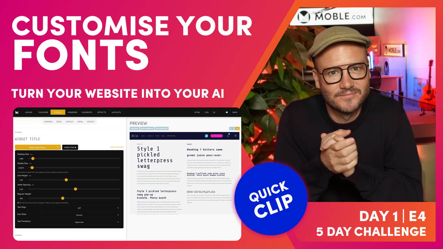
Make Fonts
Paul Davenport | 03:41
Understand how to make Fonts with key functionality such as Bold Regular, Desktop and Mobile.
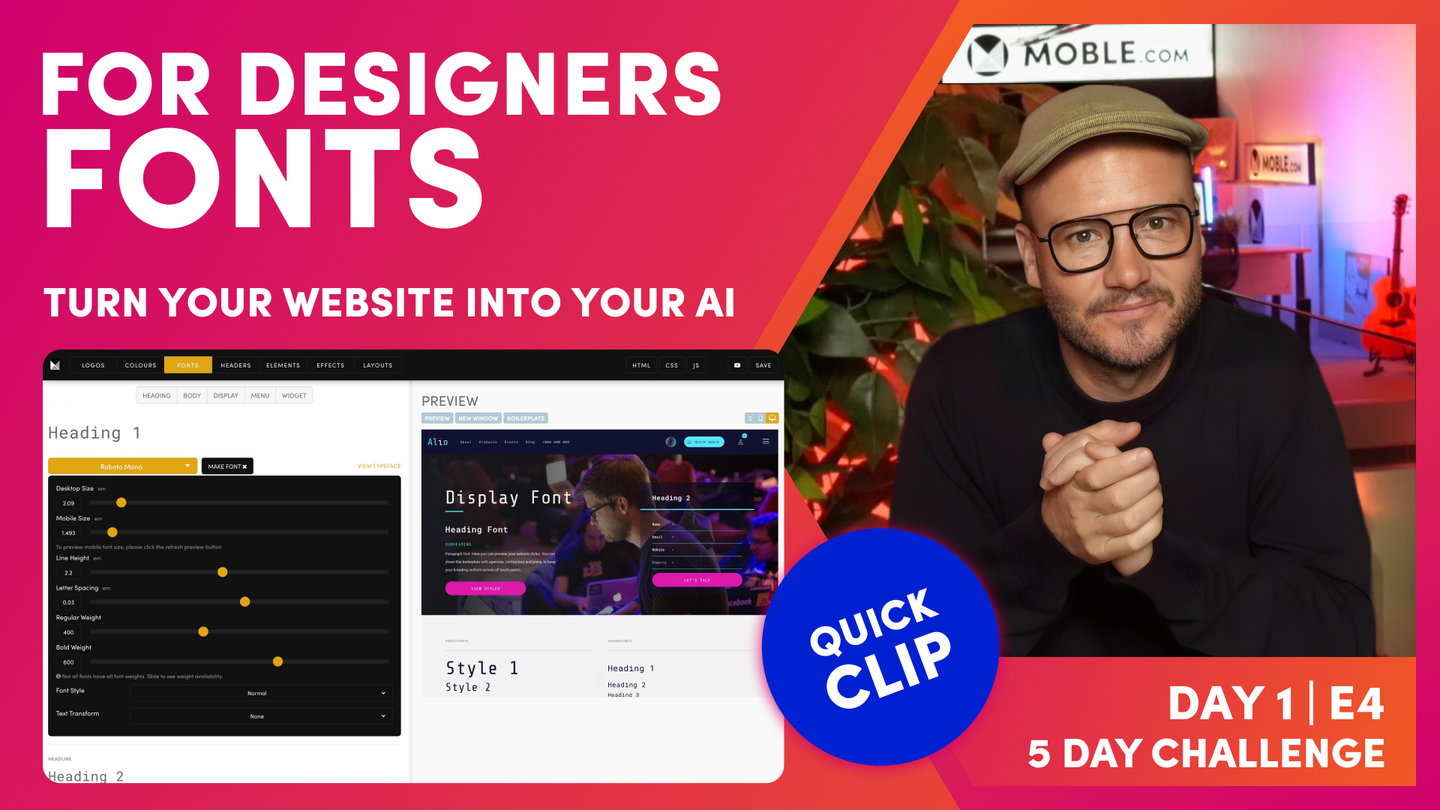
"So now, we're going to go over and make the fonts. So you can see, once we've got a typeface, we want to turn it into a font. So this is when we change the size or, we've referred to it before, the line height or the letter space and the weights. So in the page Editor, we've got a weight for regular and also for bold. So by changing these settings for each, we actually make that typeface our font.
So let's have a look here. We've got a desktop size. I can change this and as I change this, all the Heading 1s on the entire website will update at once. So if you did change a font style, you don't have to go into every heading on every page to update it. You just do it here in this master control panel and it's going to update everywhere. Again, the big advantage there is that we can do redesigns very quickly. So look, that's desktop font but of course, the font on the mobile doesn't want to be that big so we can also change the size of the font on mobile. Okay. So you can see here, I can change this and then go over to the mobile preview and you can see, I can see the font here in that mobile size.
So in a Theme, we've got these nicely styled for you right out the box. So often, you won't need to change the sizes of the fonts but you might just, in very particular instances when you're first doing the design, you might just say, "I might want to make this a little bit bigger." But I would say, wait until we get to Day 3 when we're designing the Layouts, and then we can make those decisions on sizes there and it'll just be tweaking them just slightly, maybe not on every font, maybe on one or two fonts as we go through. So my advice is just leave that now. Just be conscious that you can change the size here and when you do, it's going to update through every Layout, every page that would be, in this case, a Heading 1.
Now, once we've set the mobile... I'll just put mine back to how it was. Then, we can have a look at the line height. Well, the line height is the spacing above and below the actual characters. And then, the letter spacing is the space between the characters. And then, I think most people understand the regular weight and then of course we have the bold weight. And then, there's other particular examples here. We could lock down a particular font and say, "Right. This will always be italic," and that's often good for the brand guidelines. Maybe it's a particular quote or something like that that you always want to be in italic so keep that there in mind for now.
And then, we have what we call Text Transform which is obviously uppercase, lowercase, and capitalize. Often with uppercase, a common example is using that in the header font. Sometimes you want to make sure that the header is always in capitals. But again, if you're unsure, just leave that because people can control that themselves in the Editor or in the page or navigation area."
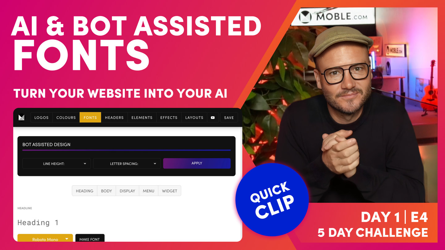
Apply Bot Assisted Fonts
Paul Davenport | 06:17
Let our bots do the hard work for you by applying proven styling for Line Height and Letter Spacing.
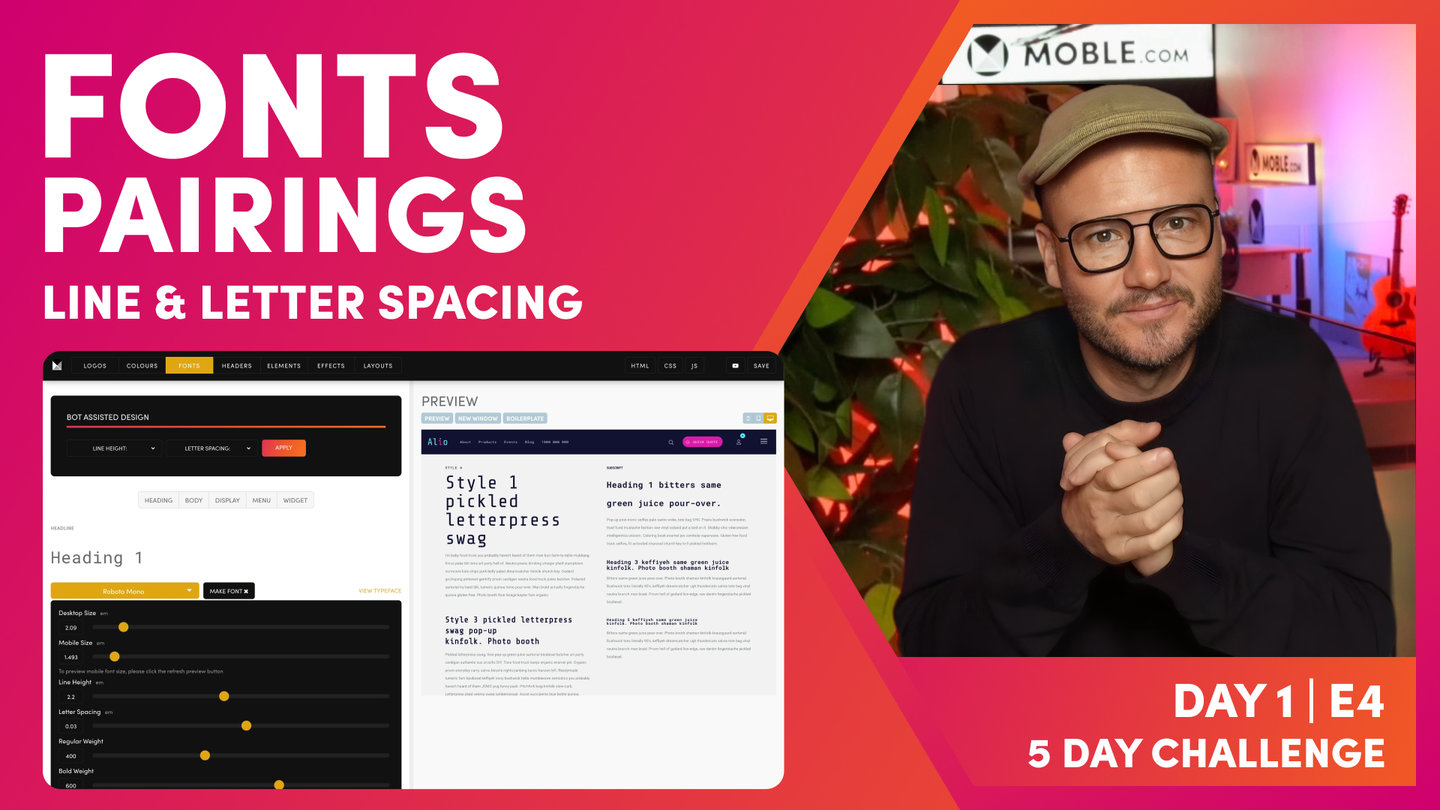
"Okay. At this point, I'm going to introduce you to line height and letter spacing. Now, if you're a designer, you already know this. But if you're not a designer, sometimes you'll be wondering why a particular webpage looks good and why on other times it does not. And that's often because when you've had a designer design a webpage for you, they understand subtle differences like line height and letter spacing. So like I say, if you're not a designer, we don't expect you to know this because we've got AI Website Bots that are going to take care of it all in seconds.
But it's also important in this episode just to show you what we mean and why this can make such a difference. So I'm just going to explain this now and then I'm going to let you play with the bot so that you can choose yours in a particular preference. So let's look at this and to explain this, I don't think there's any better font to explain this on than your paragraph text.
Okay. So let me just click Body and let's go to Paragraph Text, Make Font, and you can see here I've got my line height. Well, it's set to 1.6 here and in my preview, I can see what 1.6 means there. So let's change it to 2. Well, 2 is actually the double line height. So to view that, I need to press Save. Now, once I've saved, now I can hit the Preview just like refreshing. So now, look at my paragraph style, it's double height. So that should make sense there because it's doubled, 2 is double. So now, you've got your eye in. This is double. It's what we call loose.
But we could also change the letter spacing and make that more loose or we could make it tight. So you can see here a tight, we could go to minus or I could set it to zero. Now, imagine if we had to go and do that for every font because different sized fonts in a ratio are going to have different line heights and letter spacing according to how big they are.
And if you're a newbie, you're not going to understand that, right? Even a lot of designers don't understand that. A lot of designers will go actually individually into the page and change that. Imagine how much work that is. We've already got the Fonts area here that's doing a lot of the work for you. As you update one font, it goes and updates that entire font across the website. That's already a quick win.
But now, we use AI Website Bots for an even quicker win. So look at this, look at the bot at the top. My line height, I've got some presets which are Tight, Regular, and Loose. So if I just select a particular one here, let me choose Loose, and then with the letter spacing, let's say I could choose Loose as well. I could always have less spacing tight and the line height loose like this. We'll start with tight so I'll make them both tight so that you can see. And then, if I have a look in here, you can see how tight that is. I've got really tight space between the characters and really tight spacing between the lines. So in changing that, our bot goes and changes that across every font and then updates it across every page. So we'll do the same with regular, so you can see the difference. So you can see, it's a little bit more generous and you can see here between the spaces and then between the lines, right?
Okay. So I think you're starting to get what's happening here. So what I can do next is go and make them both loose. So if I look at this and press Apply. Then, watch this, now they are looser. Well, character spacing, that's quite loose. And then, we've got the line height which looks pretty good in loose. So I will just say there that right now in 2023, I would say that it is becoming quite contemporary to have a loose line height. It makes that text feel a little bit more legible.
But with the letter spacing, it can be nicer depending on the font that you have to have it a little bit tighter. So that's where I want you to have a play now. All you need to do in this episode is go and first of all, put in your main font, your main typeface, and you're going to click, apply that typeface to all. Then, you're going to think about that display font. Do you want a more poppy one? You're probably going to put those to the first six and then you're going to apply it to maybe the widget title and maybe the price and you're going to press Save.
Then, all you're going to do is go to the bottom and choose a particular line height. If you're unsure, I would start with Regular or Loose. And then, you're going to choose a particular character spacing and that really is depending on your preference in the fonts and once you've applied that, press Save. And really, in the time I've even said that, in that one minute, you could have really completed all of your fonts in really an absolute masterclass with not understanding anything and just relying on our AI Website Bots to do it all for you. So we'll wrap that little bit there. And now, I'm going to go on to tell you a little bit more on how we can look at choosing font pairings."
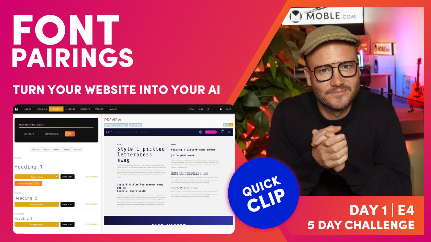
How to choose your Font Pairing
Paul Davenport | 04:46
An introduction to how designers decide on their Typeface choices, what is know as Font Pairing.
"Okay. So now, we're going to look at font pairings. If you are a designer, obviously, font pairings needs no introduction. You've probably got your own techniques and your own ways of choosing font pairings. But if you are not a designer, I'm just going to show you something quite simple that you'll be able to apply because the choice of those two fonts that we've been looking at really makes a difference to your actual design and to your brand.
So there's lots of font pairing resources across the internet. I'm just going to look at this quite basic one called fontpair.co. Now, you can see here in the Pairings tab where I am now, you can see a whole bunch of pairings. Now, the title here is your display font and the paragraph, that's where we've got our main heading and body. We hit the Apply All, it's going to apply that second one.
Okay. So if you don't have a font yet, the instructions here are just look at this site, start to get your eye in, okay? If you find a pairing that you like, look at the paragraph one first, and then go back into the Fonts area and use that as the main heading and then hit Apply All then it's going to make the entire fonts set there all in what is the paragraph here on Fontpair. Then, you'll go to the display font and you'll use what is the title here on Fontpair and go and put those in. And, as I said, my recommendation is that you'll also do that in the widget title and probably the price. So it's a very simple hack to get in a nice font pairing even if you know nothing about design.
Now, you might also recall in the onboarding, I said that in Day 3 we're going to be getting an AI to go and design a website for us. It's going to even design a logo, it's going to design Layouts, and then I'm going to race through and show you how I can build that from scratch. It's going to be really very quick. In under half an hour, we're going to have a website designed and built from an AI from in no time at all, right?
But in that, I already know the font pairing that I'm going to use. I've already decided that I'm going to use this font pairing called A Philosopher and Jost. A lot of people say Jost, J-O-S-T. I'm English, I say Jost. But if you see here, if you look at this font pairing, just look at the word Uluru, okay? It's got an uppercase U and a lowercase U. And here you can see in Philosopher, we can focus in there on our serifs. So you can see, on the uppercase, we've got the serif there in the top left and the lowercase, we've got the serif there also in the top left. Well, if we look at the sans serif or Jost, you can see that there's no serifs. But the both words look quite similar just without the serifs, right? So that makes it a good font pairing. So that's what you're looking out for in font pairing, some similarity between the two.
So if I just jump back over to Fontpair, you can see here the Poiret and the Montserrat. Well, both of these are characterized by this almost absolute circular O so that makes those two a good font pairing. So if you need some more context to the font pairings, you can just jump back into to fontpair.co and look at fonts in use. And you can see how actual businesses have used their font pairings and again, you're looking at this title and paragraph more often than not to see how they've done it. Except on your mobile site, you've got headings and display so you've got the option to have two different types of titles which makes your website a little bit more interesting and a little bit more diverse than the ones that you often see around the internet. Okay. So now, go and apply your fonts and hopefully, that's given you a little bit of inspiration into font pairings and how us designers go about thinking about font pairings for our designs."
TEXTBOOK
A user guide to Fonts
FONT PHILOSOPHY
Keeping consistent styling throughout your website is important for your company brand. In your MOBLE website, you can configure your Fonts in one location and they will update automatically on every page of your website.
As a designer, you can determine the creative for the brand when you initially design your website, and as a business managing the content, you can be confident that the company's branding is always preserved as you edit your pages.
Should you wish to make wholesale changes to your brand in the future, you can make your changes here and update your entire website in moments.
DID YOU KNOW?
CSS or Cascading Style Sheets is a language that describes elements of HTML, such as fonts, colours, margins, lines, height, width, background images, advanced positions and more.
Think of CSS as a way to save time. If you have a yellow button that appears in many locations throughout your website, and you decide to turn the button into a more rustier yellow, with CSS you only need to change the button colour once, and it will then update in every location around the website in an instant.
It is not just the button colour that can be controlled in CSS: it could be button hover colour, button padding, text size, character spacing, height and radius.
Your MOBLE Styles area allows you to select and change the most common parts of your CSS. If you understand HTML, CSS & JSS you can extend the framework and design your own CSS classes without restriction.
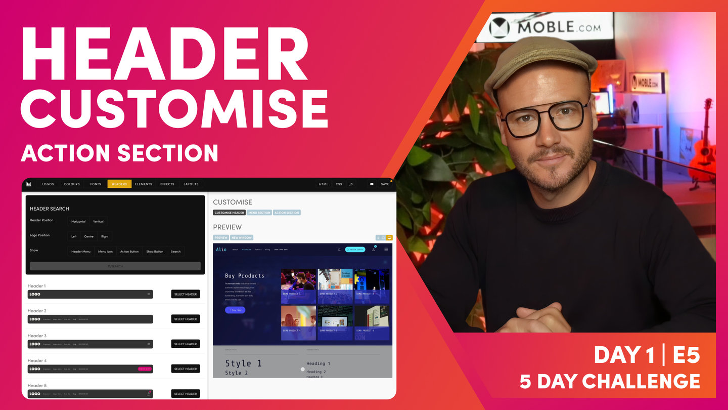
1. GO TO THE FONTS AREA
To get started, open the Main Menu, select 'Styles' and then select 'Fonts'.
You will be presented with a list of the different Fonts options available to you.

Select and customise Fonts on the left and Preview your modifications on the right.
2. FONTS IN THE VISUAL EDITOR
It is important to know that your Font selections in the Styles area are made available in the Visual Page Editor, via the Formats tab as shown in the Video below.
It's often considered best practice to have one Heading 1 on a page. Logically, you will make your Heading 1 the largest and most prominent. However, in modern day website design, you may wish to have large fonts lower down the page, and such text might not have any benefit for search optimisation, it might simply be a bold statement or call to action.
For years there has been much debate in regards to structuring your Heading Tags for SEO best practice. Without getting bogged down in the nuances between different search engines and W3C HTML standards, MOBLE provides a simple solution that gives total flexibility.
The video below demonstrates how you can select both Headings and Styles. For example, you can make large Style headings lower down the page, and give them any Heading Tag that you wish.
Your Font selections are available in the Visual Page Editor
THIS HEADING IS 'STYLE 5' AND 'HEADING 2'
If you prefer to follow traditional best practice formatting, you might set your page up in a well-formatted hierarchy of Heading tags. You would have one Heading 1, then as you progress down the page you might have a couple of Heading 2's, a few Heading 3's, etc.
<h1>Heading 1</h1>
<p>Text</p>
<h2>Heading 2</h2>
<p>Text</p>
<h3>Heading 3</h3>
<p>Text</p>
We recommend that you be consistent across your pages. Do be conscious of Headings, at least respect the Heading 1, though there is perhaps no need to have a relentless pursuit of the perfect structure. Put your user first, search engines, such as Google, prefer not to be manipulated and are smart enough to handle your preferred consistent structure.
3. SELECT YOUR TYPEFACE
You can select a Typeface from the dropdown list. MOBLE has selected the best Google Fonts for you to choose from. You can also install your own Fonts from Typekit.

Select your fonts from the dropdown list.
4. CONFIGURE YOUR FONTS
On the left of the screen you can type inline to view your fonts and automatically preview on the right.
Once you have selected the Type Face, you can now customise the font. Here you can use the sliders to ensure the Font is exactly as you desire.
You can change the Font Size on Desktop and Mobile. Notice that you can also Preview the Font on each device using the Device buttons on the far right of the preview pane.
As you would expect, you can also amend Line Height, Letter Spacing and Font Weight.
Over in the page editor, you will also be able to apply Bold and Italic, assuming these are available in the font that you have selected.

Configure your fonts via the customise button
5. INSTALL YOUR OWN FONTS
It is also possible to speak to a Frontend developer to install your own custom font. For example, MOBLE use a Font called Sofia Pro which is not a free Google Font. If you require assistance installing a custom Font feel free to contact us via www.moble.com/lets-talk.
6. TYPEFACE AND PAGE LOAD SPEED
MOBLE recommend that you only use a maximum of three different font families in your website, as this will ensure that your page loads quickly and no doubt make it easier on the eye.
WHAT'S NEXT?
Now you've updated your website with your Fonts, it's time to decide on what features you're going to need in your website header.
DAY 1: EPISODES
Play before you Pay?
GETTING AROUND
SUPPORT
AI SALES LINE
AI SUPPORT LINE
ENQUIRIES
team@moble.com.au
GET A QUOTE
A Web Builder for Design. A CMS for Business. We serve all businesses from SME's to Enterprise. Talk with us for AI development, custom website design, website development, ecommerce websites, directories, intranets and social networks.
PRIVACY | WEBSITE TERMS | PLATFORM TERMS | © 2026 MOBLE PTY LTD