PICK YOUR AI THEME TO GET STARTED

DAY 3 | EPISODE 1 | ESSENTIALS
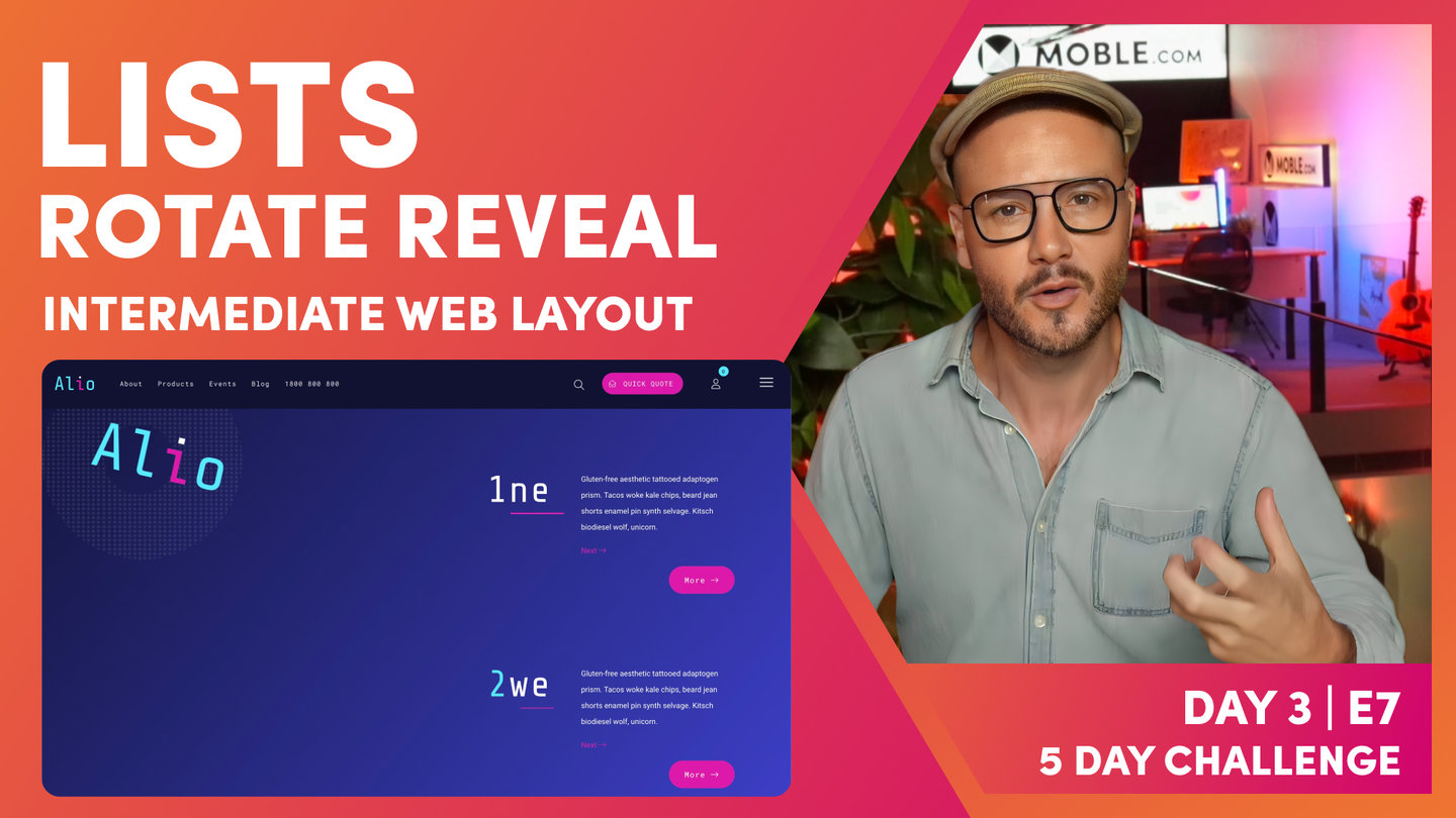
VISUAL PAGE EDITOR

Paul | 28:36 | 1 hour
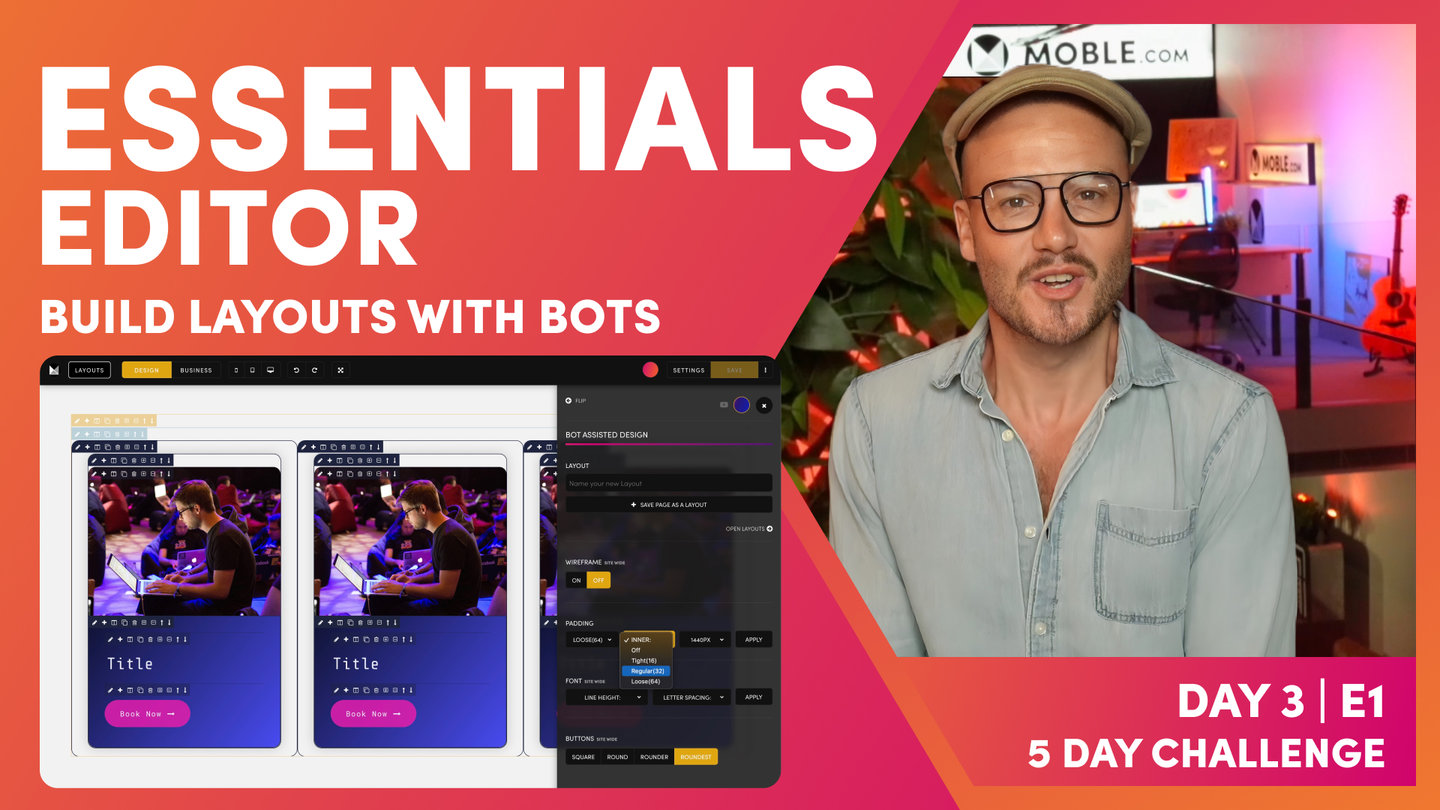
Whichever you decide, it is essential to watch this episode and understand MOBLE's tried and tested methodology to structure website layouts for Bot Assisted Design. This will ensure you manage Layouts correctly and your entire team will always stay on track and never mess up your beautiful work. The essential part of the session is to set up your Bot with your Padding and Alignment preference and understand how Padding works on mobile and desktop.
LESSON PLAN
Day 3 Intro
Paul Davenport | 04:14
This is the day that most people have been waiting for, this is the day that you become a Website Designer, learn how to use every feature of the MOBLE visual Page Editor, so that you have the skills to design any Layout from Scratch. The Masterclass sessions are split into E01 Essentials, E02 Intermediate and E03 Advanced.
"Day three, episode one. This is the episode that many of you have been waiting for. Because this is the episode where I share with you my exact process for how I build website pages from scratch, so that you will be able to look at any website in the world and build it yourself without any design skills and without any code whatsoever. Now, most importantly, you're going to build website pages, one, superfast for yourself. Two, for your content Editors tomorrow so that they will be able to make easy changes. Three, for every single content Editor in the future, so that when all these people come back, they'll all work in a consistent way and they'll never mess up the beautiful work that we do today.
That is one of the key problems with website design today with website design platforms and the way that people build website pages. In fact, in website design, we have an in joke, and that's that you always need to build two websites. The beautiful one for your portfolio and the ugly one that ends up on the internet after your content team or clients have been in there and messed it up. Now, that's quite a serious thing and that's why we built MOBLE to solve this problem. In today's sessions, I'm going to split this first episode of into three parts, Essentials, Intermediate and Advanced. Let me break it down.
We're going to start with Essentials, and everybody needs to do Essentials, and it really is quite straightforward. You're just going to see how website pages are structured. You don't need to do anything at this stage. Then I'm going to show you how our AI Website Bots go and fix up everything. What I mean by that is we've got 5,000 Layouts across many different Themes and you can drag and drop Layouts from many different Themes. All those Themes have different padding and alignment where you're just going to see by pressing one button for your own personal settings, how our AI Website Bots go and fix up all the padding alignment across all of the Themes, all of the Layouts and all of your pages in an instant. Then you're going to make a key decision. Since we've got 5,000 Layouts and since we've got AI Website Bots going to fix everything for you, do you actually need to know how to build website pages from scratch?
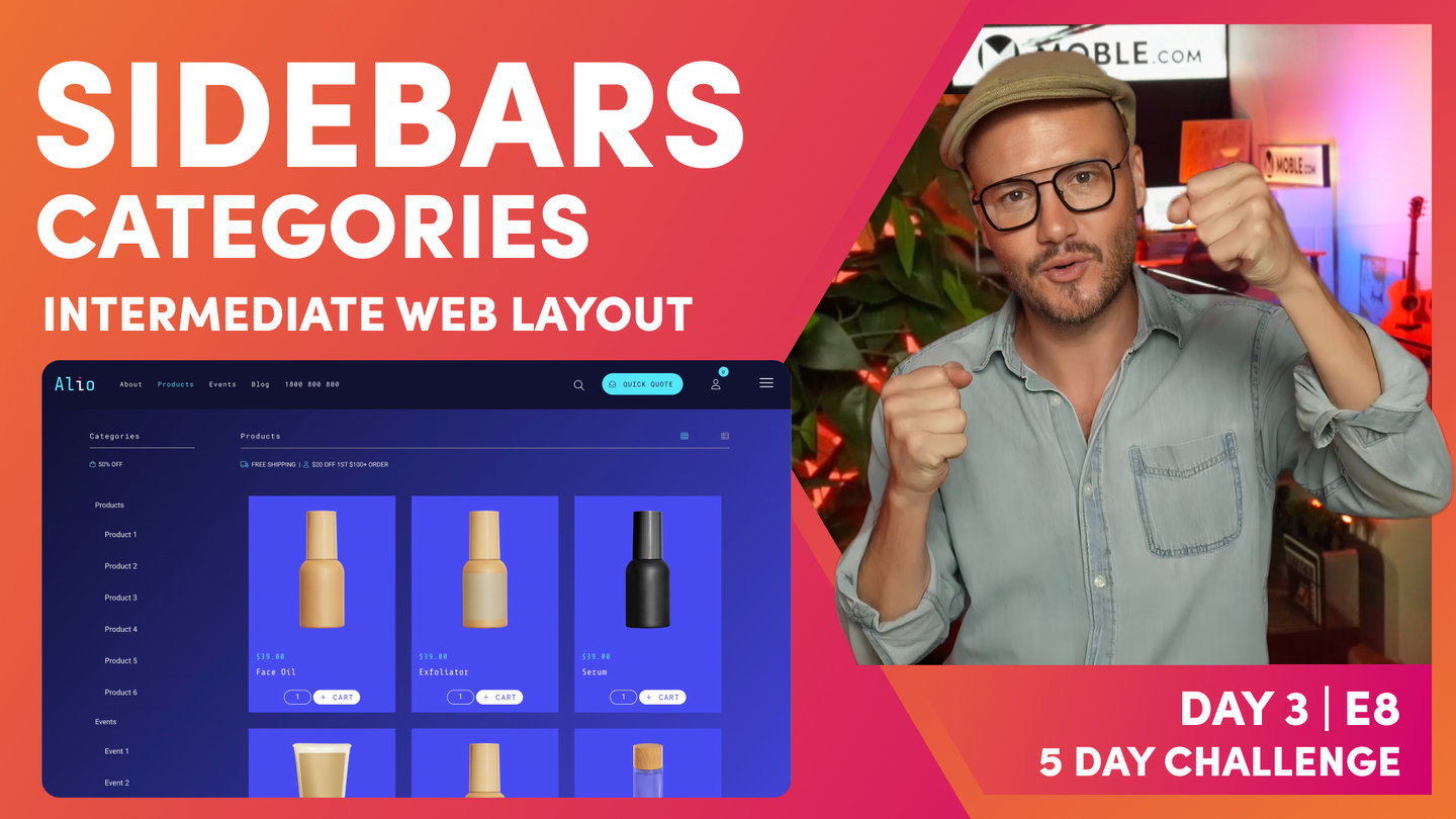
Well, that's the key decision that you are going to make, and you'll be in one of two camps. If you're in that first camp where you decide not to build from scratch, then you can just go on and pick and choose the Layouts that you want. Let the AI Website Bots align them for you and you're done for the day. Then if you're in the other camp, we'll move on to Intermediate. Now, Intermediate, you're going to see me build out the Layouts from the Alio Theme, which are quite complex Layouts in some part, but they're very easy to build. They even include padding and alignment. You're going to get a whole tour of the MOBLE Editor. Plus, learn some essential knowledge of CSS even though you don't need any code whatsoever. Then finally, we've got Advanced. Now, in Advanced, I'm going to show you some obviously advanced techniques of website design.
Really, the front-end developers know that website designers wish they knew how to do without code, and you're going to learn all of that so you never have to bother a front-end developer again. Let's do it. Let's move straight onto Essentials and let's decide if you are going to learn how to build website Layouts from scratch."
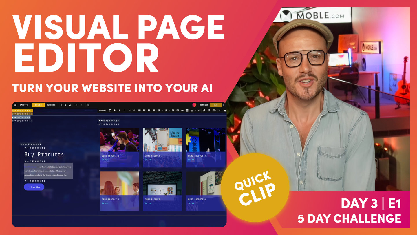
Visual Page Editor
Paul Davenport | 03:03
Design Mode, Business Mode, Layouts
MOBLE is an all-in-one Web Builder for Designers so that Designers can build anything, without code and CMS for Business so that Businesses can edit everything, without messing it up. The editor is build in this way with Design mode, Business Mode and a huge archive of pre-made Layouts.
"Essentials, so this is where you're going to make that key decision. Do you want to learn how to build from scratch or do you want to go and choose from the 5,000 Layouts and then let our AI Website Bots do all the padding and alignment for you? Well, now I'm going to give you a quick tour of the main features of the Editor. Here you can see I'm in the Editor. Now, MOBLE has got Design Mode and Business Mode. It's a website builder for design, and it's a CMS for business all in one right here in the Editor.
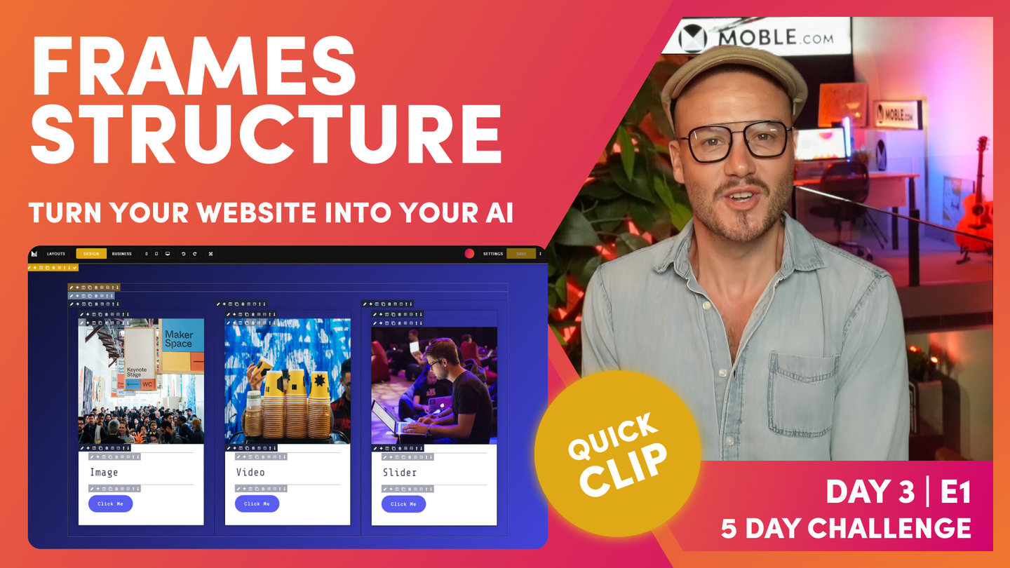
Designers can go and build anything and businesses can go and edit everything. I'll now explain Design Mode and Business Mode. To do this, I'm going to open the Layouts Drawer. Now you can see all the progress that we've made so far in day one and two. These are our Layouts with our fonts and our Colours and our images. Well, this is one Layout we looked at yesterday, which is the one that we use for the Mega Menu. I'm just going to hold shift and click and that will drop this onto the page. Now, I'll drawer your attention to Design Mode and Business Mode. You can see here I’m in Design Mode, if I flip, we've got Business Mode. Notice Business Mode show the Frames. What are Frames? Now, Well in frontend development, we call Frames’ Divs’. In MOBLE, we say Frames because it's easier for people to understand. These are literally Divs, meaning you can apply properties to your Frames. Therefore, MOBLE is an amazing No Code UI. The Editor is a visual representation of the code, and with Frames you can build anything from Scratch, just like a frontend developer would, but you don’t need code.
If I click on a frame, any frame, I can control all of the properties for this particular frame. Look, I can turn this one to blue or red. I could put a background image in here if I wanted to. I can literally go and control everything for this particular frame. I'm just going to delete this because we're going to be clean as we go. This is Frames, and I've flipped to Business Mode now. You can see the Frames only appear when I light up. Well, this is only the Frames that are business users, our content team need to edit. If I hover over the text here or I hover over the button, that frame appears. In this case, if I hover over this one, the business user could make that in a background Colour. We're going to break this down in a lot more detail, but that's it for this moment. I just want you to understand the difference between Design Mode and Business Mode."
Frames Structure
Paul Davenport | 8:47
Frontend developers use divs (Divisions) as the base structure that design elements can be applied to. At MOBLE we simply called these Frames. In the intermediate class, you'll learn everything about Frames so that you can build from scratch.
Frontend developers all have their own way of structuring divs, though most just apply them on a must need basis for that particulate task. Well without a uniform structure, it can get very messy very quickly, particularly if one developer hands over a website to another. Nobody has time to go though another persons code, this is why developers just prefer to do it form scratch.
Well at MOBLE we wanted to put an end to these inefficiencies and ensure that all pages across all teams and all projects have a uniform structure for Frames. So that everything just works, and everybody is always aligned. This means changes can be made quickly, and entire redesigns can happen without having to start again.
In this clip we introduce Frames for the first time and show you MOBLE's tried and tested structure for setting up Frames. If you use this structure you can't go wrong. Plus we have built bots based on this structure so that you can get your bots to do wholesale changes in just a few clicks.
Pro Tips:
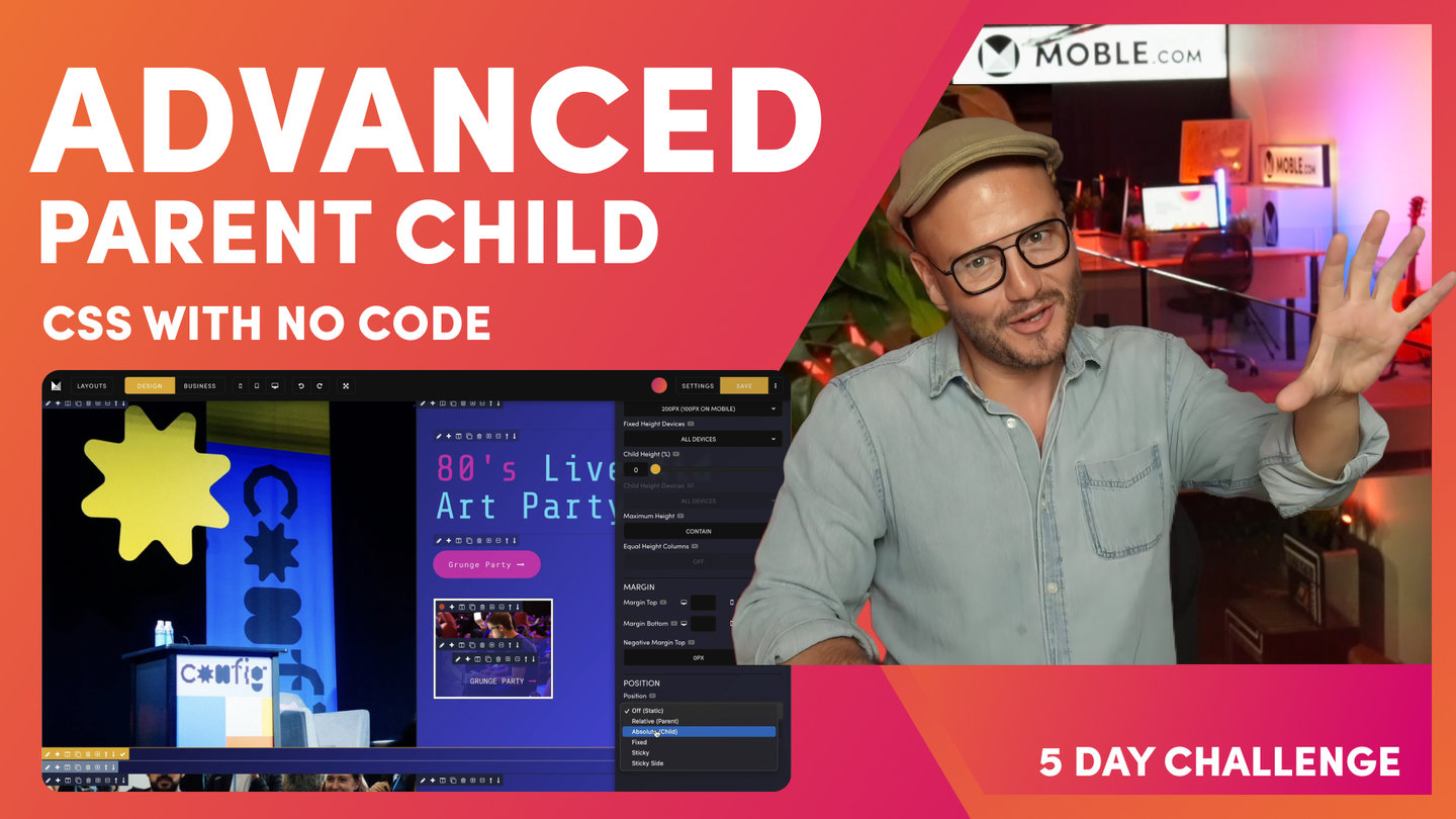
MOBLE 5 FRAMES METHODOLOGY
If designing from Scratch these simple rules will ensure your website Layouts always work with MOBLE AI and Bot Assisted Design. Watch the Intermediate Class to see this in practice.
- Outer Padding
Select: 64px, 32px or 16px or None - Max Grid
Select: 1440px, 1280px or None - Column
Select Columns or Grids.
Apply Mobile Stacking: - Reverse, Fixed, Double, Single - Inner Padding
Select: 64px, 32px or 16px or None
Add Top and Bottom Margin only if needed. - Component
Select Component. Add Top and Bottom Height.
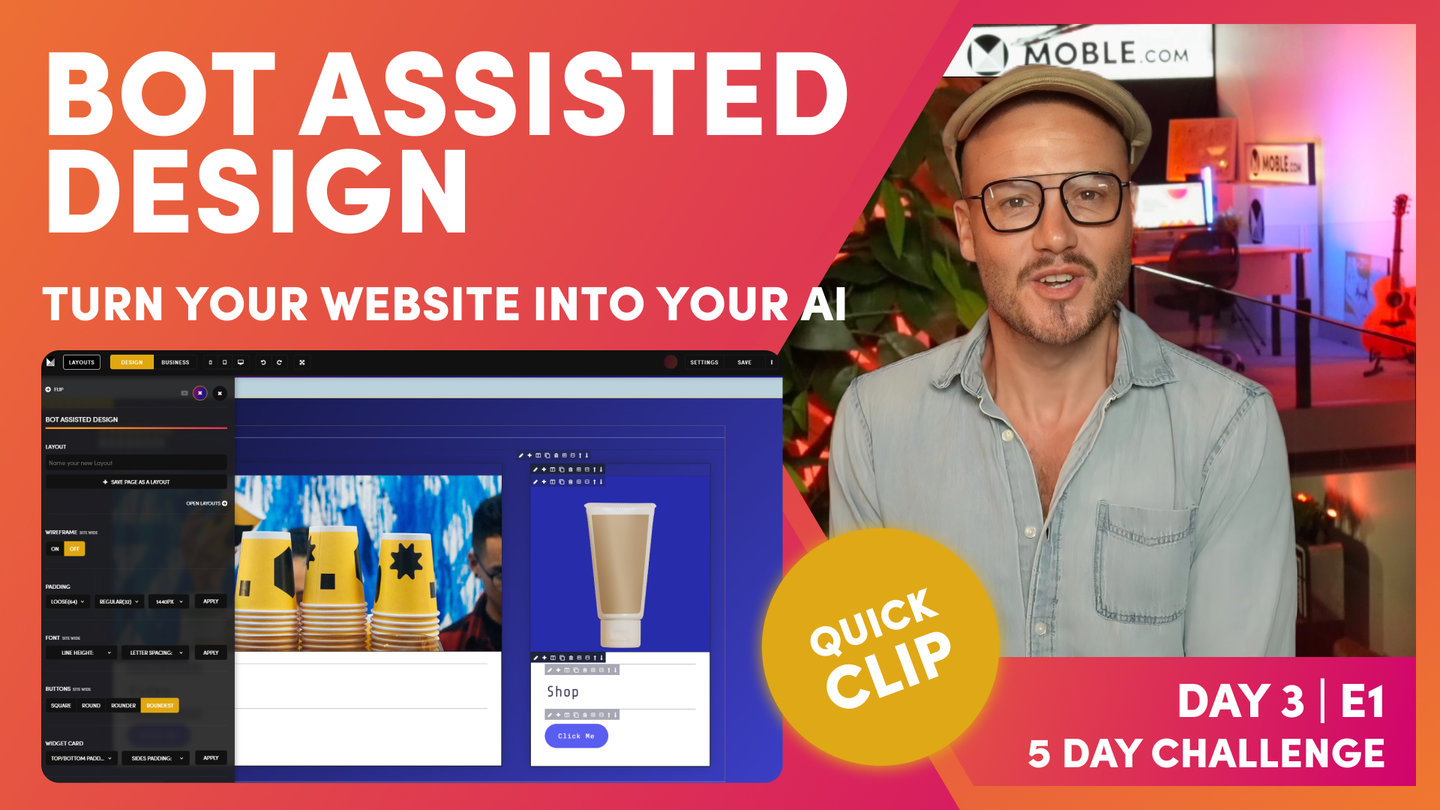
"Now, what I'm going to do is show you the structure of those Frames in Business Mode. To do this, I'll go back over to the Layouts Drawer, and what I'm going to do now is search via a Theme. As you know, I can search for all the Themes along here as we've done on the first two days. I'm just going to choose this Theme called Inco, which is quite a clean Theme. It's going to help us explain the structure of the page. What I'll do is just go down and we'll take this three-column Layout, 1, 2, 3. I'm going to hold shift and drop this onto the page, and then it drops into the page for us here. You can see it's now in our fonts and it's brought over one of our Colours as well. We've got the Layout just in here. Our previous Layout is still on the page. This is just dropped in on top.
Now, I'll go back to the Layout Drawer, and I'm going to show you a Layout from the type Drawer. I'll click here and you can see this is showing me banner Layouts at this stage. If I remove that, look at all of these, I can go for all the body Layouts, Singles, Halves, Thirds, fourth, fifth, and it goes on. Lots of different types of Layouts. Well, I'm going to choose a three-column Layout. I'm going to select Thirds, so show me all the Layouts in Thirds. Well, why do we say ‘Third’s’, and not ‘three-column’? Well, these Layouts are all split into Thirds. Look at this one, it's one-third, two- thirds and it has only two columns. This is why we say Thirds, and why we categorize Layouts by Fractions, not by number of columns. It makes it easy for you to choose Layouts that share the same alignment. Now, I'm going to go to the top of the page,grab this three-column Layout that is three thirds. You can see the Drop Zone appears on the Canvas, I just need to click and the Layout will automatically drop into the Drop Zone. Also note, that I can Hold Shift and click, and now that drops at the very top of the page, or I can Hold Alt (Option of a Mac) and Click and it will add to the Bottom of the page.
Well, here you can see I'm in Business Mode. If we observe the page and compare between the Type Layout, that we just dropped, and the Theme Layout from the Inco Theme, well look, these Layouts aren't aligned, so that's no good. We want all of our Layouts to be aligned and to look nice on desktop, tablet, and mobile. You can imagine now if we had content users, with no design skills, try to go change this, it would be too hard for them. It could even be too hard for Designers. This is why we have AI Website Bots that sort the alignment for you.. We want it to just work automatically. Now I'm going to show you how to fix your Padding Alignment, using our AI Website Bots, with just one click. To explain, It is good to know, in this Essentials Episode, how the pages are structured, even if you're just going to use the AI Website Bots to do this for you, you will benefit by know how it works.
To demonstrate, I'm going to put this into Design Mode and I'm going to drawer your attention now to the Colours of these Frames. This is a very MOBLE structure. This isn't CSS, now, this is the MOBLE Editor that helps us keep everyone aligned. This is the frame structure on what you're going to become very familiar with in a logic that just works for everything, works for all users, and our AI Website Bots are going to look at this and be able to instantly go and change things for you. This is super simple and it makes everything just work. Like I say, it's a very MOBLE thing. This isn't to do with other code, but this is why MOBLE just works. This is the secret to making sure everything is aligned. We have this bold mustard Colour on the outside, and then we have this lighter mustard Colour. Then we have this bolder blue, and then we have this lighter blue.
What's the bold mustard? Well, the bold mustard is for our outer padding. If I click the pencil icon here, it opens up what we call the Frames Drawer. In the Frames Drawer, I've got background Colours, background images, effects. I've got more advanced properties such as border Colours and how this behaves on different devices, a lot of advanced settings. I've got my Frames, and the Frames where I put my outer padding. If I look at the top padding here, which is 64px, I could turn that off or I could turn it back on to 64px. That's our outer padding. We put padding on the outside. Then on the inside here, you can see this bold, what we call block. This also has padding. You can see here, I'm just going to put this to 64px and then back to 32px.
The two bolds is what we put padding in. We have the bold mustard, and then we have the bold blue. When it's bold, that just says to everyone, that's where we put padding. We only need two lots of padding on any page. We've got our outer padding and our inner padding. We don't ever need any more padding than that on a page. Padding is in bold, keeping it really simple. Then there's these two lighter Colours. We've got the light mustard and we've got the light blue. Let's have a look at the light mustard. Well, here's what we call the Max Width. This is the maximum width that a page will expand to. I'm here on a MacBook Pro, which is 16-inch, which is quite large. What I'll do here is show you what will happen when I move this to 1440px.
Well, as you'd expect, it moves out to 1440px. Now, if you are on a laptop, which most people generally are when they're doing the course, your laptop is on average 1366 pixels. You're not going to see this desktop if you put it on desktop. All you're going to see is the 64px padding on the outside. Because 1440px is wider than your screen. This is why it says desktop here. I always say to people, if ever in doubt, set it to desktop because it's quite nice to have a laptop that goes full screen. All you're going to see on your laptop is the 64px, even though you've got this set. That means that when people on larger screens, like what I'm on here, or on a big desktop, which is 1920px, they're not going to be stretching the neck left and right to read the content.
They're going to have a nice contained reading pane. What I'll just show you now is that the MOBLE platform is responsive even in the Editor as you're designing. What do I mean by that? Well, this will actually all shrink down. It doesn't expand past 1440px as we've got setup here, but it will shrink. Look at this, how it collapses, and then our blocks actually collapse there and stack on top of each other. You can see what happens here on MOBLE, the MOBLE padding is actually adjusted. I'll cover this in a second, but on mobile that 64px has now turned to 16. Here, this 32px-pixel padding has changed to 16 as well. That's a little trick. I'm going to show you that just shortly. Here, we can see that, that is our light mustard, which is our Max Width. Fantastic.
Now, on the inside, we have our light blue Frame. Now, this Frame is for our components. In here, I can embed any type of components.To demonstrate, I'll put a child frame, and you can see I can embed all different types of content in here. I could put Widgets, which is our dynamic feeds of content, for things like Photo Galleries or Online Shopping Products, News Articles, or Events. I can configure a feed of widgets or I could put in here text and images. We're going to cover all of this in the Intermediate session where I show you how we actually build from scratch and layer all these Frames out, which is what you're going to learn in the Intermediate. Now it's just Essentials. It's essential that you know what this frame structure is. We've got bold mustard on the outside for outer padding. We've got lighter mustard for our Max Width, and we've got bold for our block, which we put padding around for our components, which are in the very inner.
The two bolds are for padding. Then just as a little trick here, you can see this one's a little bit different because it's got columns. You can see our columns here have a parent blue. Again, we're going to cover this right at the start of the Intermediate session."
Bot Assisted Design - How bots work
Paul Davenport | 07:49
Now you understand Frames, you can now understand how are bots have been built, and how they work to go and make rapid changes for your right across your entire website.
Pro Tips:
If you're an advanced designer working in an Agency, the following tips will be helpful to know.
If adding Effects or Shadow:
- Use one effect per Frame. Consider adding a wrapping Frame around the Block and applying the effect or Shadow to that Frame. See Intermediate Class.
If designing Bot Assisted Layouts for an Agency, or for future Client Projects:
- Block Inner Padding: Instruct the Bots to apply Inner Padding when the Layout reused in the future by Toggling the Block class On and Off. Off will never adjust Child Padding when this Layout is Dropped.
- Parent Outer Padding: Instruct the Bots to never apply Outer Padding by removing Outer Padding (Left and Right). Then, set the immediate child Max Grid Frame to ‘None’. No Outer Padding will be applied when this Layout is dropped.
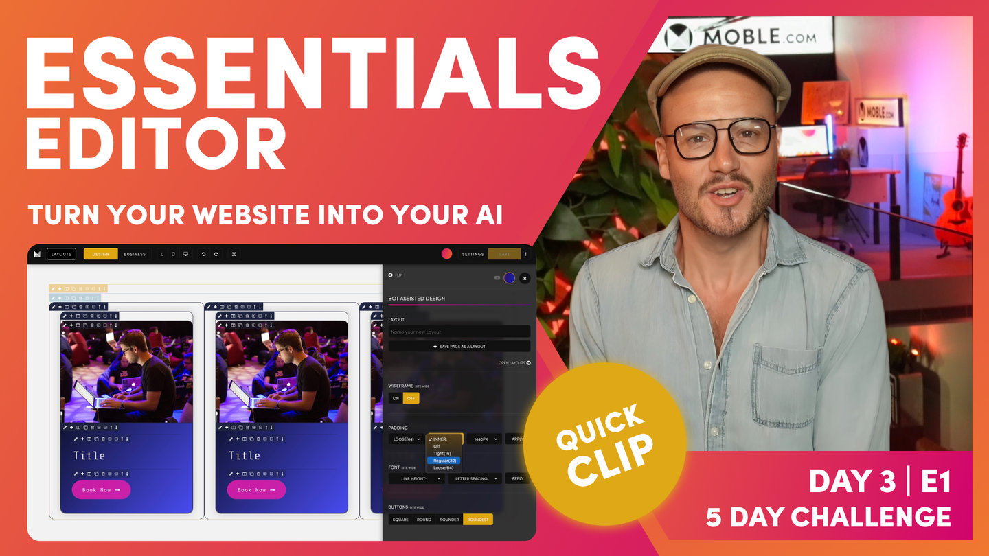
"That's how we structure a page. On this page, now we've got two Layouts that aren't aligned. We've got this one from the type Drawer, which the alignment is here, and this one from Inco, which is different. Our text comes out here, so that's not good. That's not good design. Let's now just go and get our AI Website Bots to update everything for us. Before we do, let's remind ourselves of the setting. Well, this Layout has 64px as the outer padding and it's got 32px as the inner padding, the left and right. Let's have a look at the Max Width. Well, the Max Width was 1280px.
Now let's go and look at the one from Inco. Well, Inco only has 32px left and right on the outer padding. It has 32px also on the inner padding. For the Max Width, well it doesn't have a Max Width. Well, that's interesting. Now let's go and get our AI Website Bots to go and update that for us. Could you imagine if we had to go in there and change all the padding ourselves? Even worse, imagine if the content team dragged in a Layout and they had to go and do that. Well, this is why websites become a mess very quickly. There's a lot of human error going to change padding and alignment. You don't want to be doing this. Even as a designer, you don't really want to be doing this. You just want to hit a button and know that it's all done and it all works and no testing and no time required whatsoever.
Let's do it. Well, so let's have a look at the bot. Where does it live? Well, we'll go to the Layouts Drawer and here's our bot. Here, you can see the Padding settings. Here, we've got Max Width are outer and inner. Max Width, ever in doubt, make it 1440px. You know this now because on a laptop, it goes full width anyway, left to right. We definitely want to set, normally, if ever in doubt, set it for those desktop users, who are on 1920px screens and we're just going to consider their width. There are a few exceptions which we're going to learn in the Intermediate class just shortly. I'm going to set this 1440px. Outer, ever in doubt, I say make it 64px. I actually like 32px, but since these are about 32px already, let's mix it up a little bit and make them 16.
I'll make this 16px and then let's hit the apply button, and bang. Let's close the Drawer to go and take a look. Let's first look at our alignment. It's looking pretty good. We've got 64px on the outer and we've got a 1440px Max Width. Then our inner, we've got 16px on all Inner Padding Blocks. You can see all Blocks are now 16px. Remember, the bot is only changing the Left and Right Padding. It's not changing the Top and Bottom Padding. The AI Website Bots are only ever looking after the Padding and Alignment of Width, not Height. Let's go down, and look at how the Bot performed on Inco Theme Layout. Cool! Well, we’ve now also got 64px for the Parent Outer Padding. Note that it hasn't changed the top and bottom Padding. Brilliant. We've also got a 1440px Max Width and we've got 16px on all the Inner Padding. Amazing, that folks, is Bot Assisted Design. How easy does Bot Assisted Design make your design life. Now you can use any Layouts from any of the Themes and they will instantly be aligned to your Padding Alignment Bot settings, so you have 5,000 Layouts inside your MOBLE website that you can now mix and match and be confident that they all work together. This is why you don’t need to be a designer, or need any design skills whatsoever to build a website on MOBLE.
That's all lovely. Now, I'll flip to Business Mode and you can see the alignment there is looking good. Now, I'll show you one last trick that you need to just be aware of. I'm going to show you a mobile. Now, look at our mobile. This is also perfectly aligned. Mobile, notice, it's not 64px plus 16. This is actually 32px. The way the MOBLE platform works is it's making a lot of the hard decisions for you. You don't even have to think about anything and you don't even have to do anything. Everything just works. This is why we only have outer padding and inner padding. We've only got two lots of padding on any Layout. We've got outer and inner. What we basically do, the way that the algorithm works is when we've got an outer padding on mobile, it makes it 16. Irrespective if it's 64px on desktop, 32px on desktop, the outer padding on mobile is always 16.
Then on the inner padding, irrespective if it's 64px or 32px or 16, on the inner padding on mobile is also only 16. We've got these two banks of 16 pixels. Everything just works on MOBLE. We just sort all that out for you. It's just important to be aware of that. People say, "Oh, well what happens if I wanted to make my outer padding, let's say 100 pixels or this eight pixels?" Well think about what that would mean. That would mean any content Editor coming in the future would have to know that and be aware of it when they're making changes. That's why website designs get in a mess. There's no difference in the beauty of how it would look between using 64px and 100px, because we can control that by not using padding. There's other ways we can control it.
I'll just show you this. We'll cover more of this in the Intermediate Episode. On Layout, if I wanted to change the width of this one to be a bit smaller, I could say I'm going to change the width and make that in the center. Well, width is just a function of desktop in CSS. This width is only working on desktop, in this case. If I went to look at this now on mobile, even though I've changed the percentage width of this particular frame, just going to pop that onto mobile. Look, it's still beautifully aligned because we've only got those two banks of padding. If I was to go and add a third bank of padding and not use the width, do something like this and go to mobile, you can see now I've got three lots of 16 which adds up to 48px. But on mobile if you only have two Frames with Padding, the Outer Padding and the Inner Padding, then you will always have 32px from mobile, and every Frame will automatically be aligned. That's the way the MOBLE system works and that's the way we like to structure pages so that we know they always work together.
I'm just going to put this Layout back and clean as we go. Notice, I'm just cleaning up as we go there. That is the beauty of the MOBLE platform. The way that I structure website pages is like this, in that system, without a padding, a Max Width. An inner padding on a block, and then the components inside that block. You'll notice that's the way the Layouts work on the MOBLE platform. That's why we can be sure that everything works together. All future content users are working. Well, they don't need to do anything, they're just going to change the content. If they do go and drag things in, then we've just made settings so it's going to work for them anyway. Everything just works. That's the beauty of this structure and the system built around that structure."
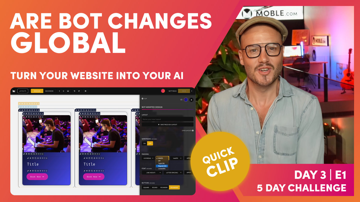
FAQ - Are Bot Changes Global
Paul Davenport | 02:15
This is a great question, it shows you understand exactly whats happening. Yes they are Global. As soon as you drop new Layouts on to the page they too will pick up your Bot Preferences.
"Now, at this point, there are a couple of frequently asked questions. The first, Are the bot changes global/site wide? Everyone always asks that. It's an obvious question. It's a great question. Well, yes, it is. You only change the bot settings once. That's why we covered it in the Elements session of day one, when we looked at the padding just briefly there. You can also change it here in the Layouts Drawer as you saw. You change it once and it goes and works across the whole website in one instant, which is great. When you drag in new Layouts, you don't need to change it. As soon as you drop the new Layouts, it will instantly pick up the padding and alignment that you've set. All of those Themes, all of those Layouts, all working together. All you're doing is choosing between three settings and clicking apply.
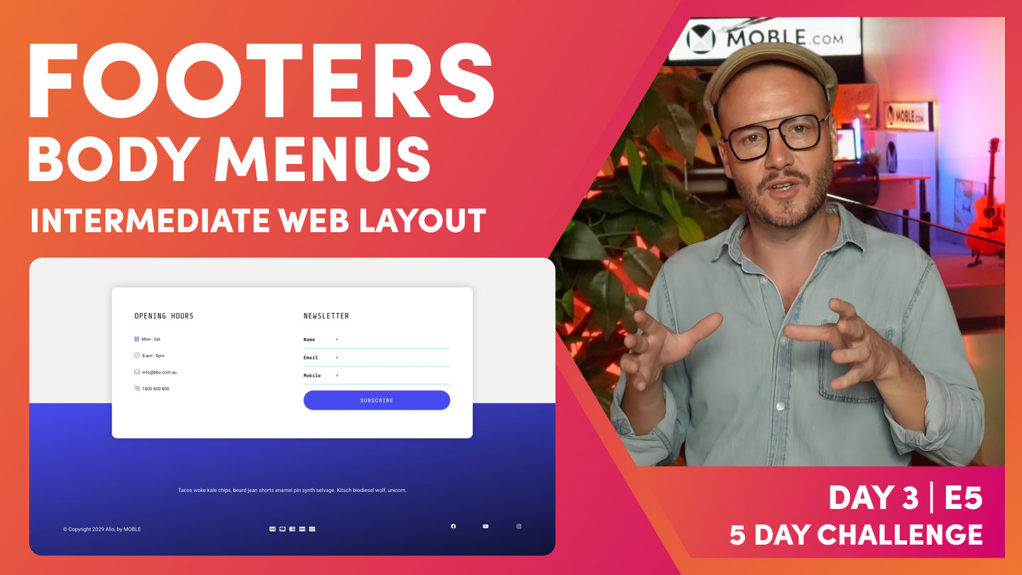
That's your outer, inner, and your Max Width. It's as simple as that. Now, I will just say that there's some Layouts when designers make them that they don't put Max Width in there. Now, this might be such things like banners. Sometimes you want the text to go to the full width. Deliberately, they've left the Max Width out. Sometimes they put it in. It's up to that designer. Typically, you'll see that in the Footer. Often the Footer has got a lot of content in, so they don't want it to have Max Width on there. Sometimes you'll notice there isn't a Max Width, and that's because the designer has left it out. In the Intermediate, the Advanced, and the ongoing sessions, you'll learn where and when to apply Max Width."
FAQ - If bots do all this, do I need to learn how to build from scratch?
Paul Davenport | 06:33
This is the defining question of the day. If you decide not to build from scratch you can pick your Layouts and move on to Day 4. Though, if you do decide to build from scratch a whole new world of web design is about to unfold before your very eyes! You'll move on to the Intermediate session, where you will become a Website Designer.
"The second question is really, the defining question. That is, if there are 5,000 Layouts and MOBLE are always adding more Themes, and always adding more Layouts, do you need to learn to build from scratch? Well, that's why after this session, there's two camps. Either you're going to be the person who doesn't want to learn from scratch, and that's totally fine. You can just go and there's so many Layouts. You can pick the Layouts that you like and drag them onto a page and then really, you're ready for day four. We'll just say on that note, if you are quite happy with just choosing the Layouts and then choosing your bot settings, that's fine. One little tip I'll just show you. Remember the navigation area from day two? Well, I'll just jump back in there now. Here in the navigation area, you can see the quick links. Well, there's a whole bunch of pages in here.
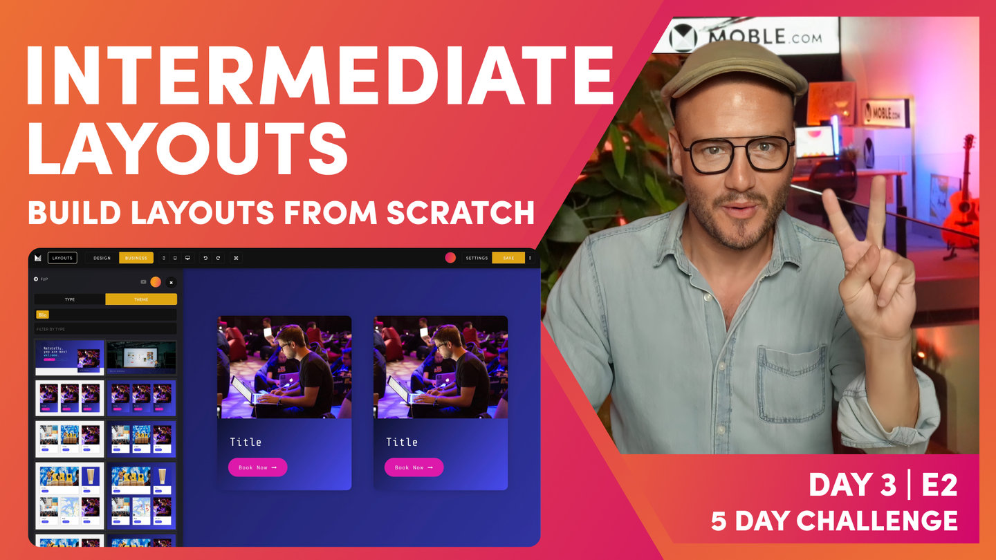
You might just jump ahead and go and pick some Layouts that you like for the quick links. Here, you've got Footer, Action Section, Menu Section. If you haven't done those yet, maybe go and play with a few of those Layouts. The idea is, with Footer, you'll click edit and then go to the Layouts, search for Footers, and then choose one that you like. Hold shift, drop it onto the page, and you've got yourself a new Footer. It's as simple as that. The only thing I will say over in the Layouts Drawer, so I'll just jump back into the Layouts Drawer here. The only thing I will say is that if you're looking for pages like your About Us page, what we haven't looked at yet so far in the five-day challenge is what we call these body Layouts. Here, you can see it starts off on banner Layouts. Typically, you might choose one of these for the top of the page if it was an About Us page.
If you look at body Layouts, there's a whole bunch of Layouts in here, so many. Go and explore the body Layouts, there's hundreds of Layouts in there for those internal pages, and just get inspired and think about what you like. That's the first camp of people. You're just going to go on now and use the Layouts knowing that the AI Website Bots are going to do it for you. The second part of that question is, if there's 5,000 Layouts, MOBLE are always adding more and the AI Website Bots sought out the pattern alignment, why would you ever want to learn to build from scratch? Well, it is a good question. Really, I would say there's two reasons for that. If you're a designer, two things happen. Design trends always change. You always want to stay up to date with those trends.
Really, that's looking at what the work other people are doing, being inspired by that and then being able to recreate that on your own. Now, that's not copying. The definition of a trend is that a whole bunch of people are doing similar sorts of things. This is why we get trends and movements, and this is why we get styles in time. It is a good part of design to look at what other people have done and then be inspired by that and try and recreate it for yourself. Knowing that you've already got your own Colours, you've already got your own fonts, you've even got your own font letters, basin and line height that the AI Website Bots have fixed up for you across all of your different font pairings. From there, you've now got your own different padding and alignment. Even if you're inspired by one Layout, yours is going to look very different and very customised for your brand.
That's the first thing, always staying on top of trends. Even though MOBLE are always releasing new Themes as well. The second and this is quite important from design, every design presents a different challenge or problem. If you're designing for your business or even for a client, those pages are going to have very different content. The content requirement might change. It might be that you need not to put the emphasis on the top of the page. You need to put the emphasis to content in the middle of the page. Why not be able to design a custom Layout from scratch knowing that you can design for that particular content challenge? That is what we're going to do next. We're going to move on to the Intermediate session, which is setting up pages in the structure that you've just learned. Then showing you some nuances around design styles. In Particular, we're going to go through all the features of the MOBLE Editor, all the features of that Frames Drawer, and even show you how to apply animations and effects to your Layouts. That's coming up right now in the Intermediate session."
WHAT'S NEXT?
So are you ready to build from scratch? In the next episode, we explore every feature of MOBLE's Visual Editor. You'll be able to look at any website design in the world a recreate it in moments and confidently call yourself a website designer.
DAY 3: EPISODES
Play before you Pay?
GETTING AROUND
SUPPORT
AI SALES LINE
AI SUPPORT LINE
GET A QUOTE
A Web Builder for Design. A CMS for Business. We serve all businesses from SME's to Enterprise. Talk with us for AI development, custom website design, website development, ecommerce websites, directories, intranets and social networks.
PRIVACY | WEBSITE TERMS | PLATFORM TERMS | © 2026 MOBLE PTY LTD