PICK YOUR AI THEME TO GET STARTED

DAY 3 | EPISODE 3 | ADVANCED
WEB DEVELOPER TRICKS WITH NO CODE

Paul | 40:23 | 1 hour
This episode will complete your knowledge as a 'No Code' website designer. We explore edge cases and tackle them with a bit of troubleshooting along the way. You might not require with your design, but you will certainly need to know these skills if you go on to build websites for clients and forge a career in website design.
LESSON PLAN
Use the Quick Clips below as a browsable breakdown of Full Flick above, with convenient class notes and takeaways.

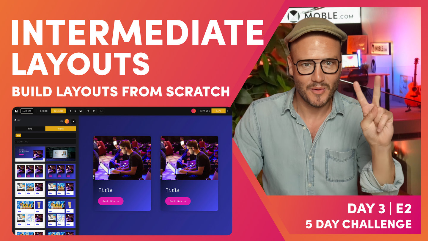
Advanced Intro
Paul Davenport | 01:41
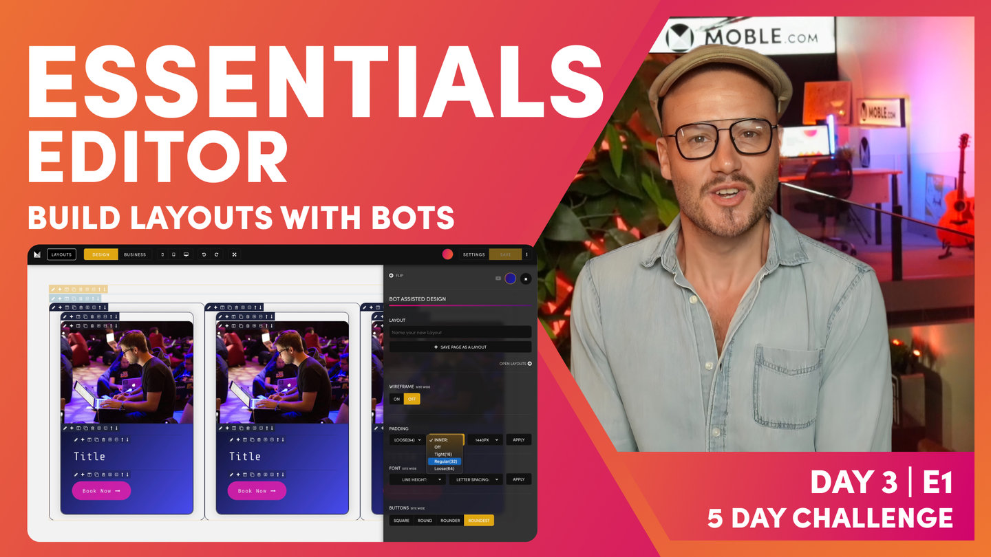
Did we say 'three' techniques designers wished they knew how to do without code? Well, turns our we throw in a forth! This class is called Advanced, but once we break it down, you'll discover, just like Bot Assisted Design, it ain't so BAD!
"Well here we are at the advanced session and this is where you become a fully fledged website designer. And I'm going to show you the three techniques that I've been talking about. Those are the three website design techniques, the website developers know, the website designers wish they knew how to do without code. And when we go through these three techniques, we're actually going to build on the 10 layouts that we've already built in the intermediate session. But most importantly, I'm going to use this to show you how to think about troubleshooting. Troubleshooting is an essential website design practice because it's not just when we invite your content team in the future and also tomorrow on day four, but it's also when people see things, errors. You'll often get people contacting you or maybe even completing a form on the website saying they've noticed an error, well you'll need to know how to fix it. And normally it's not a book, normally it's just one setting in the frames drawer or something like that that you just need to change.
I'm going to show you how to think about that and get to that change very, very quickly. So this will take you from being an apprentice into really become a website design master."

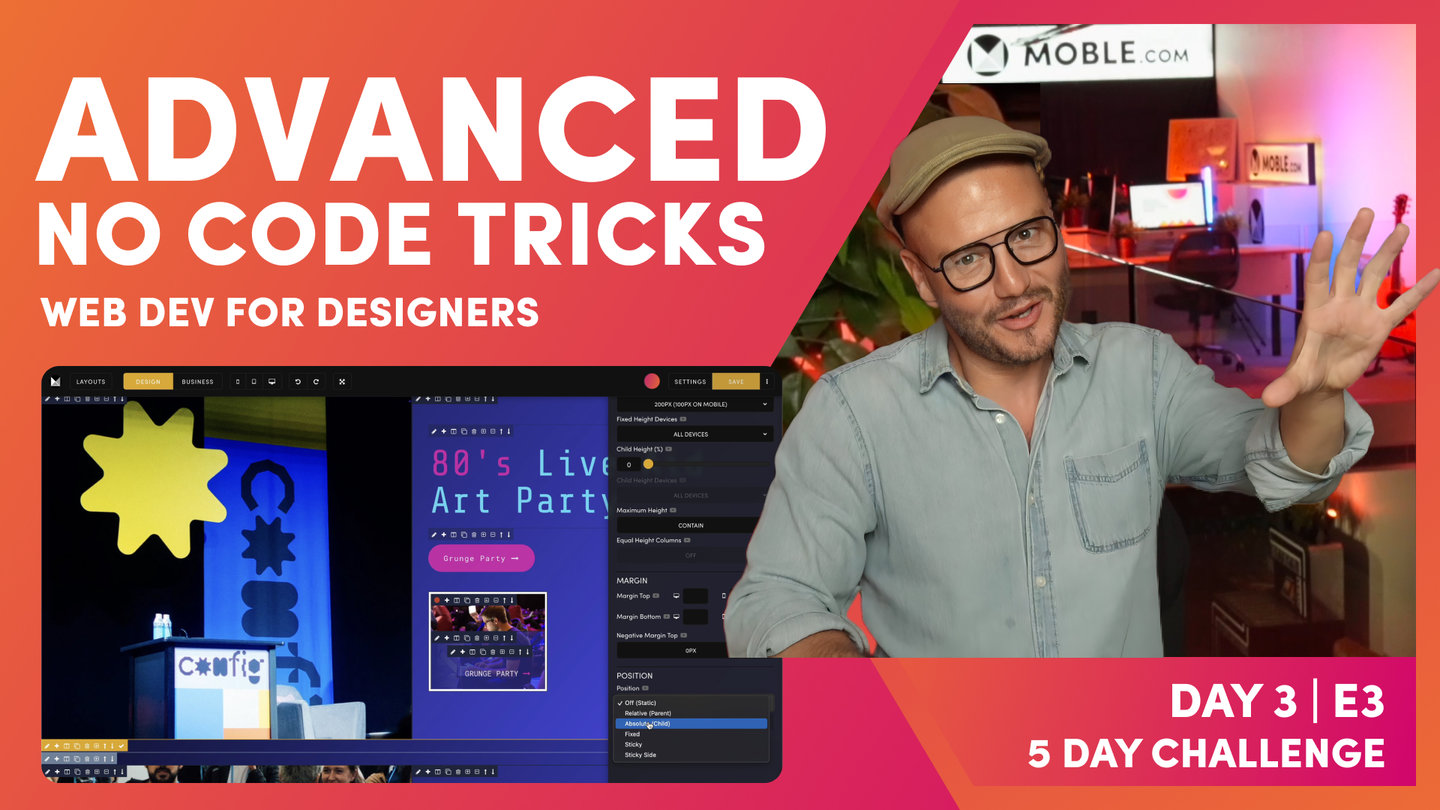
Child Height (%)
Paul Davenport | 14:09
If you set a Fixed Height to a Parent Frame you can use the Child Frame % tool to give your Child a vertical position. Combine this with Width % and Width Alignment and you can design Blocks to be positioned anywhere on your page.
TROUBLESHOOTING RULE
Lots of Text: 'Desktop'
Short Headline Text: 'All Devices'
"Well, let's explore your first parent and child relationship. Well here we've got a common setup. We can see our outer padding, max, we've got our inner padding and then our component. Okay, so what we're going to do now is look at this child and its positional element on the page. We're actually going to put it as a headline down at the bottom of the page. So let's look at our parent first of all, and so we can see these frames a little better. Let me just change the gradient so we can see this is our max-width frame. Let's go and have a look in the frames area, we've got max-width. Well, I did allude to before on max-width that you don't always need a max-width on the page. So just because we haven't looked at this yet, I'm actually going to remove it.
If I wanted to add it, I would click the add a frame on the outside and I could then go and change this at any time to a max-width. So we can actually use the minus icon to get rid of it. So here now we have a classic parent and then it's child. So let's explore. Well here you can see is our outer padding set as normal. And now this is the first thing I want you to learn when we're talking about parent and child in any relationship, we need a fixed height. It's not a minimum height. I'll show you why just in one second, okay. First I want to draw your attention to this child height devices area that's greyed out, but if I click into the child, it lights up. So the system knows already that we've got a parent and a child just always works when we've got a fixed height, that means we can have a child.
If this isn't a fixed height, then this cannot be a child. And this is because what I'm going to show you now. Well look, it's lit up and it says child height percentage. If I move it down to 100%, it moves it to the bottom of the page. Pretty cool. Okay, so this is a percentage width, a percentage height of this fixed height. That's why it has to be fixed because the child height is a percentage, and this isn't just the mobile platform. This is how CSS and markup on the internet works. So this is all websites. So this is our child height, this is our child with a percentage height, and this is our parent with a fixed height. So that's the lesson number one. And if you're troubleshooting, why isn't the child height? Why isn't the child percentage lighting up? It's because the parent isn't a fixed height.
So let's make this look a little bit better and a little bit more pronounced. So we'll go to our child frame here and let's give it a Colour. We could give it a full Colour, but in this case we are going to give it a background. But what we'll actually do, actually we'll do a little bit different. We have been using this gradient at 130, haven't we? Okay, so what we'll do here is combine this with an overlay and what we can do is we could potentially change the percentage width here if we would like to so that we can explore the gradient angle. But for now, because I'm working with 130, I'm going to keep it at 130. Okay? Now this has got opacity in it, meaning it's a percentage of 40%, meaning if this was a background image, we can see through it.
So some people on headlines don't like to always just use gradient, they'll just use a straight opacity and you can make it light and dark. In this case, I'm combining opacity with a pretty cool gradient. So we're going to come back to this in a moment. So what we've got now is our parents and our child. While we're in here, we know that this is going to be a headline, so it's in a banner, so it's most likely to be heading one. So I could put it in style one, but I know my content users are going to have all different lengths of text. So I'm going to gamble there and make it a logical style three. I'll actually put an arrow in there because, so let's go to our insert icon tool. And I could type in arrow, which you can see this is my arrows, here is our right, but I could also type in right and there's our arrow.
Now, if I wanted to Colour this in, let's say pink, I wouldn't highlight with the space. I'm only going to highlight the actual arrow itself. We're going to keep our markup nice and clean. This is a masterclass. So now we've got our nice headline for SEO it's a H one in style three with an arrow. So now let's explore a little bit further. So I'm going to go to my child and I'm going to change its width, but I could also change its height so I can start to change the position in here. With the width, look at this, I could put it into the center. I'll flip this over and I could also put it to the right. So I can control the positional element now within that parent and child. But in this case, we're going to put a headline down at the bottom of the page.
So we'll make it 100% width, and then what we'll also do is make it 100% higher. So the first troubleshooting, why isn't it at the bottom? Okay, well this is because the parent has got padding in, so you're just thinking logically all the time. So there we have our first headline. So now let's do a bit of troubleshooting. And what I'm going to do is have a look at our beautiful headline banner here on mobile. So we'll preview this on the mobile, and this is weird. Here's our banner. You can see it here at the top. This is the form from the footer, but why is banner not the fixed height? We've set this fixed height to 700. So logically now let's go to the parent and see why that isn't 700. So in the frame, let's go down to our 700 and look below it, it says fixed height devices. This is desktop only.
So that's strange. Why would desktop only be default? Why would on the mobile platform desktop be default? Surely you would want that fixed height on all devices. Okay, I'm going to put it on all devices and now I'm going to go to mobile to have a look at what we've got. Okay, well you can see now it's on all devices. We've got our 700 pixels, but now two things are weird. One, why is desktop only default? And two, this is our headline here. Why is it at the top when we've got the child height to 100% at the bottom? Well, let's explore the child height first. Troubleshooting, we're exploring child height, so let's go to child and we're in frame and we'll go to height. Okay, so now you can see that we've got our child height at 100%, but this is also desktop only.
Again, so why is desktop only the default? Well, let's just humour ourselves here. Let's put it to all devices and then let's go and see mobile. Okay, great. So now we've got our 700 pixels and we've got our headline that is now a hundred percent on the bottom. So we've got a parent 700 and a child with a hundred percent bottom. That's pretty cool. So what's going on? Why have mobile decided to make desktop only the default? Okay, well quite often you have got a child with lots of content. So imagine if my content on mobile was greater than the height of 700 pixels. What would happen? If a content editor just goes and puts that in and hasn't done this advanced masterclass then they're never going to know that. So we always want their content to work. We always want to display all the text all the time.
Very simple, but let's go and explore this and show you this visually. So what we'll do now is just go and put in a lot of text in here. So I'm just going to paste in some text. I'll hit this and put in a paragraph and just so we can see what's at the very top of the page, I'm going to make this one... we'll make it the sky blue so it really stands out. And actually we'll make this second one sky blue so we can see where that is and I'm going to here. So the content user now has just put in a whole bunch of text. So much so there's more text even than what's on the desktop. They've just grabbed a whole bunch of texts and they've pasted it in and we've got a six height and now everything's freaking.
Out so much so I can't even see my tools, I can't even see my frame tools. They've gone off the page because the frame is set to 700 pixels. So this is where we've got our expand feature, so that expands that. So what I'll do here is just take out some text and we'll just make it a little bit nicer, easier on the eye. So here we've got this now, our child is at 700 pixels. So let's have a look at this on mobile. Let's have a look at this on mobile. Okay, well look, we're missing that main headline. And that's obvious now, isn't it? Because we've got a fixed height on mobile of 700 and we've got more content than 700, and it's also set to a hundred percent at the bottom. So it's pulling it to the bottom. So we've got two ways to fix that.
Now I would always say let's start with the child at this point. Okay, so with the child, we want to say the child height, let's only put that on the desktop only. So that's basically going to sort out that positional. So let's first of all go and look at the child with child height set to desktop only. And you can see our title is now at the top. So at least we've got the text at the top of the page, but if we look closely, all the text is overflowing over this form. So we've got a fixed height, but the child is now no longer 100% at the bottom, it's at the top and it's just rolling down all the way. So now we know that on the parent we need to make the parent not 700 pixels fixed high on mobile, but we do want it to be 700 pixels high on the desktop.
So obvious now we'll make that desktop only and we'll go and preview this. And that is why mobile always set desktop only as the default because we don't know on the content management system side of things how much content all of our clients and all of their teams is going to use in this instant. So we work with a probability that basically says at least you'll always be able to see the text that they put in there. They'll always see the text even if it's just a short headline. So that's why we want the default to be desktop only. So all you need to do now is basically say if there's a lot of text desktop only, if there's not a lot of text then child type or devices and the fixed height all devices. So all you're thinking is the fixed height is the less text than the fixed height.
So I'll just say that again, if there's a lot of text, it's most likely to be desktop only. And if it's not a lot of text, it's most likely to be all devices. So in this case, we are building a banner with a headline with not a lot of text. So we're going to take that out and we now know what we're going to do here. Well, we want this to be fixed height on mobile too because we're always going to see that text. So let's go and make that on all devices with that fixed height and let's look at the child and we want that to be on the bottom always on all devices. So there is your first parent or child relationship. Now one last FAQ I sometimes get at this point is when there's only one lot of padding on the page, such as here we've only got inner padding, we haven't got outer padding. How does our bot know what to do? Well, let me just tell you that in this instance this would be the inner padding.
So if you had your inner padding set on the bot to 16 pixels, drag this in, it would change it to 16 pixels. So let me show you what I mean over to layouts. Let's go over to our bot. If the outer was 64 and inner was 16, in this case it would just change this from 32 to 16, it would know it was the inner padding. So the algorithm works from the bottom up in this case in case you're wondering. So all you need to know is it just works. Now the second thing I should say is this wouldn't be a masterclass if I wasn't encouraging you to save your layouts and capitalise on your work. So in which case we could click the pencil icon here, put this back to our blue and save this. In this case I would call it something like banner headline gradient. Now we could capitalise on that further. I could clone this and now I could say for this one I would want a banner headline with a background image.
So what I can do at this point is explain another frequently asked question, and that is if we have background Colour and a background image, which one goes on top? Does the system put the background Colour on top or the background image, right? Well, let me just show you this, absolutely. What I'll do is go through the hierarchy, well background Colour goes at the back, and then background image goes on top of that. So let's have the image, we'll choose this guy lecturing and we've got a crowd of people down here. So we'll set this to the bottom. You can see all of the guy and you can see through the gradient now into the crowd, we'll set this as cover, no repeat, and it will be cool to fix this so that we can see the background fixed with it's scrolling on top. So we've got at the back, we've got our Colour, and then on top of that we've got the image.
And then on top of this, if we could put a gradient, well first of all, I'm just going to turn off the background Colour and only put a gradient on. So here you can see we've got this gradient on top. But watch this now, if I also now add a background Colour, this has still got a gradient, but now I'm adding a Colour so we can mix this background Colour with the gradient. So if we add a Colour, then the Colour comes on top. So it's background, Colour, image, gradient, but if we add a background Colour to mix the gradient, it will know that background gradient always comes on top. So that's the gradient hierarchy. So at this point, what I will do is actually turn off this one and then I could decide do we want a gradient on this or not? I might leave it like that. And on this opacity here, this is at 130, well 270 is from absolute left. So what I'll do is just change this to 270 and that looks a little bit nicer like this.
So if I had text over on this side, I might move this gradient over here. So I'll just show you that again, we're always using gradient to help us with text legibility. So I could move that over here or if I've already got a headline, I might not need any gradient at all. So in this case, I probably wouldn't, may as well see all of the image. And now I would save this one as the background image."

Quick Quiz - Child Height
Paul Davenport | 05:04
Now we've covered some Troubleshooting. it's time to test you with a Quick Quiz... just in case you missed the Troubleshooting Rule above!
"So now let's go and test our learning and what we'll do is just jump back over into the editor and I'll open the layout straw, okay? Now notice here I've prepared four layouts earlier, so we don't need to go through and build all these from scratch, but we can use these just to have a quick test to make sure that we can apply this knowledge in all future scenarios. So we've got this layout here with a lot of text in a banner. So I'm going to drop this one on the page. And you can see here I've made a variant of this. This has got a background image, but I've also made a variant in the gradient ready for our content team to use. And then we've got this particular column with a headline fixed to the bottom. And again, I've made this in light and in dark. So we'll take the dark and we'll drop this onto the page.
Okay. So now the first test would be here we've got a fixed height for our parent. So what will the parent and child settings be? Okay, so let's go and have a look here. So let's look at the parent first of all. Well let's go and look at height. Yes, we've got a fixed height of 700 pixels and our fixed height devices is set to desktop only. Well why is that? Well, we know that our content team could add any amount of content on here, so if they had lots of content we don't want it to be a fixed height on mobile. So as they add more content on mobile, it will continue to grow. Therefore, we want the fixed height to be desktop only. Okay, so now for the question, what should the child settings be for fixed height? Should the child be desktop only or all devices?
Okay, well let's go and have a look. And here we can see our child height is 100% at the bottom, but we only want the child height to be desktop only since they might add lots more content. And we want it to start with Eaglewood, the title at the top. So we've got both of our child height and our parent height at desktop only. And the rule of thumb, as you know, is if there's a lot of text, make them both desktop only. And that is why our default setting on the mobile platform is desktop only. It's foolproof for our content team. So at which point we could just come and have a little look at that on mobile. And let's scroll down to our layout. And you can see here it's perfectly formatted on mobile.
Okay, so now let's go and have a look at this particular layout and let's just see what's going on here because our headline is mistakenly here at the top and not at the bottom. So let's go and explore. So here we can see our columns and we've got our child height now set to a hundred percent at the bottom, but of course it's desktop only. Now that's our default setting. So if we were troubleshooting this and someone said, "Hey, why is the headline bar not at the bottom on mobile and it's only at the bottom on desktop only?" You can now say, "Ah, let's make this all devices because there's not a lot of text." If there's only a short amount of text, we don't need to worry about this expanding on mobile. We don't need to worry about how much content our content team are going to add. So we can say make the child height 100% on all devices.
And of course we can go into the parent of this and have a look and we can see that our parent is set to 600 pixels and the fixed height is also on all devices. Meaning on mobile we want this to be 350 pixels high and all the time. So there is your troubleshooting. Let's go and have a look now on our mobile. And here we can see our headline is now at the bottom. So the rule of thumb in this advanced class is if there's not a lot of text, all the devices. If you feel that your content team is going to add a lot more text desktop only."
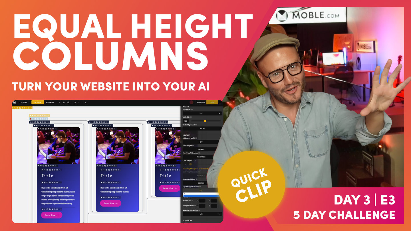
Equal Height Columns
Paul Davenport | 09:46
Equal Height Columns extends all Columns the the Height of the the tallest Columns. This technique tends to be an edge case, since many designers prefer to use Widgets which does it all for you automatically. Though, it's worth learning even if your website doesn't require Columns with equal Heights, since in this Episode we also intro Maximum Height for the first time, which we'll use more and more in the ongoing YouTube classes that follow this series.
"So now we're going to move on to our second example of parent and child. And I've alluded to this before and this is where we have columns. So let us go and grab a layout that we've prepared earlier. So what I'll do is just grab this one here, hold shift and drop it onto the page and I'll put it into business mode. Okay, so here you can see our columns. So the scenario here is what happens if someone's got more text in this than over here? Will the bottom line up, will it be equal height columns or will it have equal height columns?
So this is a name in CSS, in CSS an actual code in front end markup, we call it equal height columns. So mobile, you can add this here, this feature. So let's see how it works in actual code. And the mobile system works in exactly the same way. So what we'll do in here, we'll actually clone this image and I will paste in some text. Okay, did I say image? Clone this text and we'll add in some text again. Again, so I'll clone this text here and I'll just show you another trick here. If I paste over this, so look, I've got it all highlighted and paste that exact same piece of text. Look what happens. It preserves the style when I highlight all. So if I hit command or control and Z and now I just remove it, delete it, don't highlight it, okay, curses in and now press paste. It will be in the paragraph style. So again, learning something new there. So in this case I will make this piece of text smaller than this. So we've got three different heights.
So now what we're going to do is turn our equal heights' column on. So to do this we go to design mode and it's equal heights' column. It's a column so we're going to go to the columns frame, sky blue, click the pencil, it's a frame. So we go to frame, we're talking about height. So let's scroll down to height. Here we are and inside height we have equal height columns. Well, it's off. So now let's turn it on. Well look here and I turn it on. Hasn't worked. So troubleshooting, right? So now let me explain how code works. When we have equal height columns, this is now our parent, equal height columns is on, that's fantastic. But now we need to look at our child. So in the child here, what I'll do is just for this design, just for this exercise, I'm going to turn it to this one again so we can see our frames. So you can see here this is our frame with the inner padding. Now this frame, the inner padding has got height. You can see that these heights don't match.
So we need to say to the frame here, you need to be the full height. So what we need to do is this is literally what front end developers do in the diffs. We actually go here and we say, look, our maximum height notice, I can't put equal height columns here, not the parent. This is the child, cool. So in this one we can put it as full frame. So we have to do this in all the childs, okay? Now this maximum height isn't just a function of equal height columns, it's actually used for more things as well. That's why it is above here in the hierarchy. So now we've just learned that we've got a parent with equal height columns on and we've got our child that's telling it to be the full height of that frame of that diff. But there's a particular thing going on here now because this frame has got the padding, but if we look inside it, there's also our border where we've got this shadow. That's got a shadow all the way around here, which we put on in the intermediate class.
So in this case, this one also needs the full frame. Basically the rule of thumb here is ever in doubt just go to the child and put full frame on. That's literally it. But you do need to do it. This is the way that the front end works and we can't say go and predict if you want it on or off because quite often you don't. And I'll show you a scenario of that as well when you don't want equal height columns on. I'll do that just at the end. So now at this point I could go and preview, but we've also got this other height here. So at the moment we also need to tell this one to go to the bottom two, otherwise it's going to push this down and we're going to get a shadow and the white card isn't going to push down, so we have to put it on all of these properties too. So what I'm going to do is back to height, find our maximum height and just put it all to full frame.
So this is the biggest example you'd ever have to do it. Sometimes you only have to put the max height on. In the one instance, if you had no image in this case, then you would put it in the frame and in the card. In that first column, if we didn't have a card, you wouldn't need to put it in here at all. But in this case, this is the most complicated example you'll get and that's when we've got a card, we've got a shadow and we've got our inner padding. So unfortunately there you have to put it on nine times. So that's why this is a masterclass because I've shown you the most complicated thing. Now to make this even more of a troubleshooting exercise, we don't show full height in the editor and that's because it can make editing really difficult if you're using full height for other purposes. So we turn that off in the editor just like we turn off background video in the editor. So what I'm going to do now is save and view. Okay, so I'm just going to save and view this on the front.
And you can see here that we have equal height columns all lined up. So there you go. That's your second scenario. So arguably when you look at that, does it look as good? So equal height columns is an edge case of code. I don't expect you to use it a lot. That's why I've put this session in afterwards as the advance because arguably that doesn't look as good. Some people like to have them lined up for very specific reasons in their design. So you'll see that. Most of the time in all the 5,000 layouts that mobile has got, this is hardly ever on, okay. So that's just a little tip there for you so that you can see that in action. Now I will just say on the other scenario why you probably don't want that on, let's just look at masonry. So what I'm going to do here is clone out this here. Now just bear in mind we've got the full frame on here.
So what I might do is just going to show you if I move these blocks over to each of the two. So what we'll do here is we'll just put another wrap on there. And then what I'm going to do is take these and actually paste that one in there. So I'm holding shift, click paste, now I can remove this one and move this one down. And now I've got our other one which I'll move, okay. So I'm just going to hold shift and paste it in there and then I'll move this one down. So what we would have on here is a scenario where we're starting to build out a masonry. I could do the same over here. I could click the plus, clone this one, and then let's take that cloned and move it over here by just holding shift and placing it into that frame and clean as we go. So what we're starting to build out is that this kind of masonry look, which can look pretty cool, right?
So what would happen now if we've got equal height column on all of these, because we've just cloned this masonry, this masonry wouldn't need any equal height column on here. But what's going to happen at the bottom when we've got it on? So you really like edge case of code here. So what I'm going to do is just save this and let's go back and view this. So here, this isn't good. So it's basically, because we've got it on an all three, it's putting them on all three to the full height. So if that ever happens, quick fix. Well you've got to now go and take the full height out of all of these. So what you could just do, just as a little hack sheet, is go to your frame and turn off your equal height columns and then you've just got a bit of sanity there. So I'll just go back and view this one and now you can see our lovely masonry effect. Okay, so there you go. You've learned equal height columns."

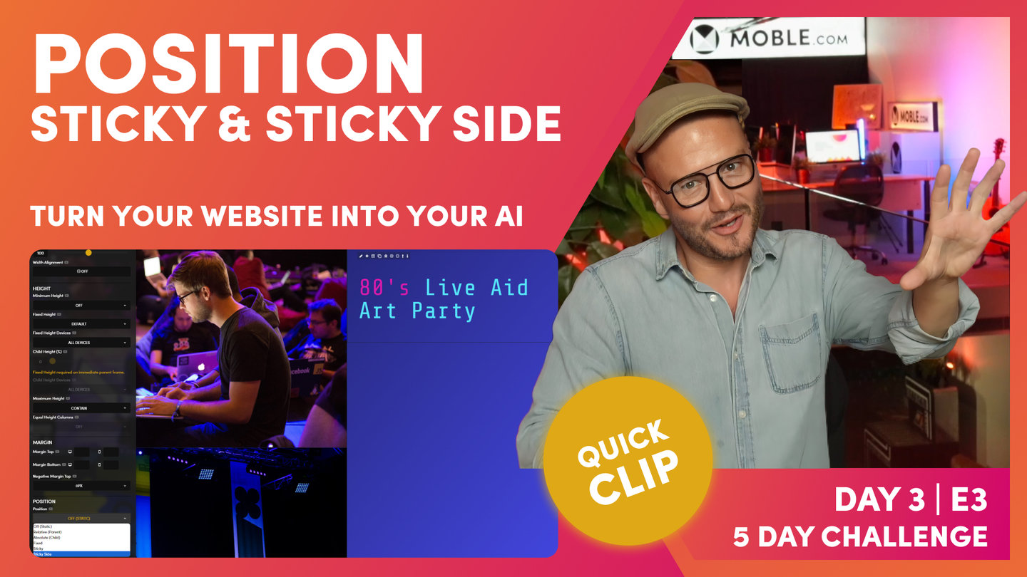
Position - Absolute and Relative
Paul Davenport | 04:02
So what's going on here? Well said simply: "Position your Child Frame 'Absolute Bottom Right' relative to the Parent Frame."
Ok, so if you can position your Child relative to the Parent, isn't this the same as the Child Height feature above? Yes it is, so which one should you use? Well, most of MOBLE's clients tend to use Child Height (%) to position Child Frames. However, most Frontend Developers tend to use Absolute and Relative, rather than Child Height.
Why is this? Well, this is because Frontend Developers don't have a UI like MOBLE to play with, where Child Height is quite easy to visualise and more flexible in height position (Simply put, there are more Percentages than Absolute positions, so it's just more flexible and works in far more use cases).
Therefore, the MOBLE Team, tend to encourage Child Height rather than Absolute and Relative. We also know from years of experience that there are less potential conflicts when your future content team begin to add new features and content to your page. An example of this is Background Video, as you now know MOBLE makes the hard decisions for you behind the scenes, well, there is also code running behind the scenes too. You don't need to know any of this, but when you add a Background Video we automatically apply a Relative class for you, and if the content team start randomly adding Relative classes everywhere, and don't clean up their classes as they go, they could in theory, start to leave a trail of unused Relative classes around the page, which could confuse the Video behaviour and cause a conflict. This is really is an edge case, and MOBLE has algorithmic procedures to prevent such situations by striping out unwanted classes, but even so, we've scene it happen. So MOBLE encourage Child Height for Designers and Absolute and Relative as a supporting tool for Advanced users.
So when should you use Absolute and Relative?
In this Episode, we use an Anchor link inside an Image, to Navigate up and down the page. This Image is "Absolute Bottom Right Relative to the Parent Frame". The Image, therefore ignores the Outer Padding, and hugs the Absolute Bottom right. So if you ever have a requirement to place a Frame in a position that ignores Padding, this is a great time to consider Absolute and Relative. We cover Absolute and Relative some more in upcoming episodes.
"So since this is a real edge case, I'm not going to build this example from scratch, I'm just going to show you what's happening. See this particular frame here, it's really tucked away. This one's actually being used as a point of navigation. So you can scroll anchor two and anchor up to the top. So let's just go and have a look at what's happening on this layout in the backend. So I'm just going to jump over.
So the first thing I'm going to put it into design mode. And what we've got here is a half half and both of these have got our fixed height in here. So we've got a fixed height and a fixed height. Now in here we've got a whole bunch of things going on. This particular text isn't fixed at the bottom, so it's no good me, in this case, putting in a child height because I don't want all of this child to be positioned to the bottom. I only want this element to be positioned to the bottom, but not the text on top. So if I put this in business mode, you can see this one here, I want bottom right. And this text here I want at the top. So I couldn't use in this case the child bottom. If I did do this, it's going to get confused because this one wants to be at the bottom and this one doesn't. So it is just rule of thumb edge cases here. So what I can do is put this actual frame here. I can make it absolute bottom right.
Okay, so let me just put it back into design mode. Let's have a look at this. This is got a width 35, and if I come down to my position here, you can see the child element is set from off. I can set it to absolute, in this case, bottom right. Now the editor in business mode will show this. Okay, so we've got absolute bottom, but I'm going to just say a sentence, right? This is absolute bottom right, but relative to what? Okay, well in this case we want it absolute bottom right either relative to this particular frame or probably relative to the actual parent. So we need to tell the markup here, this is an absolute bottom right relative to the parents. So what we would do in the position element here, we would call this relative swan mobile, we like to make it sound a bit easier for learning. So we call the relative the parent and we call the absolute the child okay? So this is absolute, let's just put it in here.
This is ‘absolute’ ‘bottom right’ ‘relative’ to the ‘parent’. So that is it. In CSS this is an absolute and relative positional relationship. There are many instances when a Web Developer would use this. In MOBLE, this is a bit of an edge case, in MOBLE we decide to use Child Height %, before we fall back on Absolute and Relative, as Child Height % is much easier to use and conflicts with less things. This is the reason why I taught you Child Height % first, when we created your Hero Section banner. Frontend developers, however, are not building for designers or for the content team. They are only building for that one instance, therefore, they will tend to use the Absolute and Relative relationship. Here’s a trick. When you use Absolute and Relative say this sentence. This is the ‘absolute child position’ ‘relative to the parent frame. Lovely, okay, so I think you get that. Absolute is the Child and Relative is the parent that you are anchoring the child too. Easy right?!"
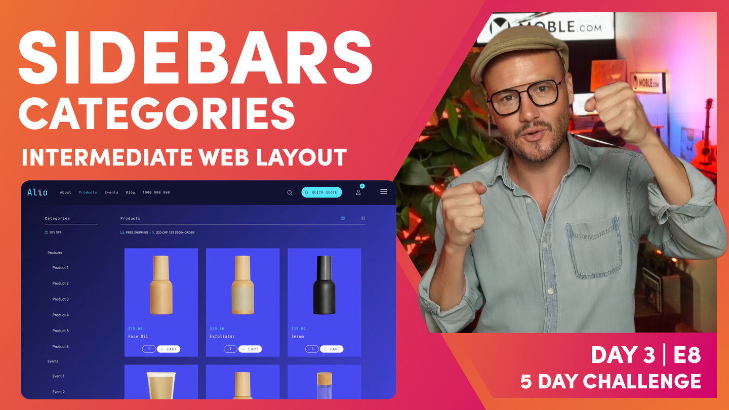
Position - Sticky and Sticky Side
Paul Davenport | 03:23
Sticky and Sticky Side classes offer an enjoyable technique to bring an element of animation that brings focus to key content, such as Call-to-Actions and Forms. Here we look at Sticky Side on a Layout that you can play with on the Gilyan Theme. Use the Layouts Drawer to drop the Layout if you if don't wish to build this one from scratch.
Check out the Side Bar episode to see Sticky and Sticky Side in action for Online Shop category Sidebars.
"Ok moving on. Let's take the relative off, we don't need that anymore. So I can do a couple of cool things right, on this one, let's put it into design mode. Let me clone a few of these, right? Let's just do another one. And what we might do here is just change the image so it doesn't look so... so it's not the same. We've got sticky on. Let's just choose a couple of images. We'll take that one and just random here, let's choose another one. We'll take this particular one in this case. I could choose better images, I don't have to have background image fixed on either. So on the front end, if I press save and we'll click view. Okay, we've got this situation, but I could decide that I want to make this text sticky. I want to make this text always stick. So let's go back. What we'll do actually, make this a bit cooler. Now we'll give this a bit of padding, make that look a bit cooler. And what we can do now is decide do we want to put a sticky side?
Well, which side do we want to be sticky? Well, in this case, let's put this side sticky, so this side continues to scroll. So now let's go to our sticky. And what we need to do is make this one say sticky. I'll just show you in the class here, it's added sticky, cool. But then what we also want to do is make it sticky side. So let's go over to put this on sticky side. And now let's go and have a look at this on our front end. So I'm just going to save and view. Now I'm going to scroll and you can see this side sticks or this side scrolls. Cool little functionality, I often use this in sidebar. I'm going to show you a sidebar episode where we stick the sidebar to one side, particularly if it's short navigation, we want to stick that nav so people can always see it. And then scroll this side, another call use case. What if this was a form? Sorry, that's a boat there just leaving in the harbor, right at the end as normal.
But I was saying there, always called if you put a form in there, and it might be an event timetable. It could be timestamps for this video, it's a particular long one. We might need to scroll that on that side. So there you go, you've learned some real advanced positional CSS there. And these are all functions of actual CSS. And these are all the ways that front end developers have to design in code when they set up their dibs in code. We can do here nice and easy within frames."

Advanced Wrap
Paul Davenport | 01:36
Well, how cool was that. Now you have all the skills and it's time to build your Layouts! For the rest of the day Paul continues to build more Layouts that you can 'Watch and Learn' at any time to explore practical use cases of the features you've just learned in today's masterclass.
"And that is the end of the masterclass, the advanced masterclass session. So you've learned some really cool things and really edge cases there and troubleshooting. So now for the rest of the day, I want you to start building your own layouts. And meanwhile I'm going to continue building some of the other layouts from scratch.
So I'm going to add a few other episodes such as I'm going to do the banner, I'm going to do the footer, and I'm going to do a sidebar and a few others that I'll keep on adding so that you can see those. And if you want to keep on watching more and see how I've done it, you can, but you've learned everything there. And now I will just say we're going to have a watch and learn where every time we release new layouts and new themes, now you've watched these episodes, we'll be doing very quick run throughs of how we build out all of the new themes and all of the new layouts. So you can pick those up so they'll be a bit shorter and a bit snappier. Now you've got all the learning, so make sure you subscribe to the YouTube channel because every time these themes and layouts come out, they're going to be in your editor so that you can use them."
WHAT'S NEXT?
Episodes 4-8 of Day 3 are Watch and Learn episodes as Paul builds Layouts from the Alio theme. They are currently in Production and live soon, so stayed tuned to our YouTube channel to be notified as soon as they are released. You can jump ahead to Episode 9 via the button below or move on to Day 4 where we go through some essential content formatting tips and techniques.
DAY 3: EPISODES


Play before you Pay?
GETTING AROUND
SUPPORT
AI SALES LINE
AI SUPPORT LINE
ENQUIRIES
team@moble.com.au
GET A QUOTE
A Web Builder for Design. A CMS for Business. We serve all businesses from SME's to Enterprise. Talk with us for AI development, custom website design, website development, ecommerce websites, directories, intranets and social networks.
PRIVACY | WEBSITE TERMS | PLATFORM TERMS | © 2026 MOBLE PTY LTD