PICK YOUR AI THEME TO GET STARTED

DAY 3 | EPISODE 9
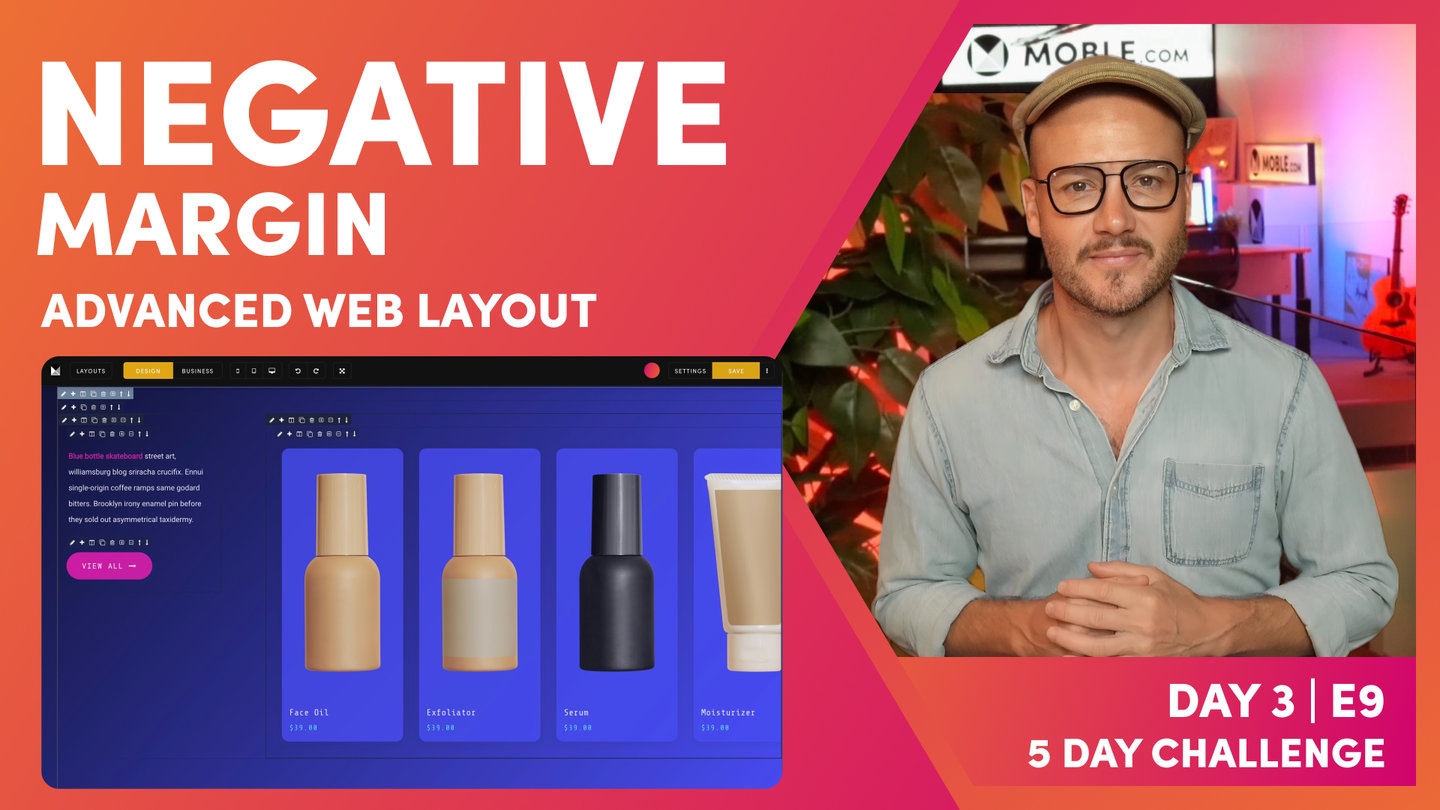
NEGATIVE MARGIN

Paul | 16:06 | 15 mins
People often ask what's the difference between "Negative Margin" and the "Shift" effect. Well, in none-tech-speak, if you use "Shift" it will shift the Frame and leave the space where it came from, if you use "Negative Margin" it will shift the frame and remove the space where it came from... it will have a negative margin.
QUICK CLIPS
What is Negative Margin?
Paul Davenport | 16:06
Negative margin pulls up a Frame, by a set pixel height, out of its container Frame. Therefore, content appears to overlap from one Frame to another. It is "Negative" since it does not leave empty space in the Frame the it is moved from. In other words it "pulls" the content upwards by the same distance it moves up.
Why is Negative Margin different from Shift?
Both Negative Margin and Shift move a Frame over another frame. Negative Margin is different from Shift because while Negative Margin does not leave a Negative Space, Shift does leave a space.
You could say the Negative Margin 'pulls' content, and Shift 'moves' a Frame.
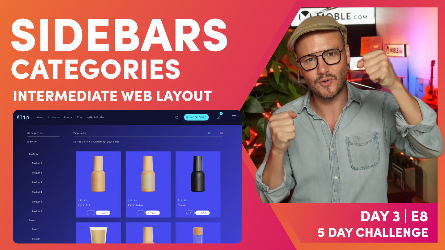
"Well, since the day has been going so well, I'll finish off now with one more advanced layout, and that's because someone just said to me, "What's that technique that MOBLE use on a lot of our client websites?" And it is true actually, we do use this technique quite a lot. So, what's this technique that I'm talking about? Well, as you can see here, I've got this shape with content over the top of it, but this shape is actually just a frame, which creates a really nice look. Often MOBLE use it in the same way we've been looking at in the intermediate session where we use a neutral background with a white on top with the shadow and it just lifts it up off the page, but what I've done here, I'm showing you an alternative way to set it up.
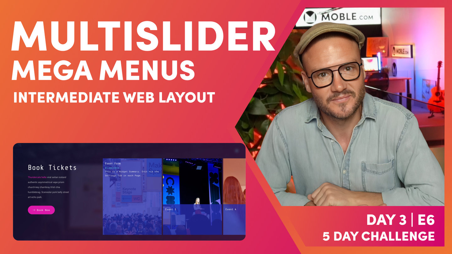
I'm actually using the same gradient angle here. So, this is still using our 130 in the outer and it's using 130 gradient angle also on the inner, and it creates this really quite striking effect. And watch this, so as I scroll down the page here, this is the next layout and look at how the gradient just melts into the other. You can't even tell these are two separate layouts. So, how am I doing this? Well, I will show you just shortly, but here you can see we've got a category here for events, looking good, and we've got a category here for products, again, looking good. And of course, I can mix and match these, so I could put videos in here, products in here, so on and so forth. As you learned at last night's Sunset Talks. So, what's going on? Well, to fast track this, I thought it'd be good to showcase this picking up from the multi slider episode.
So, in the multi slider we demonstrated that by setting up on mega menus, didn't we? So, we started off with the products in a grid and then we built on that... Cloned that and made the events mega menu, didn't we, with this multi slider? So what I've done, I've just started here and fast tracked us to get us to this position because these are very similar layouts on there, you can see here. So prerequisite, if you haven't watched this episode where it was built using the multi slider, the widgets episode to build out this mega menu here, go back and watch that because it is a good episode and we'll pick up there. So, what I'll do is jump into the editor now and you can see I've got this set up in exactly the same way we left off in that mega menu episode.
We've got our outer padding here at 64, and remember, we turned it off on the right because on this particular layout we've got our multi slider and then in this case we've got 110% overflowing off on the right-hand side, which creates this lock here where the slider is overflowing, so it's pretty cool stuff. I can just hover this with my mouse like this or I can use the arrows to move it along, so let's jump back into the editor now and let's have a look at what's going on. So in the multi slider, in the mega menu session, I used one third and two thirds, but in this one slight difference, I'm just using one quarter and three quarters because we're selling here, it's giving us a little bit more space on the page. So, it's looking good there, isn't it? One quarter and then three quarters with 110% on this side.
So, you should know that by now. After, again, we've learned in today's session. So, now what's going on? Well, we're missing one key ingredient here, aren't we? We're missing this shape. So, how do I put this shape into this page? So, let me go and have a look in here. So here we have our layout, but how do I get the shape in there? Because if I put a frame in, the frame is really about 75% here, isn't it? It's like three quarters, so how do I get that shape in there? Because if I move this to 75%, well, I'll just move this in here to 75%, it's going to move the whole thing, but I only want to move a shape in the background. So, let me go and show you now how to set this up, and I'm going to show you how to do it with a technique that we use in front end development called negative margin.
So, that's not margin where we add padding to the outside of the frame. So, you can see here we've got our frame and we use margin here, which allows us to add padding to the outside of the frame, but in this case we use negative margin. So, what's negative margin? Let's break it down, so what I'm going to do here is put in another frame here. This is going to be the one where we're going to use our shape. I'm going to use this for this shape here with this rounded corner and the shadow. So, let me go and put in this shape first of all. So I'll put in a child. I'll give it a height, so we can see what's going on. So, in this case I'll make it... It's quite high, isn't it? So, I'll make it 900 pixels high and you can see that's our shape.
Now just for contrast, I'll put in a gradient now so we can see what's going on. So, what I'm going to do now is go here and put in our gradient that we always use at 130, so I can use that, but I can hone in, as you know, we've got our gradient angle here. Well, this one, it was about 75%, it had rounded corners. So, let's go and pop those in now. So, what we can do here is go to frame and then bring this down to 75% as you can see here, and then what I'll do here is take out this padding off the parent now because as you know, there was no padding on this side. It goes all the way to the edge, so let's just do this now. I'll take off the padding on this side. Now, let's also move the padding down here as well.
So, we're probably going to have to put some more padding back in here, but let's just focus on the top frame to begin with. So, what I want to do is give this a rounded corner and I want to give this a rounded corner and I want to give the whole thing a shadow, but what I don't want to do is give a rounded corner on these sides because these have got hard edge. So, I only want to give a rounded corner on the bottom right and the top, so can that be done? Well, let's go and explore over in the advance where our borders and shadows live over here. So first of all, I'm going to look at that rounded border and look, I can give this a top right roundest. So, round is not very round and that roundest is very round. So as you know, MOBLE making those hard decisions for you by setting up all these presets that we've used on hundreds of clients time and time again.
So, in here I've got top right roundest, which you can see now, this is the class in our class box down here, border top right roundest. Well, for those who want to learn front end development now, I can actually copy this and paste this and look, I could write bottom in here just as a little cheat there. I'm showing you how to write with classes, but of course, I could just select this in here as well. So, now we've got our two rounded corners. So, you're learning a bit of front end development as we go, even though you don't need to know any code because you can do it here in the editor. The MOBLE editor is just following the principles of code. It's a no code platform. You don't need to know code, but it is coding in the normal, conventional way. I'll just take this space cadet out here just so we can see the rounded corners.
And you can see here our rounded corners. So, we're looking good, we've got our shape, but this shape just needs that shadow on, doesn't it? So, I'm just going to pop over here and let's give it some shadow. As you know from the intermediate session, we are using shadow more, which is given that shadow as you can see there. Let's put our space cadet back in the background here to give us that full effect, and there's our space cadet blue. All right, so we're looking good here. So, now we've got this particular background shape, but now the only problem is this text, this content needs to come up over the top. I almost said shift over the top, this is not a shift effect. This is literally moving up over the top. It's moving up over the top, and that is what negative margin does.
It moves the bottom frame up over the top and we can tell it by exactly how many pixels. So, this was 900 pixels, and I'm going to move this one up over the top here. So, what I'm going to do is just have a look at this. Well, first of all, I want to put a bit more padding in this. Remember, I want some more padding on this side. So, actually I'm going to put in our padding here, I'm just going to use 32 and I'll actually use something like this, so we can see it a little bit better. So, we're looking good. We've got this space in here, which is quite nice. Now, I want to target this and place it over the top. Well, this is 900 and as you've seen there, I've got a bit of padding in that as well.
So, I want it to be more than 900 pixels. So, I'm just thinking logically here. So, now I'm going to go to this entire frame here. I'm going to pick this up. I'm going to move it over the top of there. I'm going to do this with negative margin. So, let's go down to our frame. Here's our frame, and in the frames I'm going to roll down to where it says negative margin just here, and I'm actually going to select something that's greater than 900. Well, you can see here I've got 960, so I put 960 in. Now again, design mode. As you know, you wouldn't to see something shift in design mode because it's a blueprint, so we can see all of the frames. But if I pop to business mode, we can see our effect is in place there. So, I'll just show you one more class that's coming soon here.
I'm going to just show you. I'm going to go over onto the widget here. I'm going to go into our advanced, and you can see here we've got a new class coming in the widget, which is widget board and roundest and widget shadow. So what that actually does, if you want to use this class, you can, it's two different classes, widget board and roundest and widget shadow. You can just pop these straight on here. We use them a lot on MOBLE, but as you know, we have been building the MOBLE tools inside our own agency, so a lot of the time we just use classes that we know are there and we haven't released as UI tools yet, but these are coming as tools inside the widget, so that you'll be able to put border roundest and shadow right here in the widget. That's coming very soon, second quarter 2023.
So, if you're watching this course now you might just check to see if these features are in here, which is border and shadow inside the widget, but if you're watching this before that's there, you can just write in here, widget-border-roundest, and widget-shadow, and that gives this effect where you've got the borders on the widget with the shadow on them, really cool, really nice way to use rounded corners on the widget. And I will also get the team after this session to drop it in the class list here. So if you want to use those class lists, just go here and click them. As you know, the class list, this is all our work in development, all those features that we've got class lists for that we're rolling into the UI in what we call beta, this is literally our beta list of classes that we're rolling in.
So, lots of cool stuff there, a lot more effects that are coming, and diagonals, as you'll see me go through as well, if you haven't seen me do that already. So, we've just added some extra class lists in here. And what I'll do, I'll just change this. What we'll do is actually we'll put cameras in here. So, what I'll do is go in here and say, show me cameras and we'll look at the black cameras. Show me black cameras and what I'll do, I only want to see tags that've got cameras and black, so must match all tags, and then we've got some black cameras there, lovely stuff. We want title and price, happy with that. Got some black cameras there, quite happy. I'm going to press save and then I'm going to come back. I'm going to hit refresh, and let's have a look at our negative margin on the front end.
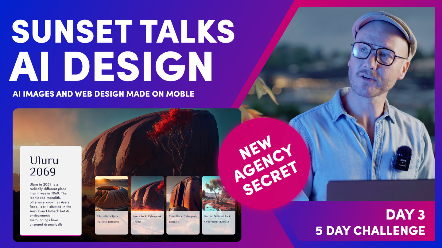
I'm pretty happy with that. I hope you are pretty happy with that too because that is an awesome page. And so, what I can do now is just actually one more thing, what I'll do here is actually show you how to clone this one because what I could have done there is actually cloned this particular layout, so we would've had the skincare one. So, let's go and do this properly. I'll clone this one. I'll go back here and I'll write skincare and then I'll come to this widget and I'll change the tags over to skincare, and we are now looking good. I'm going to hit save, go back, hit refresh, and that is a beautiful setup. I'm sure you will agree, that it's easy to apply. Now, I will make sure that these layouts go inside the Alio theme. So if you're looking at these, search for Alio, but also in tonight's Sunset Talks, I'm going to build a new theme rapidly. I'm going to get the AI to design the theme.
Now, I might lean on some of these kind of card layouts depending on what the AI throws up. I've used a lot of the AI generated designs, and this is actually quite popular. So, I'm going to create a new theme tonight, and I'm going to call it ZAIA, which is AI with a Z at the start, and an A at the end, ZAIA. It's actually a Hebrew word for light, and this particular AI-generated website, it's the one where we use in the AI-generated images with lots of Australian landscapes at morning light. So, it's a very fitting name there. So if you are looking for this particular layout, go and get it from either the Alio theme or the ZAIA theme and use it to create your own website because it is a beautiful theme. Even though it's an advanced layout, just by dragging it in, even first time users can make a beautiful category style layout as you've seen here. Well, I'll wrap there, and next is for me to see you in the Sunset Talks, where we look at AI-generated website design."
WHAT'S NEXT?
Tonight's Sunset Talks we pick up where we used AI's to generate website images with a structure photoshoot process. We look at some AI website design inspiration and go on to build a website from the designs that the AI created for us.
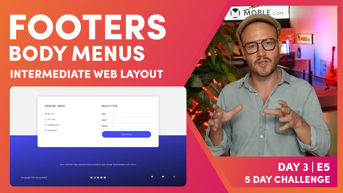
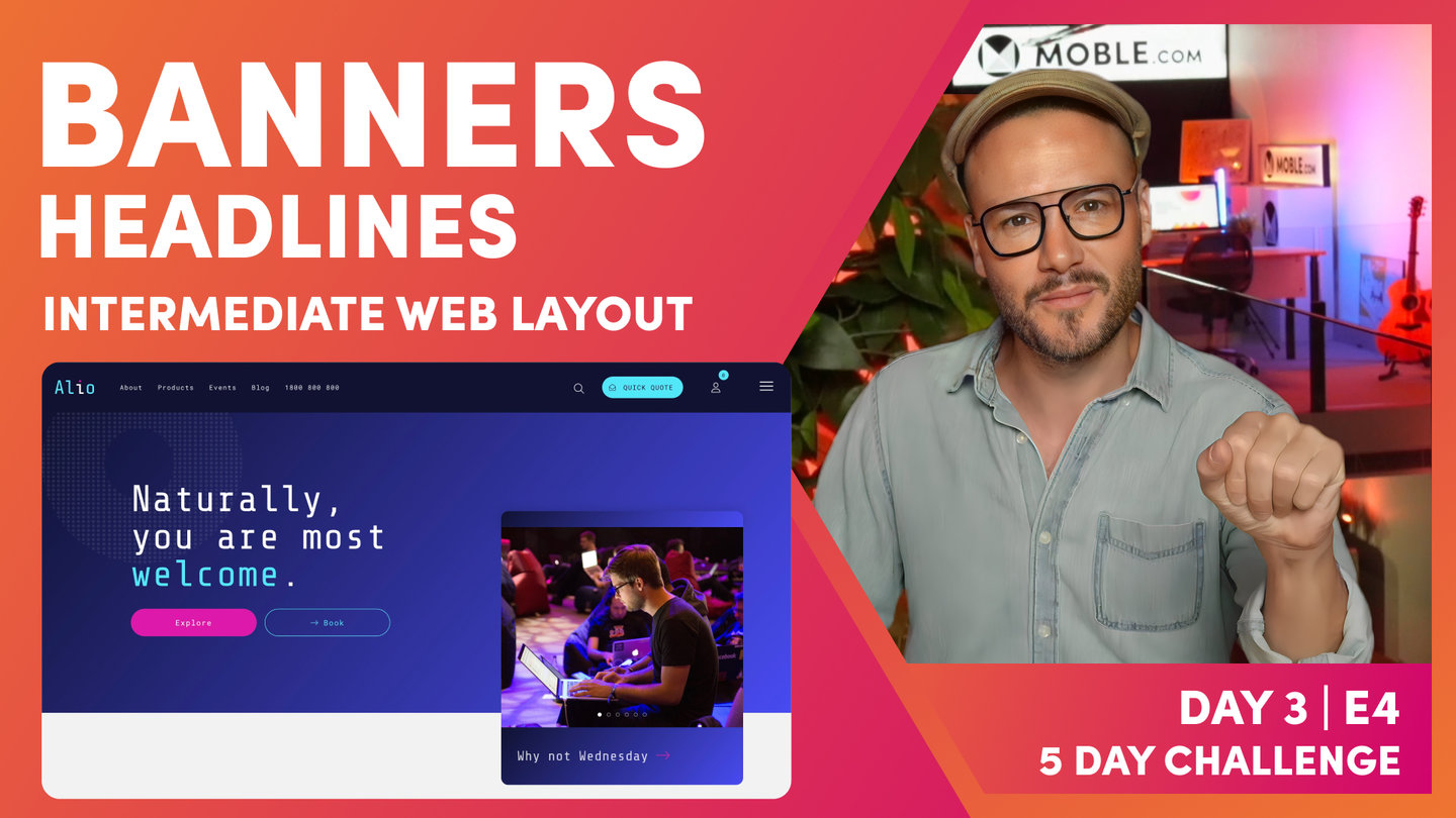
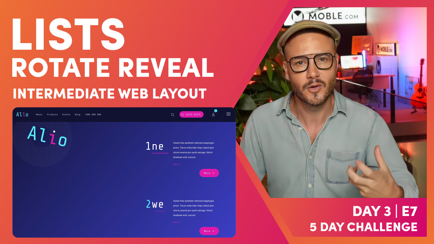
DAY 3: EPISODES
Play before you Pay?
GETTING AROUND
SUPPORT
AI SALES LINE
AI SUPPORT LINE
ENQUIRIES
team@moble.com.au
GET A QUOTE
A Web Builder for Design. A CMS for Business. We serve all businesses from SME's to Enterprise. Talk with us for AI development, custom website design, website development, ecommerce websites, directories, intranets and social networks.
PRIVACY | WEBSITE TERMS | PLATFORM TERMS | © 2026 MOBLE PTY LTD