PICK YOUR AI THEME TO GET STARTED
Choose an Award Winning AI Website theme, then just pay $9 hosting to unlock the full AI tools and customise everything.
Build: a $50-$50k AI Website
Free: Theme, 5,000 Layouts, and Course
Includes: AI Chatbots, Voicebots and AI Automations
Become: the AI Manager and Web Designer
Earn: life changing passive income with an AI Agency

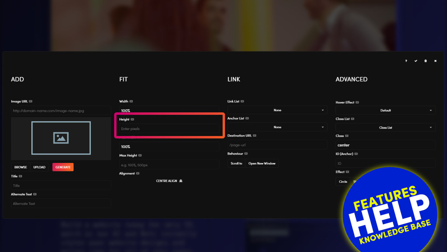
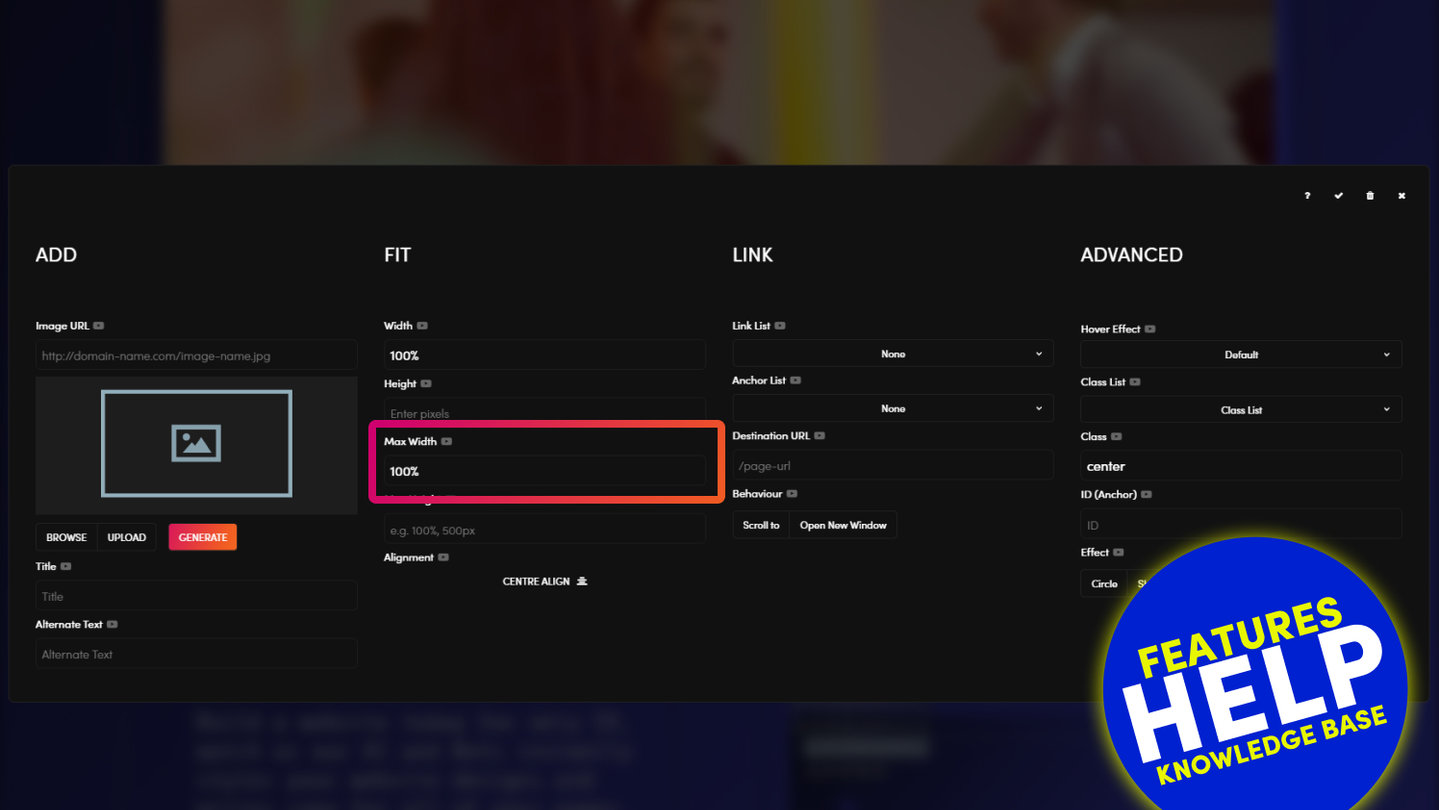
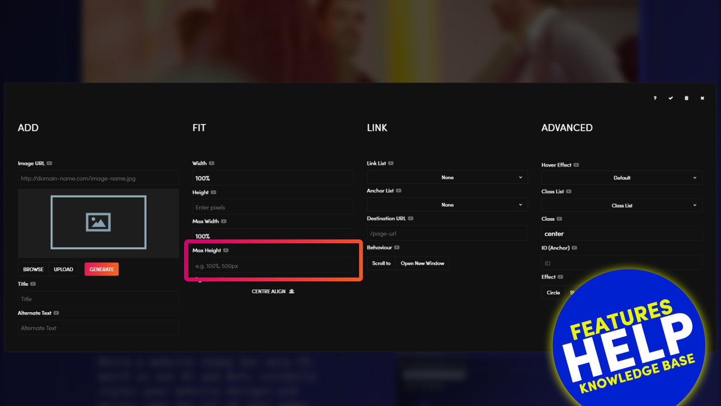
WIDTH
You may decide if you what to display your image to actual pixel width or a percentage width of the frame.
- Width (%) is a critically important tool for responsive design as it allows you to determine the width of the image in relation to the frame. In considering how the image will render on all devices MOBLE CMS automatically sets your image to 100%. This will ensure that your image will stretch to be 100% of the frame irrespective of the size of the device. I.e. it will automatically shrink and expand to fit the device through which it is being viewed. If you wish to reduce the size of the image, consider reducing the percentage of the image width, rather than reducing the pixel width.
- Width (px) will set the image to a fixed pixel width. If the device screen is smaller than the width of the image, then the image will overflow to the right of the screen.

RELATED HELP


Play before you Pay?
Brand an AI Website and Chatbot Theme in under 3 minutes, anyone can do it!!
GETTING AROUND
SUPPORT
AI SALES LINE
AI SUPPORT LINE
ENQUIRIES
team@moble.com.au
GET A QUOTE
A Web Builder for Design. A CMS for Business. We serve all businesses from SME's to Enterprise. Talk with us for AI development, custom website design, website development, ecommerce websites, directories, intranets and social networks.
PRIVACY | WEBSITE TERMS | PLATFORM TERMS | © 2026 MOBLE PTY LTD