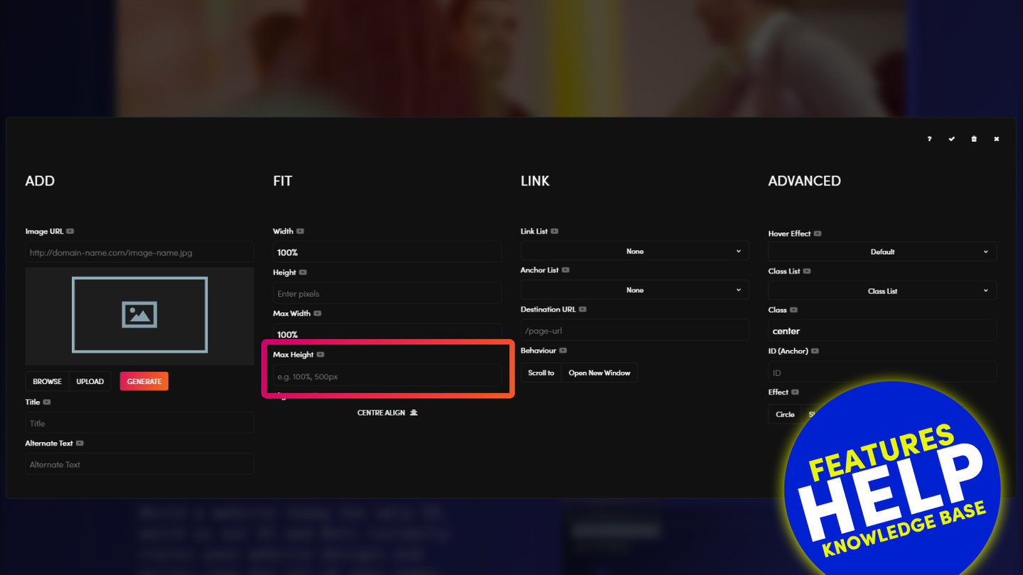
'Max Width' provides additional functionality that can enhance the look of your images. You can set 'Max Width' if you wish to control the maximum width of an image, even if on a particular device (e.g. desktop) the frame is wider than the image.
Imagine that you have an image that is 900px wide and you do not wish it to stretch beyond 900px (otherwise it will become pixellated or blurry).
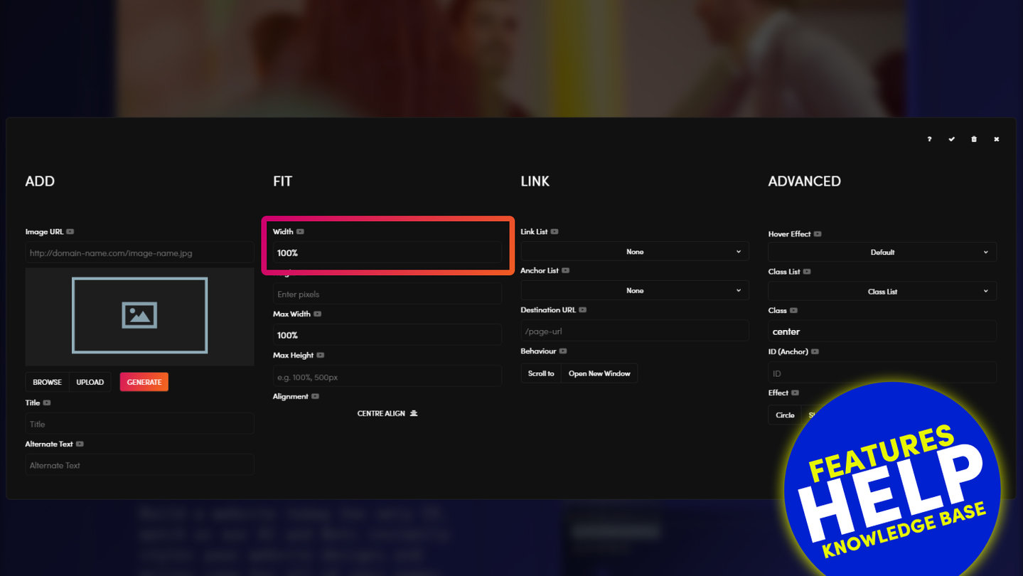
You set the (normal) Width (%) to 100% as default on MOBLE CMS.
On a Laptop the screen width is 1440px wide, therefore by setting the Max Width to 900px the image will not expand further than 900px.
However, on a mobile, that is say, 320px wide, the image will render to 100% of the screen width and shrink with the size of the device.
(This is why MOBLE CMS has 'Max Width' not 'Min Width').
'Max Width' can be set to an exact pixel width, like in the example above, or as a percentage of the frame (e.g. only ever display the image to a max of 90% of the frame).
GETTING AROUND
SUPPORT
AI SALES LINE
AI SUPPORT LINE
GET A QUOTE
A Web Builder for Design. A CMS for Business. We serve all businesses from SME's to Enterprise. Talk with us for AI development, custom website design, website development, ecommerce websites, directories, intranets and social networks.