PICK YOUR AI THEME TO GET STARTED

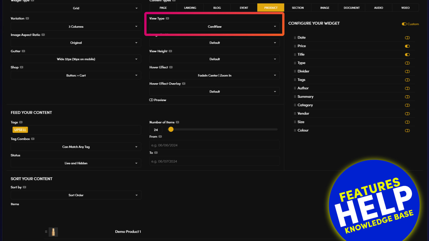
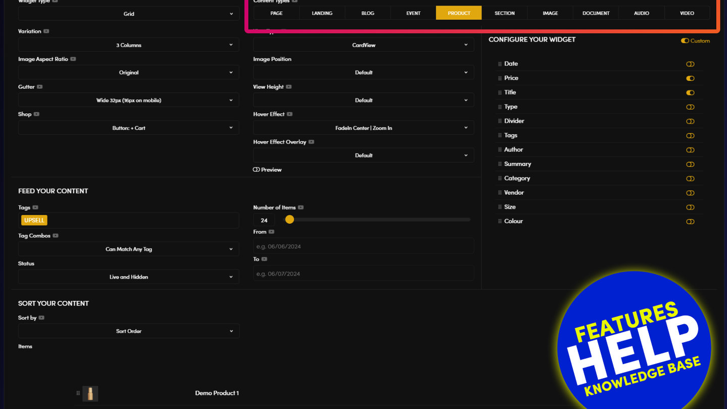
WIDGET TYPES
Widgets provide a powerful mechanism to categorise content, bring it to life with visual effects and manage large volumes of content quickly. As such, it's well worth getting to know your widgets, and MOBLE CMS comes with a series of widget right out of the box.
MOBLE CMS also gives you the ability to modify each widget to specifically suit your content. There is no limit to the number of times you can use the same widget on your website, and you can even modify a widget so that it renders differently in every instance.
In this article, we take a closer look at the different Types of Widget that are included on MOBLE CMS, out of the box.

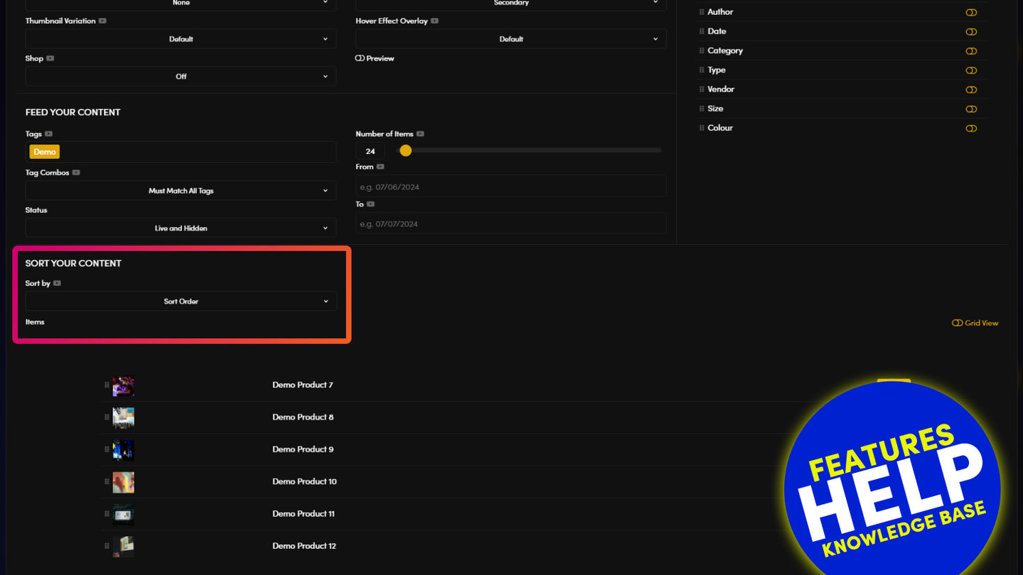
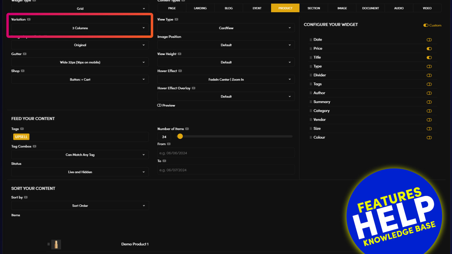
GRID WIDGET
USED FOR: NEWS | BLOGS | SERVICES | PRODUCTS | CATEGORIES | EVENTS | TOPICS
Grid Widget is used to display a grid of either Pages or Files (files are images, Documents, Audio & Video).
Therefore, Grid widget is an incredibly useful widget to organise your content into groups that can be displayed to your user.
The intention of a Grid Widget is to link your users from the widget to a group of associated pages. Here we look at how the Grid widget behaves when it links to different types of content:
- Grid of Pages:
Displays the 'Page Icon', also known as a thumbnail.
When you click on the thumbnail you are linked to a new page. - Grid of Images:
Displays the image 'File Icon', also known as a thumbnail.
When you click on the File Icon it does not pop up the image, like it would in a Gallery Widget. Rather, it opens a new page as defined by the Destination URL of the image.
The Destination URL of the image can be updated in the Files area. The Destination URL of the image opens up a new web page. This makes a Grid of Images an extremely useful widget, for example, if you would like to link away to other websites, such a logo bank of your clients or partners that links to their website.- PRO TIP: When adding your destination URL for the image (in the Files area), if you add the full URL with 'http://www' at the start, it will automatically open as a new window.
- PRO TIP: When adding your destination URL for the image (in the Files area), if you add the full URL with 'http://www' at the start, it will automatically open as a new window.
- Grid of Documents, Audio or Video:
Displays the document 'File Icon', also known as a thumbnail.
When you click the File Icon it opens the file in a new window.
The File Icon can be edited in the Files area, when you upload the file, if you do not add a File Icon, an Icon indicating the file type will automatically display for you.
Example File Icons:

MASONRY WIDGET
USED FOR: NEWS | BLOGS | SERVICES | PRODUCTS | CATEGORIES | EVENTS | TOPICS
A Masonry Widget behaves in the same way as Grid and Portfolio Widgets, with one key distinction; the Cards (tiles) in a Masonry Widget do not have a fixed height.
Widget Summary Text
As such, the height of the masonry widget is determined by the the content that sits within the card. The height for the card will automatically increase with the content of the widget 'Summary' text. Therefore, there are no summary text restrictions like with: Grids (restricted by the height of the card), Portfolios (restricted to 140 characters).
- Grid: restricted by the height of the card
- Portfolio: restricted to 140 characters
- Masonry: no restriction in height
Default Masonry Configuration
As a standard configuration, the Masonry is a hybrid of the Grid and Portfolio.
Like the Grid, the Masonry displays the Icon image as a background, behind the text.
Like the Portfolio, the Masonry widget has guttering (margin between the cards).
If you would like to modify the display of your icon image or guttering within your widgets, please speak with your website designer; or you con modify this yourself in the HTML and CSS.
- Grid: Guttering off, Icon behind text
- Portfolio: Guttering on, Icon below text
- Masonry: Guttering off, Icon behind text
The Masonry widget also has a button to link to your page of file at the bottom of the Grid.

MIX WIDGET
USED FOR: NEWS | BLOGS | SERVICES | PRODUCTS | CATEGORIES | EVENTS | TOPICS
Mix Widget is a special variation of Portfolio Widget.
As see in the image below, a series of Tags can be placed vertically on top of the Widget Cards (Tiles) as shown in the image below. When the user clicks one of the Tags, the widget will automatically filter to only display items that have that Tag. When the cards are in the process of filtering, you can see the Mix effect in action. This is a shuffling motion of the cards, which offers a pleasing visual enhancement to your web page.
Column Variations and Guttering
As standard the Mix Widget is configured as follows:
- Page Icon: Portfolio style, Icon above the Text
- Guttering: On
- Columns: 4
- Tags: Display in the card
If you would like your widget to to be configured differently, you may contact your web designer; or you may control the settings via the HTML and CSS.

GALLERY WIDGET
USED FOR: PHOTO GALLERIES
Photo galleries have long been essential aspects of websites, used to display a collection of images within a gallery module.
MOBLE CMS Gallery displays thumbnail images in the Gallery Widget. When the user clicks the thumbnail image it opens up as a full image in a Lightbox carousel.
As standard the Lightbox pop-up will display the following:
- Image: The image is scaled proportionally to fit within the screen, un-cropped.
- Title: The image Title display below the popup image. It is named via the 'Title' field when the image is uploaded, it can be renamed in the 'Files' area.
The following image attributes, can also be displayed in the Lightbox, but require a website designer to edit the CSS:
- Summary
- Destination URL
Gallery Thumbnail Grid Display
Please note that the number of thumbnail Columns in a gallery can be controlled in the Widget Component. You may chose to display between 1 to Columns.
The number of thumbnail Rows can be changed globally via your website designer in the CSS. The thumbnail Rows is being added in forthcoming MOBLE CMS releases, please feel free to let us know if you would like to edit this feature immediately.
SLIDER WIDGET
USED FOR: BANNERS | FEATURES | ADS
Sliders are used to transition Pages and Files from left to right.
Image Slider
The most obvious use case of a Slider is to slide a set of tagged images from left to right. The Slider will automatically display the image to be full width of the Frame in which it sits.
By default the Image Slider will open the image as a pop-up Lightbox. In exactly the same way as the Gallery widget works, see above.
Page Slider
The more dynamic and flexible use case of an image Slider, is to transition a set of tagged 'Section' pages.
To recap on section pages; when you change the 'Page Type' to 'Section', the Header and the Footer of the page are automatically disabled. Therefore, the Section page may sit neatly within another page. A section page has it's URL (web address) hidden, so it is not recognised as a page, even though you have full control to edit it in any way that you like.
The most common use case of a Section page is your Footer. To edit your footer you simply look for 'Hidden' and 'Section' pages, you still have the power to edit your footer just like any other page, even though it is not actually a real page.
With this in mind, to make your Page Slider, you may now create a series of Section pages, as follows:
- In the Page Editor, click on your widget to open it.
- Select 'Slider'
- Select 'Section'
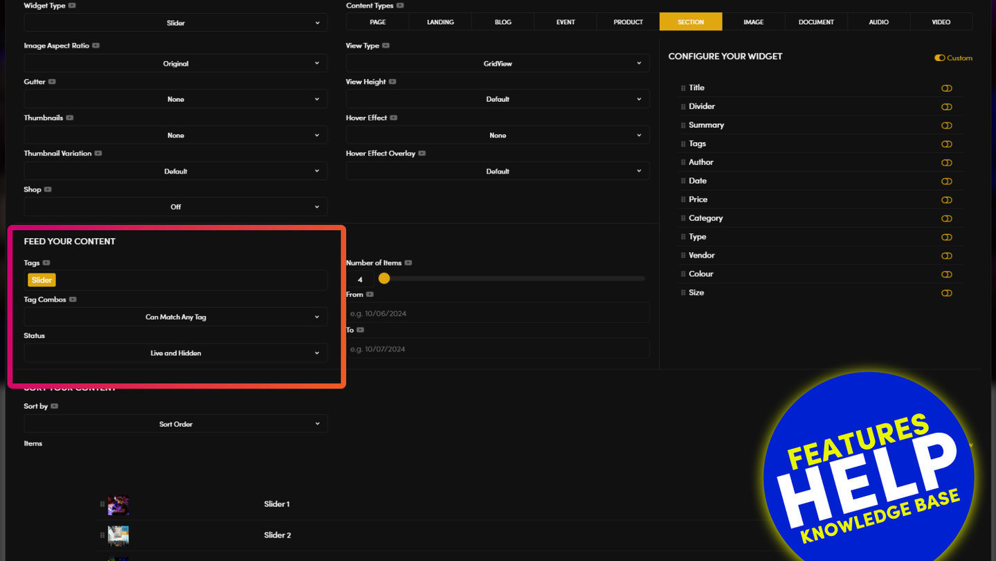
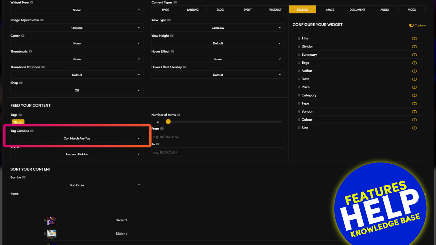
- Select your tags 'Tags'
- Select any other preferences that you would like to apply
- Save. Now your Section pages will transition in a Slider
Page Sliders are extremely useful because you can completely change the content in each Section, so that each page Layout is completely different.
Pro Tip: When creating new Page Sections to be used in a Slider, you should ensure the height of each Section page is exactly the same height. This will allow for a nice even look when the pages slide. You can set this up as follows:
- In the Page Editor, flip to 'Row' view at the top of the page.
- Click the Pencil Icon in the Frame Tools.
- Set the Height of the Row e.g. to 500px.
- Try not to write too much content, so that the content does not overflow the space available in the Layout. Because the image is a fixed height, surplus content will overflow the bottom of the Layout. If your content does overflow, consider changing the 'Overflow' settings to 'Scroll'.
- Save your Page.
- When you create new pages to appear in your slider. You can simply clone this page using the 'Clone Tool' in the main Page List area.

MULTI-SLIDER WIDGET
USED FOR: FEATURES | BANNERS | GALLERIES | ADS | NEWS | BLOGS | SERVICES | PRODUCTS | CATEGORIES | EVENTS | TOPICS
The Multi-Slider is a special type of Slider. It slides a group of tagged Pages or Files in a carousel motion from right to left.
Much like the Slider, the user may swipe the Slider in either left or right direction using their mouse (using a 'click-hold-scroll' mouse action); or on mobile devices use their finger to swipe in either left or right direction.
A Multi-Slider is set up in exactly the same way as a slider. However, the width of each Icon in the card is a fixed width and this can not be changed.
Slider Actions
Clicking on a card will have the following action, depending on whether the Slider is set to Image or Page:
- Page Multi-Slider: Opens a Page
- Image Multi-Slider: Opens a Lightbox popup. If the image in the Lightbox popup has been assigned a destination URL, when you click on the full image it will link to that page.
MOBLE CMS: BUILT FOR YOU
Short on time or feeling lazy? That's ok, many businesses are in the same position as you. If you would like MOBLE to build your website for you, get in touch with us today to have and let's have an initial chat to determine how we can best help you.
Talk to one of our expert consultants and we'll tailor make a solution that right for you.
RELATED HELP

Play before you Pay?
GETTING AROUND
SUPPORT
AI SALES LINE
AI SUPPORT LINE
ENQUIRIES
team@moble.com.au
GET A QUOTE
A Web Builder for Design. A CMS for Business. We serve all businesses from SME's to Enterprise. Talk with us for AI development, custom website design, website development, ecommerce websites, directories, intranets and social networks.
PRIVACY | WEBSITE TERMS | PLATFORM TERMS | © 2026 MOBLE PTY LTD