


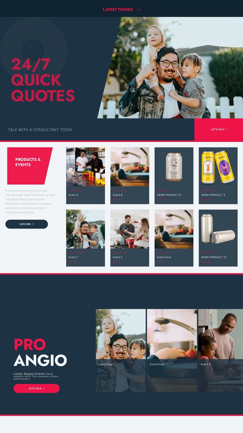


CHOOSE FROM 40 FREE DESIGNS
SUBMIT YOUR OWN DESIGN & RECEIVE A 40% PER MONTH ROYALTY
Select your free website design, then completely make it your own with our easy to use website builder and CMS.

PICK YOUR AI THEME TO GET STARTED

BUILT
FOR YOU

Site in a Day is back, for the same price as it's inaugural release in 2014!


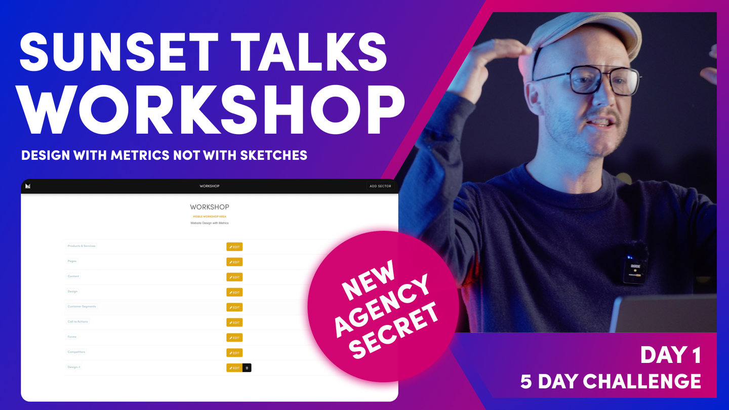
REPUTATION EDGE

DAY 1 | EPISODE 6
LOGOS

Paul | 23:12 | 30-60 mins
Many businesses like to use logos showcase their work and build trust with social proof. At the end of the episode we'll show you how to prepare your logos so that they work with your design, and are perfectly aligned whether embedded on pages or served dynamically in widgets to effortlessly make awesome photo galleries and sliders.
LESSON PLAN

Logos Intro
Paul Davenport | 01:09
Your website has many different types of Logos including functional Logos in your Header and Notifications and also Client Logos to build trust and social proof. In this episode we ensure you size and upload them all correctly.
"In this episode, we're going to upload all of your logos. Now, your logo is more than just the logo that's in the header. There are other logos around your website to be aware of. I'm going to start this session by uploading all of those and then quite quickly we're going to move into a masterclass where I show you how to make logos so that they're perfectly aligned around your website. And to do that, I'm going to demonstrate by showing you a client website that I'm currently working on. This has a logo that also animates on Scroll, but it also has lots of [inaudible 00:00:45] logos around the website. And I'm going to show you how I make those so that even if you are not a designer, you'll be able to copy this technique and make your own logos so they're perfectly aligned right the way across your website."
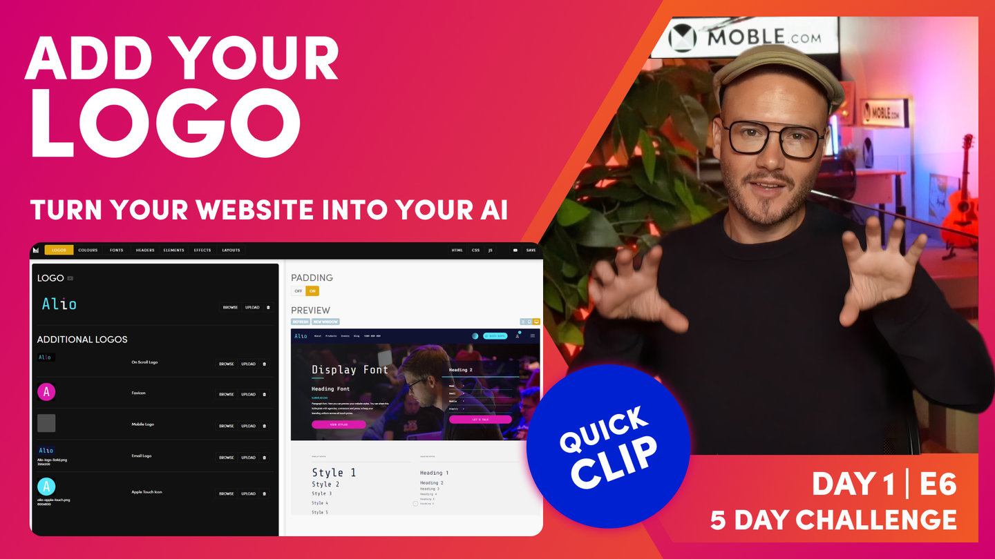
Add Your Logo
Paul Davenport | 02:24
Your main logo lives in your Header and is most often a transparent png file. Your main logo has a default link that always clicks back to your Home Page.
"Okay, so here we are in the logos area, which you can access by the main menu, click styles, and then the first tab is logos. Now the first thing you can see here is the logo that we uploaded during the onboarding. Now if you recall, I uploaded a PNG with a transparent background. So that wasn't a JPEG, it was a PNG. Well, PNGs allow us to have a transparent background, and you can see here that literally it's just the letters. There's no background, which is really great for when we have logos in a header. So that's the first thing to note. If you are asking your graphic designer or whoever made your logo, ask them for a PNG of the logo. And you can upload that here.
I'll just drawer your attention to the padding here. I've got padding on, but if I turn padding off, this is often a popular technique for graphic designers to provide a logo. So they will actually put their own padding in here, and I'm going to show you that just in a couple of minutes how I build out my logos and the padding that I use. But as you can see here in the graphic file of my logo, there's actually some padding on the right and I've used that back in the preview here. I've used that to add to this padding here. So I'm going to show you the exact pixels just shortly of what I use for my logos. But this one with Alio, I like to have the padding on here, which gives me this 16 pixel wrap plus the extra padding that I added into my logo. So we'll look at that shortly, but we'll whip through. Now, I'll just show you the logo on Scroll."
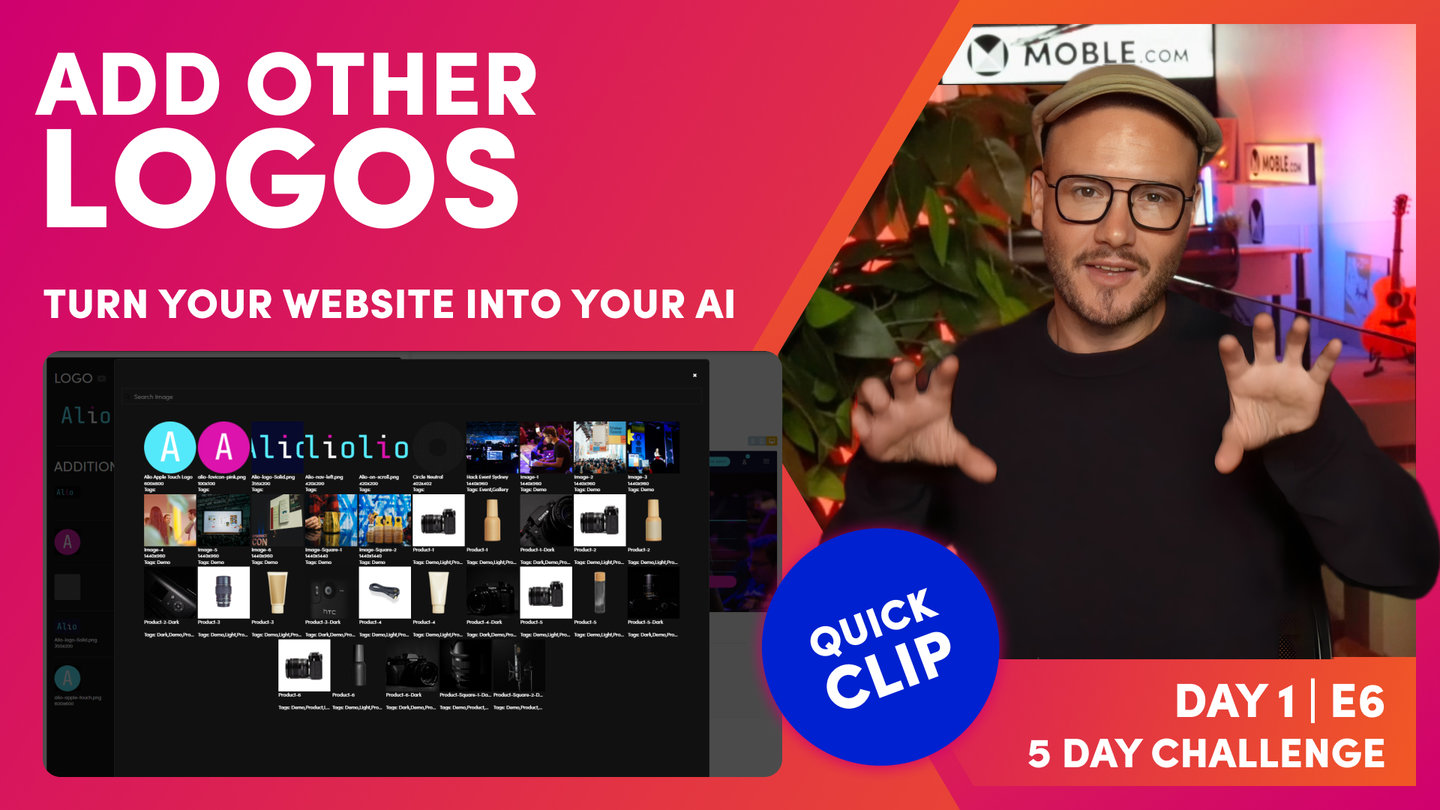
Other Logos
Paul Davenport | 04:58
Next, you can upload a 'Logo on Scroll' to bring a simple but striking animation to the most visual part of your website. Other Logos include you Favicon, Apple Touch Icon, Mobile, and Email logos.
"So to demo logo on Scroll, I'm just going to go right ahead and upload my logo. So here you can see I've got logo on Scroll. I'll click upload, and I'm going to choose this logo here, which is a variant. Notice the eye on this one is pink, so I'll upload this and press save. And now if I go back to my preview and Scroll, you can see that the logo animates, all it's doing is replacing one logo with the white. As I Scroll, it will replace it to the pink. So that gives you a bit of inspiration there and what you could potentially do with your logo.
Well again, I'll demonstrate this by uploading my fave icon. So I'll go straight to upload here, and I'm going to choose this pink logo here, which is a 100 pixels by 100 pixels. So I'll update that and let's go and save this and take a look at this in the browser. So now if I hit refresh, it's going to swap it from the mobile logo, which is a default to my fave icon, which is the pink. Now, one of the common questions is, why do I make my fave icons 100 pixels when if you do an internet search, it's going to tell you to upload it at 16 or 32px to keep the file size low? Well, things happen with technology, particularly recently, we've had display screens, which are double the amount of pixels. So I'm just future proofing that there. 100 pixels is a very small file. We also compress images and upload as well. So I just choose 100, but if you make your fave icon somewhere between 16 and 100 pixels, that's absolutely fine.
Okay, well now let's move on to show you the mobile logo. So here we can see the mobile logo in the list. If I jump over to the preview and hit the mobile icon, I can see my mobile logo here. Now for Alio, I'm quite happy with my logo as it is. So in this case, I'm not going to upload anything and it will display the default, so I don't need to upload two if my logo's going to be the same. Some people might like to have quite a minimal mobile logo and maybe if you've got an icon, just display the icon only, but there's enough space for it here in the mobile design. So I'm quite happy. So I'm going to skip this and move on to the email logo.
To demonstrate the email logo, I'll go right ahead and upload mine. And as you can see here in my list of logos, I've got a whole bunch of logos, some have got a background and some don't have a background. As you can see here, there's no background. But when you've got an email, you don't know where that email is necessarily going to. Some people might be reading their email, for example, in dark mode, whereas others might be reading it in light mode. So I don't like to send an email with a transparent background. So in this case, I'm going to choose this logo here that's got a solid blue background, so my logo will always be seen.
And finally we'll upload the Apple Touch icon. Well, the Apple Touch icon are the icons that appear on the homescreen of your iPhone or iPad. But typically those icons open apps, but they can also be used to open up web pages. So here we have the icon that will be used if anyone saves any of your pages to their home screen. So for you personally, you might choose to save your contacts or your inquiry screen of your mobile platform to your home screen. So you can click that at any time and see all of those inquiries as they come in, which is what I do with my mobile platform so I can get all of those leads and respond to them immediately without even having to use a CRM."
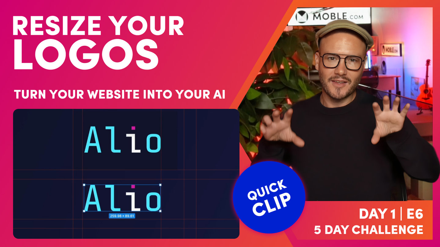
Resize Your Logos
Paul Davenport | 07:33
With so many different Logos you need to make sure you know how to resize them, a great platform to size your Logos is Figma.
"Okay, so now I'm going to show you how I make my logos, fave icons and Apple Touch icons and the exact sizes that I use. So even if you are not a designer, you can at least give those dimensions to your graphic designer or branding agency so that they can provide you your logo and you could simply upload them. It is good to know what we're doing here. This is only going to take a couple of minutes. So here I am in a program called Figma.
In earlier episodes, you've seen me look at these brand guidelines. This is in a platform called Figma. So if the UI is looking like this, it's not mobile CMS, this is Figma. Figma recently got bought by Adobe for about 20 billion I think, and Adobe's the company that makes Photoshop. So that just shows how good this tool is.
I like it, number one, because it allows us to collaborate. So different staff members can log in at the same time and we can also invite clients to log in and help us design bits and pieces. But it also works in the browser, and that means that even if someone's on a Mac or a PC, they can still use this tool without having to download anything. And there is a free version, at least at the time of this video on figma.com. So it's quite accessible to everybody for that reason. So in here I'm going to zoom into our logo, and you can see here I've set up some guides. So one of the first thing that I'll do here, if I just jump into the logos, you can see here's effectively my logo on the left. So if I just move this out, this is the image of my particular logo, but if I uploaded that this isn't going to have the padding in it, is it? This is kind of a weird size.
So if I was going to make this so I could upload it to the header area, so it's got some padding that I want to customize, then what I'll do is actually make a logo. So to do that, I'm going to press F, which means it's going to open up a frame. So in this particular frame, I'm going to make mine 400 by... Sorry, 420 by 200 high. The first thing people say is, "Why are you doing 200 pixels high when if we jump over into the website, I can tell you that the header is a 100 pixels high?" Well, earlier in the episode I talked about Retina screens, which are double the pixels. So when we're designing, we often like to design for double the pixels now to accommodate these new Apple screens. Otherwise, you might look at an image and it could be blurry. Okay?
So we'll see how that goes, but I like to future-proof my images and designs for that reason. So back over in Figma now, just to summarize, I've got a frame set up here, which is 420 pixels wide and 200 pixels high, and I've got this wrap around, which is 32px. So now I can take my image and I can position it to where I want it to go. Okay, so here's my image, but I might actually lock the proportions here and I might actually click scale on here. Now what that's allowing me to do is to scale this image up and hold the proportions. So I could actually make this image to the size I want to have it. So you could play around with this so that you can get it exactly how you like it. For me, I've already decided that I want this 32px pixel, which is 16.
So I position it exactly halfway. So you see the guideline there. So that's how I like mine in this instance. And then I've got 300 pixels here and 420 pixels there. That's 120, because of retina that's actually 60 pixels. So that's why I like that 60 pixel buffer so that our navigation can start on this side. So the width is going to be up to you, whatever you want to choose your width, whether it's 420 or whatever you want to make it. So I could change the name here to logo if I could spell. And then within here, I can now go and choose to export this. So if I go down to the bottom and click export, notice I'm choosing a PNG for the reasons we spoke about at the start of the video. This is going to allow us to have a transparent background.
Well, look at this. This isn't a transparent background yet, so I just note that there's this spot in here, show in exports. Well, if this is off, our background fill is not going to export. So that will export as a transparent PNG. Pretty useful if you want to see the background. But the other thing is here you can just take out the opacity and as long as you make sure you click in frame, if I've just got this, it's going to export this section. But if I click the actual frame itself, it's going to export the dimensions that we've just set up. And then you're going to have that perfectly aligned logo.
While we're here, we'll quickly show fave icons. As I said at the top there, I like to make my fave icons 100 by 100. It's totally fine if you've been provided a fave icon that's 32px by 32px, just take that and upload it and it will be absolutely fine. As I said, the reason why mine are 100 by 100 is because of Retina displays. But also I find that clients like to use their fave icons for other things around the website, and sometimes 32px is a little bit small. So I also like to save a bit of time there because I know at some point they're going to want to use that logo for something else, that icon for something else.
Now, similarly with the Apple touch, in this case, I would make my Apple Touch logo a bit bigger. 300 is a good size. So in this case, I would make mine 600. And so what I can do here is lock the proportions, go over to scale, and then actually make that, move it up to 600. Now, you could do it, drag here or you could simply type in 600 and that's going to make that perfect Apple Touch icon for you. Not like that, but like this. So in this case, I would rename this frame in here, Apple Touch icon. I would go over hit export, and we now have fave icons and our Apple Touch icon."

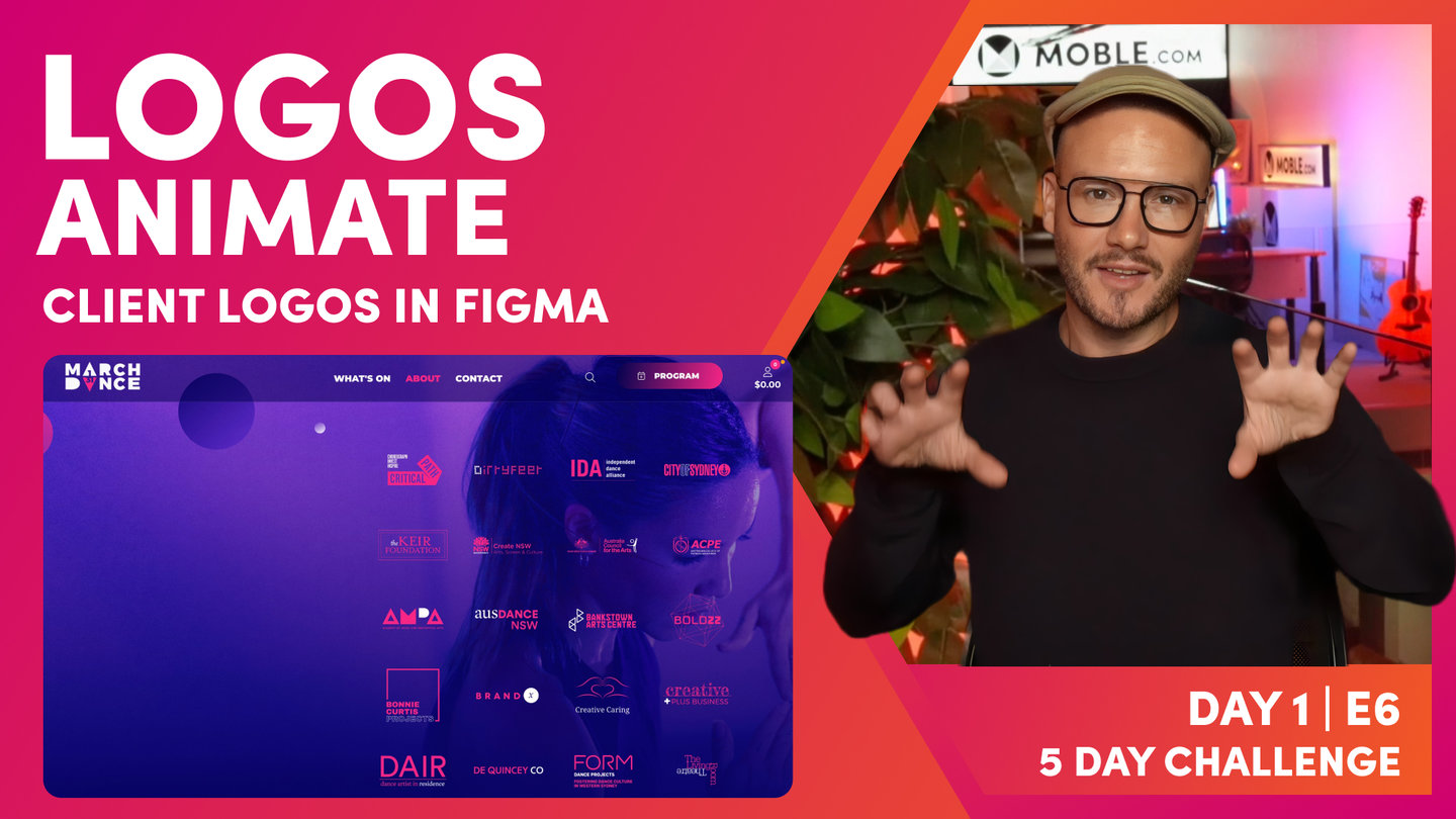
Client Logos Masterclass
Paul Davenport | 08:34
Client Logos are an excellent method to build trust and social proof. However, many website mess them up by just uploading what they find on their partner website or across the web. Here you'll learn how to re style your Logos for a branded look and perfect alignment.
"Okay, so now you're ready for a bit of a logo's masterclass just to finish this session. Well, here I am on this website called March Dance, which is a website that I'm working on. If you see that I Scroll here, you can see that the logo changes. Now you can see here it's a festival in March, which goes from the first to the 31st. So we've designed this logo really to show the first to the 31st, and the logo perfectly animates there in a really, really nice way. But if I just Scroll down here, you can see that there's a few cool things going on here. Here's an animation that we've built in CSS and Java Scripts showing each artist moving through in the similar kind of logo triangle accents. So I might show this episode later in the Watch and Learn series, so make sure you subscribe to our YouTube channel for that.
Watch this. So we've looked at our logo there and we've looked at our on [inaudible 00:15:57] logo there, but if I come down here, we've got these client logos. Now look at these, these are all PNGs, right? There's no background. If that had a white background, that wouldn't look quite so good. But I've also put these accents within the pink here. So how have I done that? Well, let me show you now how we make these client logos so they're all nicely aligned as you can see here. They all just seem to work together. So if we jump back into my Figma file, you can see here's a logo that's been [inaudible 00:16:31]. It's just a JPEG with a white background. So I need to remove that background and then make these the Colours. I'll make this pink, and this will be the white accent. You can see the other logos that we made earlier.
Okay, well here's our frame. So this is just called frame one at this stage, and it's 800 by 600. I like my logos 400 by 300, four by three just seems to work. So if you are thinking about logos, you could have them in a square, but you'll find you get all this white space in here. So I like a four by three shape for my logos, typically. Anyway, I find when you look at all different types of logos, a four by three will generally work. So that's the first bit of advice. So we know about Retina displays now, don't we? So instead of 400 by 300, I've made mine 800 by 600. Okay. So in this 800 by 600, you can see at this time got a 64px padding. And this is going to be the guide area of where I'm going to drop the logo.
Sometimes the logo might be this shape and fall within these lines. Sometimes it might be wide. It will always be contained inside these lines. I don't want anything over-spilling outside of these lines. So as you know now, I'm just going to click on this, make sure it's locked, and I'm going to go over and click scale. And then I can just manually, okay, move this down. Now I know that this is 800 less 64px, so I could just instantly type in a size like 600 and something in here if I want to. But yeah, I don't really need to do that if I've got the scale on because I can really just move it to my particular size.
Now at this point, it is hard to see, because I've got an image with a white background here, my frame's also got a white background. I could go to the frame and at this point just get rid of this, [inaudible 00:18:40]. Now at this point, I could turn this into a different Colour. So I'll just put this as a kind of gray for now, and then we can see our logo in here that we're sizing. So I can just touch this up and make sure that it falls within that line and maybe change the sizing accordingly. We need to remove this white in the image. So how are we going to do that? Well, if I [inaudible 00:19:16] click on here. Notice that I've got some plugins in Figma, and this is a particularly reliable plugin called Remove BG.
And I can just hit run. And that is going to remove the background. So I'm just going to hit that and watch this. It removes the background. Now question that you're asking is, where do I get the Remove BG? So I've just thought that the easiest thing to do here is just show you the URL. So it's just Remove BG. That's a very simple, and then once you've installed it, you might need to restart Figma. But if I jump back to Figma now, I've now got an image without a background. Well, let's explore this further. Now, what do I need to do to Colour these in? Remember, I want to Colour this one in pink and this bit in white. So the first thing I'm going to do is press R to open up a rectangle. And I could Colour the whole thing. I could put a rectangle over the whole image here.
I'm just going to Colour this in pink so we can see that rectangle. So now I've got a rectangle on top of an image. You can see this here, rectangle image. I could name this at this point, like pink rectangle, but I'm just going to highlight both. And then I'm going to hit this. This is what we call a mask. So you can see now that's turned the whole of that image into a pink Colour. Well, I could hit R again now and highlight over the word proper. And now I could go and make this our white, and it's as simple as that. So now I could call this frame proper motion, which we can see here. Now, on this one, I probably would want to remove this background Colour, which as you know, I could simply go down on the opacity, but making sure I've got the whole thing highlighted.
Go to exports. We want to export it as a PNG. You can see when we do that show in exports, checkbox appears. Well, I can uncheck that 'cause we don't want that background fill in our export. So at which point, I click export proper motion. Okay, now we talked about a logo on Scroll. What if I wanted to make this to be that logo on Scroll? What if I wanted this bit ON Scroll to go white and this bit on Scroll to go pink? Well, I could just copy and paste and that's going to give us this alternative. Well, I could go in here to our rectangle and make this one white, and then I could go onto this one and make this one pink. Okay? Now, [inaudible 00:22:11] I would come back up here and I would call this one on Scroll. And now I can go and export this one as a PNG too.
And now I would go back into the logos area and that's where I would upload the first one as the logo and the second one as the logo on Scroll. And that will give us that nice effect that we can see on Alio, and we can also see on the March Dance website as such. So that's how we manage our logos, our logos on Scroll, but also applying logos."
TEXTBOOK
A user guide to website logos
ADDING YOUR LOGO
Simply upload your logo to get started.
PRO TIPS:
- Before uploading, remove any background colours from your logo image (e.g. white background). You can do this by saving the image as a png with a transparent background.
- Before uploading, size your image dimensions. If your logo is going in the top left, consider a rectangle around 400x100px (no wider). We'll do the rest to make it work on all devices.
- Toggle padding 'On' and 'Off' as you please. You can add some padding to your logo. In the Header, this applies a 16px padding around the outside of your logo. However, many designers like to set their own padding in the actual logo image before uploading to make it just right.

The MOBLE Logos Area showing the different types of logo, padding option, and preview.
ADD YOUR FAVICON
Your Favicon is the small icon that is often seen in the browsers address bar or next to the list of bookmarks.
PRO TIPS:
- Size your image dimensions before uploading. Your favicon should be a square, ideally, aim for either 16px or 32px though MOBLE will automatically optimise the file size for you.
- Consider removing any background colours from your favicon image (e.g. white background). You can do this by saving the image as a png with a transparent background.

Favicons for DirtyFeet.com.au & MOBLE.com.
ADDING YOUR MOBILE LOGO
Given that mobile screens are quite different from desktop and tablet screens, you might wish to have a different version of your logo for mobile devices. Perhaps a square icon, or perhaps even just the logo icon without the business name.
If you do not add a Mobile Logo your Logo will show on mobile by default.

The mobile logo on DirtyFeet is in the top right, it actually uses the same logo as the desktop. Interesting we made a special icon to load the Drawer Menu from the top of the screen.
ADDING YOUR EMAIL NOTIFICATION LOGO
When your users complete a form, and you elect to send them an automatic email notification, a logo will display in the body of your email. This is your 'Email Logo' and you upload it here.
- You can upload a regularly sized logo,
- or, to create a banner look, you can upload a banner image that is 600px wide.
ADDING YOUR APPLE TOUCH ICON
Often you might like to save your website Home page, or perhaps your Enquiries page to your mobile phone home screen. The 'Apple Touch Icon' is the icon is the icon that will appear on your iPhones Home Screen.
HOW TO SAVE A WEB PAGE TO YOUR IPHONE HOME SCREEN
- Open the web page on your phone
- Click the 'Upload or Share' icon at the bottom of the screen
- Click the 'Add to Home Screen' icon
- The web page will now be shown on your Home Screen with you Apple Touch Icon
- This is nice branding should your website visitors wish to have your website feel like an App on their phone.
Often clients ask MOBLE to develop a pop up that appears when users visit your web pages, to encourage them to add your website to their Home Screen.
Speak to MOBLE should you require this service.
WHAT NEXT?
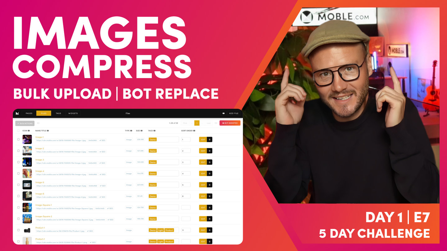
Next we'll build on your logo, by uploading your entire library of images in bulk. Our bots will compress your images so they are optimised for Google, and we'll even get the bots to swap out the demo images right across your theme, with your shiny new ones. At the end of this episode your website will really start to feel like your brand.
DAY 1: EPISODES
PARTNERS & INTEGRATIONS

70 Award
Winning AI Themes
GETTING AROUND
GET A QUOTE
A Web Builder for Design. A CMS for Business. We serve all businesses from SME's to Enterprise. Talk with us for custom website design and website development, ecommerce websites, directories, intranets and social networks.